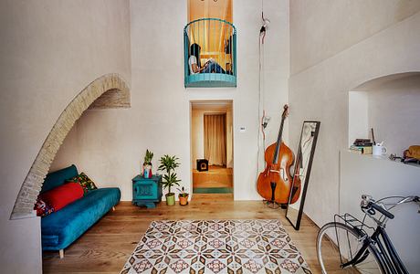
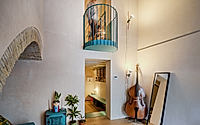
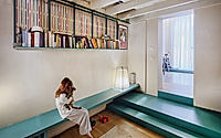
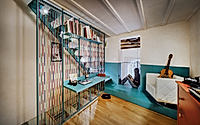
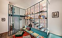
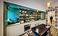
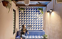
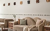
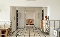
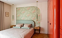
Mexico and “Vucciria” transforms an existing apartment in Palermo, Italy into a narrative interior by Vid’A, shaped around memory, color, and everyday ritual. The project draws on the client’s formative journey to Mexico and the dense urban character of Palermo’s Vucciria quarter, translating those impressions into rooms that compress and release, invite conversation, and keep family life at the forefront.
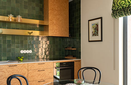
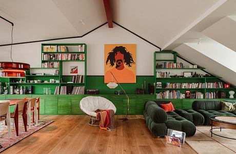
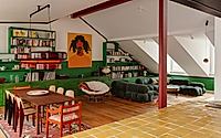
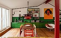
AFL Port Praski unfolds as a richly layered apartment on the fringes of Krakow, Poland, shaped by Mistovia for two graphic designers and their dogs. Across 125 m², the interior balances vivid colour, tactile materials and everyday comfort, turning the home into both studio and living quarters. The result is a place where work, art and rest overlap without friction, yet each room still guards its own mood and tempo.
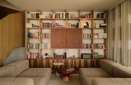
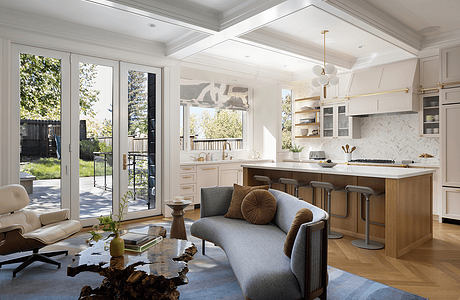
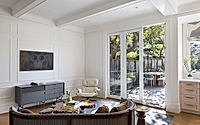
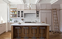
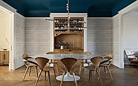
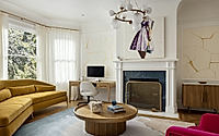
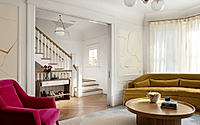
Glen Park II reimagines a 1910 Queen Anne house in San Francisco, CA, United States under the direction of Gast Architects. The renovation teams the architecture studio with interior designer Noz Nozawa to tailor a richly colored, highly personal home for a contemporary family. Every level carries traces of the original structure, yet the refreshed rooms lean into light, comfort, and well-edited drama suited to daily city life.
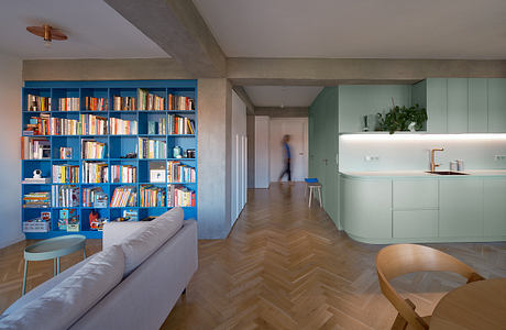
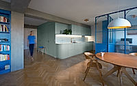
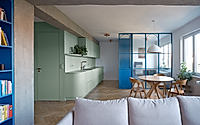
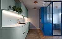
Three Shades of Home sits in a renovated 1950s panel apartment in Prague, Czech Rep., reshaped by B² Architecture for a young family’s daily rhythms. The project turns a once cramped layout into a light-filled sequence of rooms, with a colorful central core that quietly organizes movement and privacy. Color, concrete, and oak work together to give the home a steady, contemporary character without losing the building’s honest structure.
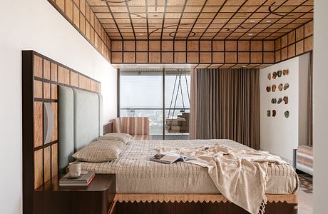
Gingham Dreams crowns a 25th-floor apartment in Mumbai, India, with a vivid sense of order and play. Conceived by MuseLAB for a three-generational family, the home replaces conventional luxury with gingham-patterned marble, saturated color, and a social core that draws people toward long views of the Arabian Sea. Every room carries the grid in a different register, turning daily rituals into small encounters with pattern and craft.
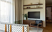
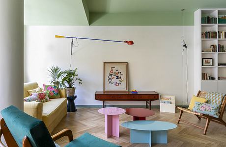
Riverside Project opens as a compact yet expressive apartment in Vilnius, Lithuania, shaped by designer Marija Orloviene in 2025. She combines warm woodwork, tailored furniture, and confident color to give each room a distinct mood while keeping the home readable as one continuous interior. Daylight, patterned textiles, and graphic surfaces work together so the apartment feels personal, modern, and tuned to everyday rituals rather than passing trends.
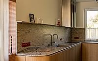
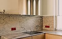
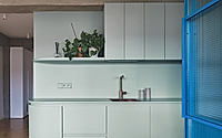
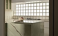
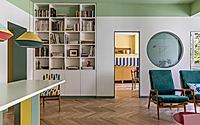
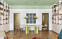
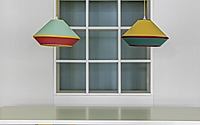
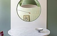
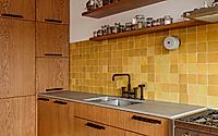
Casa Monti Parioli turns a once-generic 1950s apartment in Rome, Italy into a vivid home tailored to a young family of three. Costanza Santovetti Studio reworks the plan around a stainless steel and marble kitchen, using it as a clear visual anchor. Color, geometry, and light now knit together daily life, replacing the former monochrome shell with a lively yet ordered interior.
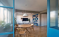
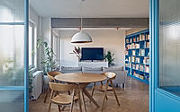
Chroma Penthouse unfolds across the roofline of a Kreuzberg residential building in Berlin, Germany, where Studio Bosko crafts a home around unapologetic color. The penthouse interior translates a young couple’s wish for “as little white as possible” into a vivid, primary-hued environment that assigns each room its own chromatic identity. Bright yet precise, the project turns an open plan into a richly legible home for living, working, and gathering.
