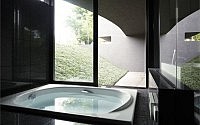
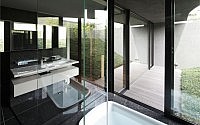
Breeze House by Artechnic
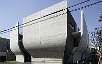
In Tokyo, Japan, you may find a contemporary concrete house by Artechnic. The exterior is pretty progressive.



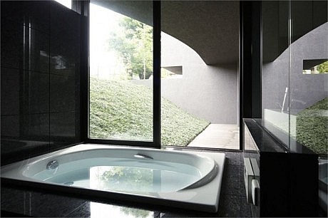
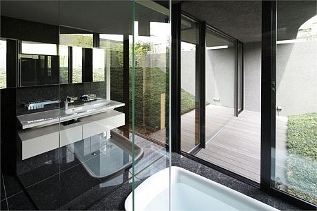
Description by Artechnic
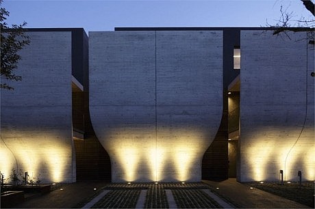
A building that sits in mute repose, like an impassive signpost.
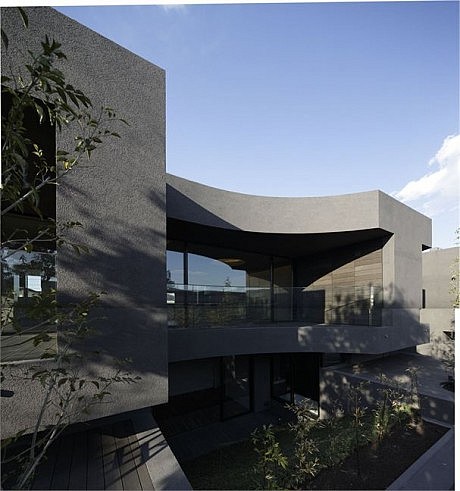
In seeking to realize such a building, which becomes part of the scenery around it, acting as part of the backdrop for passers-by, I felt that I needed to create an exterior that was distinct from the standard architectural lexicon.
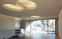
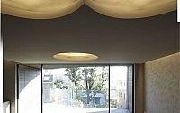
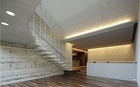
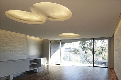
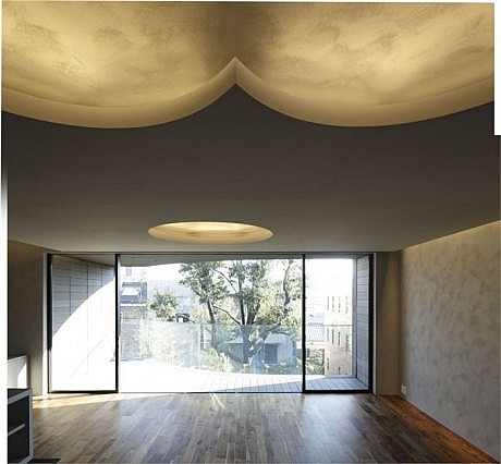
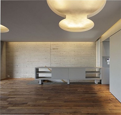
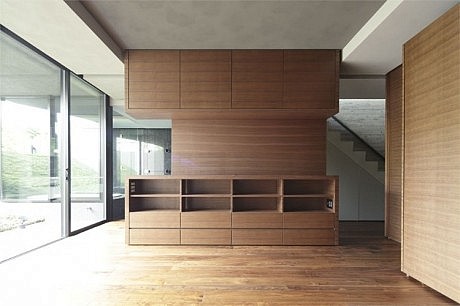
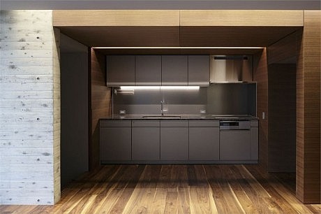
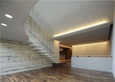
Once you slip through the entrance that recalls a crevice to a secret rock cave and pass through the dimly lit interior void, suddenly you are presented with an open space that is in total contrast to the confines of what you have just experienced. The effect is to create a space like a private beach, enclosed by a soaring rock face. My concept was to create a space that would provide a bolt-hole for personal rest and relaxation, while still being able to benefit from the convenience of the city center—an ideal private spot in the heart of the city.
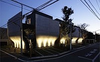
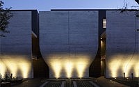
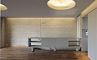
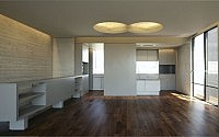
Although the house is located in a quiet residential area on a vacant lot next to the former home of one of the notable prime ministers of 20th century Japan, it sits on a 5.5m wide frontal road that is a well-used side road, with a stream of cars and people passing by in the morning and evening. In this location, the single largest challenge was to consider how to achieve a building that would continue to maintain its appeal and superiority as a high-end rental property. Buffering walls were created on the two sides that fronted onto this main access road, with the gaps between the buffering wall serving as the entrance to each of the unit. Once inside the houses, the south-facing side features an expansive open area, which provides a light and airy living space.
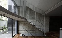
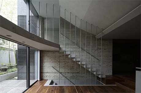
The buffering wall is creating a rational cross-section. The wall on the north side is constructed so as to allow for ground-level parking space, while also widening out to provide extra space in front of the second-storey entrances. The east side features a triple-legged stairwell with single passage space on the lower floor that also widens out to a double passage space on the upper floor.
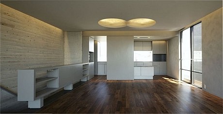
I decided on the current layout after considering the most efficient configuration for each residential unit based on the building plot, which is long from east to west and short from south to north, which fronts on to the road on the north side. My idea was that a terrace house style would be the most efficient given the specifications of the building plot. I thought that a terrace house structure would be a comfortable and appealing option. I sought to concentrate on bringing out the commercial appeal of the luxury of space created by a terrace house configuration.
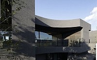
Once I had settled on a multiple-storied terrace house design, from the perspective of commercial appeal I decided to have entrances only on the first and second floors for the units, which ultimately led to a lay-out of first-floor flats, with duplex maisonettes taking up the second and third floors. As the appeal and comfort of the duplex maisonettes was self-evident, I concentrated on boosting the appeal of the first-floor flats. My solution was to place a green roof terrace of the second-floor at a slant, in order to open up the south-facing section of the first-floor apartments, ensuring a large and airy space.
In order to ensure that there was no need to place the bedroom windows on the road-facing north wall, which also looks over the parking area, I designed slits between each unit that act as light courts. As all the individual rooms face these light courts, this ensures that they all have their own private exterior aspect.
This project was one that I developed independently, from the decision on the location itself through to planning. The specifications of the building were also selected with total life cycle costs in mind.
While selecting a finish that would be maintenance-free to the greatest degree possible, I made the bold decision to use an exterior insulation and finishing system (which is coated on to the exterior wall) in order to retouch the exterior easily at predetermined periods during the building life-cycle as a means of keeping these rental units looking fresh and appealing.
- by Matt Watts