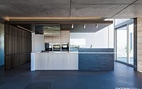
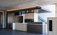
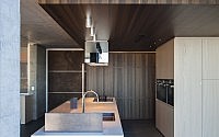
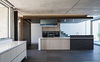
Kitchen Created Like a Piece of Bespoke Furniture
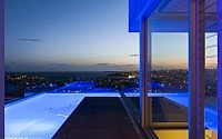
This home is perched and cantilevering off a hill in the prestigious suburb of Dover Heights in Sydney’s East. A beautifully architect designed home, boasting 270° panoramic views from Bondi Beach to North Sydney. It sits on the cliff face with 2 levels above ground and four levels down and it’s a showstopper! It embraces its surroundings and captures the stunning views in their entirety. A cutting edge modern home both architecturally and with finishes such as enormous expanses of glass, concrete, sandstone and basalt.

Description by Minosa
The family consisted of two self-employed adults with two growing girls heading into their teenage years. The home had to cater to international guests and long close family visits. Having worked with the clients on previous successful projects, the designer was well aware that this kitchen was to be the nucleus in which all-home life was based and run. it had to be well designed and handle the demands that were going to be thrown its way. Furthermore it had to sit within the hardcore architecture created and ooze style and sophistication to all that entered the front door of this exquisite home.
The Brief
The brief was to create a cutting edge kitchen, one that is more like a piece of bespoke furniture rather than the usual utility. The space had to warm up the hardcore interior as it is surrounded by off form concrete ceilings & walls. Easier than it sounds.
Client Requirements
- Open plan
- Must have wow factor
- Conceal air conditioning system above in
- Dumb waiter accessible to formal living space above
- Double appliances – two integrated fridges, two integrated dishwashers & double
- Bowl sink
- Oven, Steamer & microwave
- Large bin!!!
- Separate space for tea & coffee as well as breakfast paraphernalia
- Everyday items need to disappear
- Good use of materials. Warmth in finishes
- Floating stair treads MUST be visible
- Quality fixtures & fittings
- Everyday office for the Mum to run the home and it must be away from view
Constraints
- Essentially a glass box
- Single wall that was 3m in length & a structural pier that was fixed
- Front door adjacent to space
- Small footprint with lots of appliances
- Difficult position, with no possibility of extending as it was surrounded by front door, Pool & WC
- Off form concrete ceiling – Ducting & air conditioning needs to be concealed somewhere!
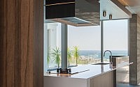
- The views! 270 degrees of them!
How the requirements of the client brief were achieved & problems solved
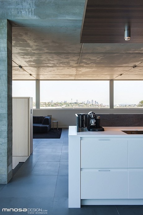
When homes are strategically positioned in such a way as this home is, the clients’ objective is to capture the view – at all costs! Glass, glass & more glass!!! It makes the job of spatially planning very difficult. This space was exactly that… and more, as the clients’ drive was an architecturally impressive home including off-form concrete ceilings and basalt stone flooring.
For one, how do you cool a home that is west facing and there is NO false ceiling to run air conditioning? Simple, design all of your joinery around it, the air-conditioning system that is…. that’s exactly what the designer had to do.
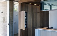
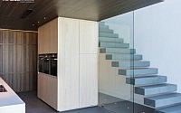
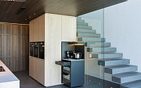
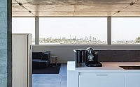
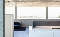
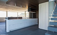
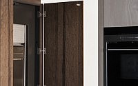
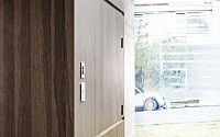
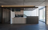
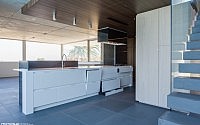
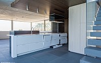
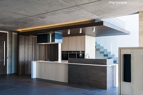
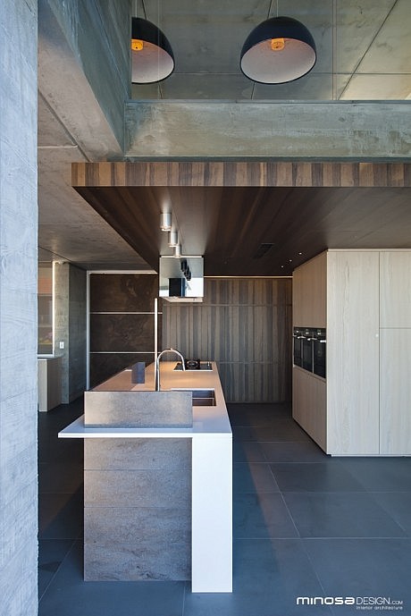
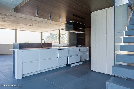
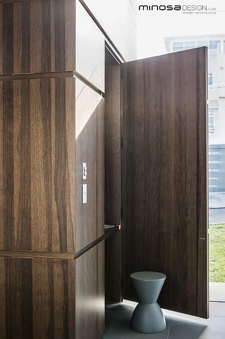
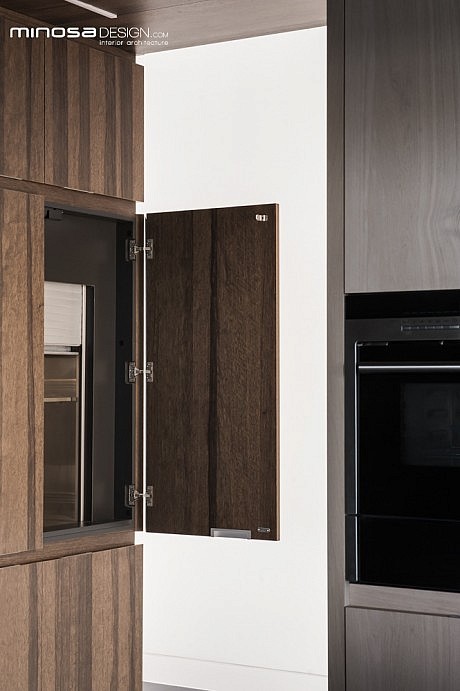
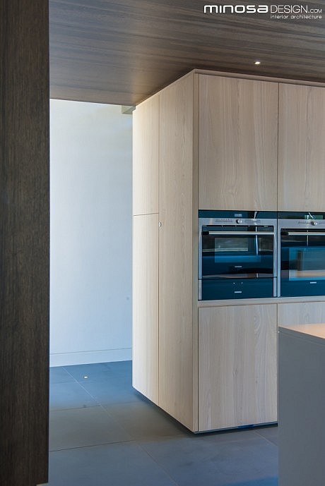
The credenza adjoining the kitchen has AC units concealed within, the entertainment unit conceals another and the largest of the three is concealed inside the kitchen bulkhead/suspended ceiling. Given the style of architecture it was obvious that a standard white gyprock ceiling was not going to cut it here, it would have looked out of place, an after thought! The designer chose to make the ceiling an integral part of the design of the kitchen and other joinery elements thru the home. The tall elements concealing the two fridges, dumb waiter, everyday home office area along with the secret glassware cabinet is part of this piece of joinery and also finished in the veneer, Tempered Frake by Shenoki. This consistent material is then applied to the suspended bulkhead thus really compressing the kitchen space, which upon entry to the home is the first thing you see. This compression then helps draw your eye to the view making an incredible statement of the amazing vista beyond…
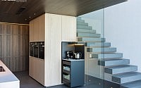
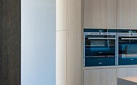
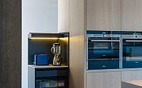
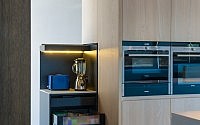
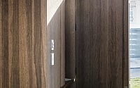
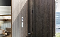
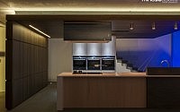
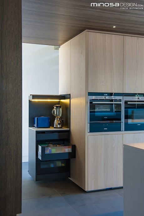
There is only one wall in this kitchen, this is concealed behind the fridges and dumb waiter, the other vertical element that played such a pivotal role in the design is a structural pier that keeps the building erect. This is concealed in the central “pod”. This central joinery plays a massive part in this space. Not only does it house the oven, steamer, microwave and warming drawers; but also below is the pantry concealed in the drawers along with the houses’ waste sorting/recycling system. On the backside the pod to the left and right are electronically controlled zones. The first one (on the right) is the Coffee & tea zone. With a touch of a button the completely concealed joinery piece emerges complete with benchtop and its own internal drawers, which house all of the paraphernalia for this zone. Complete with it’s own task light that is activated by the door opening. On the left hand side is the breakfast zone, this is also electronically controlled and has all of the breakfast products stored. The morning sees the emergence of these wings… all morning activities are performed and then on the way out…lockdown! All by way of a touch of a button! All is concealed and the kitchen appears tidy.
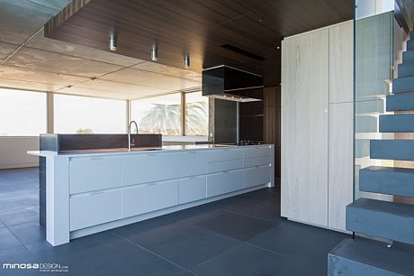
Onto the island, it was chosen that this would be the centre piece of the space, the designer chose to create a waterfall end panel that effectively wraps around the benchtop which helps draw your eye around and thru the space, like most of the design elements…all pointing to THAT VIEW and don’t forget the floating stair treads! The island unit houses two dishwashers, non-consumables, cleaning and is the cooking & preparation zone. Compact but highly efficient. Finally a privacy panel was decided upon to allow some mess in the kitchen (as things cannot always be kept tidy). The final material selection for this panel did not come about until the floor was down and most of the joinery was in as it was pivotal in creating a grounded and asymmetric balance with the all design elements. In the end, Lava Rock in the Organics range by Corian® was chosen. This was mostly due to the fact it could be made to look like a single piece wrapping around the island seamlessly and also due to the connection with other materials.
The rangehood was a big bulky item for this space and it had to preferably disappear. The designer chose to custom make the hoods cover and clad it with smoked mirror so the off-form concrete ceiling would reflect and disguise the appliance.
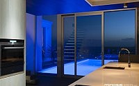
So with all the function taken care of, the designer then had to apply the lighting solution. The space during the day is filled with loads of natural light from everywhere. The two tones of veneer along with the off-form concrete create a real warmth (strangely enough) throughout the floor. Lighting was a key design element as Basics (energy efficient house rating system) had compliance issues, especially for a house that is effectively a three sided west facing glass home. LED lighting became the key lighting source; there are LED task down lights strategically placed above the sink and infront of the ovens in the pod. Accent light was achieved by way of one major element …the adjoining exterior pool! This was fitted with colour change LED all controlled by the smart home automation system so that when entertaining the pool could be set to any colour or all colours.
This home is a traffic stopper! The clients are thrilled to pieces with the end result and enjoy the functional kitchen as it plays its role as the hub of the home with poise and elegance daily.
About this winning entry:
The clients’ brief was to create a cutting-edge kitchen like a piece of bespoke furniture, that would also ‘warm up’ the off-form concrete ceilings and walls surrounding it in this stunningly beautiful architect-designed home with extensive views. The judges said that the exceptional finishes in this kitchen have created a visually appealing space that flows nicely and is highly functional. Innovative cabinetry overcomes some difficult design constraints and the harmonious blend of colour and texture complements its surroundings.
KBDi Designer – Large Kitchens NSW 2013 Darren Genner for the Dover Heights
HIA NSW Large Kitchen Project of the Year
HIA NSW Kitchen Design of the Year
HIA Kitchen Project of the Year
