Geometric Residence by Lidija Dragisic
In 2013 Lidija Dragisic completed this amazing modern apartment located in Slovenia’s capital of Ljubljana.


Description by Lidija Dragisic
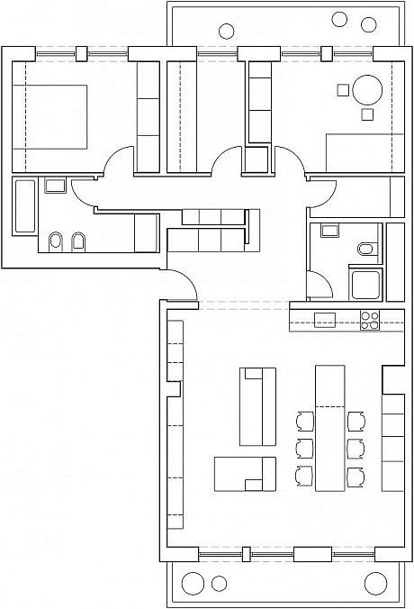
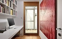
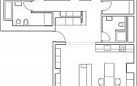
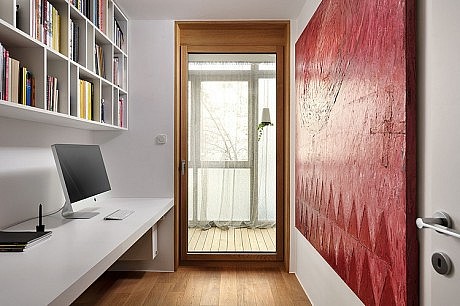
The apartment is located in the heart of Ljubljana, the capital of Slovenia. It is divided into living area (consisting of a large living room with kitchen and dining room) and more intimate / sleeping area (two sleeping rooms and a study room). In between these two spaces there is a service part offering two contemporary bathrooms and one utility.
When the client approached us, this apartment was vacant and ruined. In order to bring it back to life, the renovation was absolutely necessary. The adaptation didn’t make any significant changes to the floor plan, besides some bathroom enhancements, windows & door replacements, new flooring and electrical installations.
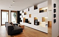
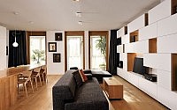
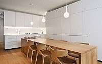
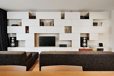
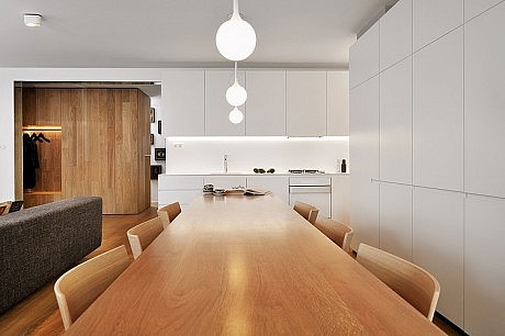
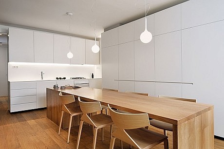
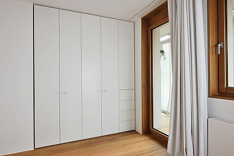
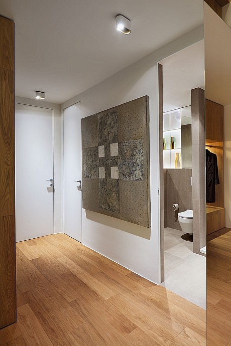
The interior furnishing design is simple, with design-scheme combining basic materials and natural colors: oak, white furniture and some detail accents in black. This approach allowed the residents the freedom of doing any additional decorations (art, colored cushions, carpets, accessories etc.) without disrupting the overall design-statement.
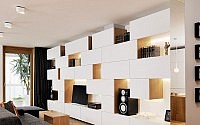
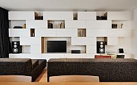
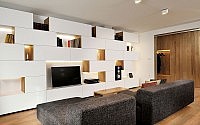
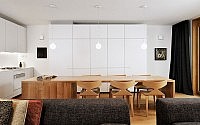
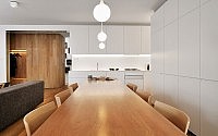
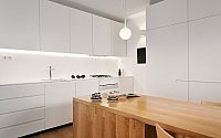
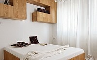
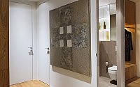
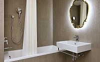
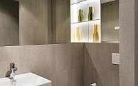
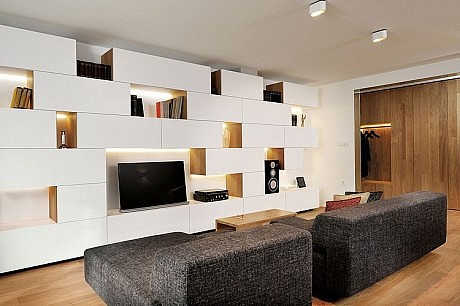
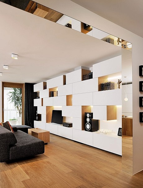
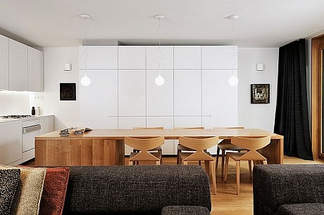
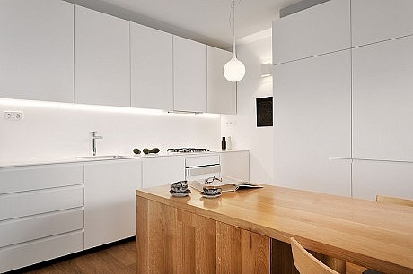
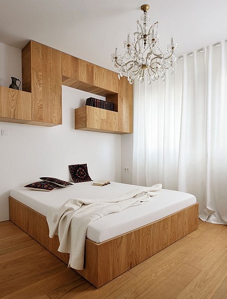
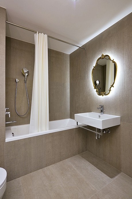
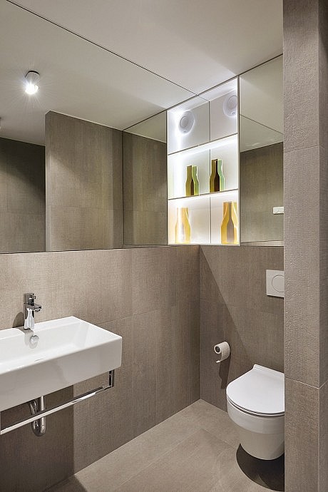
The furniture along the walls is in a neutral white and designed in a geometrical pattern, which magnifies the flat’s ambience. Several carefully selected accents are wood, which create a pleasant and cozy atmosphere. The furniture is custom and unique – for example, a big 3.5 m (11.5 ft) long wooden table in the middle of the dining area or a huge pantry with parquet-finish, which brings the living and private spaces together. The marriage of white and oak is implemented in the master bedroom as well (master-bed and a geometrically-shaped wall closet above). The massive curtains throughout the apartment achieve additional intimacy, softness and consistency (they are also in a neutral black & white combination). The bathrooms are simple and without any unnecessary decorations, which allows the beautiful concrete-like tiles to stand out. These spaces are visually enhanced with the clever use of built-in mirrored walls.
Our aim was to adapt this interior to the versatile, ever changing needs of the modern customer. Besides the functionality, we wanted to create many different lighting scenarios and environments. This is achieved by combining basic lighting with the indirect led lighting, which are hidden in the furniture elements. The ceiling in the bedroom adorned with a crystal chandelier, which (along with the other vintage accessories) gives this residence a unique soul.
