Rocha Apartment by CaSA
Colombo and Serboli Architecture (CaSA) recently finished a complete redesign of a neglected apartment located in the center of Barcelona, Spain.


Description by CaSA
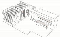
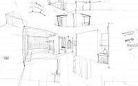
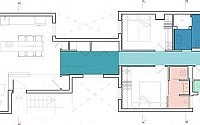
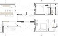
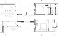
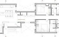
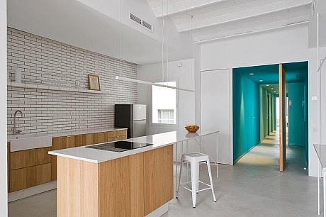
The brief was to transform this neglected, very badly distributed apartment into an attractive holiday home. The property is located in an extremely central street, right between Plaza Catalunya y Plaza Universitat, on the sixth floor of an art nouveau building. Nonetheless, this last floor was built in the ’60 and lacked of the charm of the rest of the building. In order to meet the brief, spaces had to be re-thought completely and all existing partition had to be demolished. The budget was tight and clever solutions were required to complete the needs providing an attractive, contemporary holiday atmosphere. Our client required four bedrooms. Four new bathrooms have been created, of which only one isn’t en-suite. The kitchen has been moved to be part of the wide living and to make space to an extra bedroom.
The chosen palette of materials included a micro-cement light grey matt floor, natural timber, and a dash of a different colour for each bathroom, and two shades in the corridor. The rest is white.
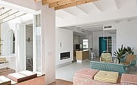
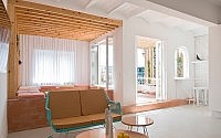
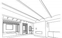
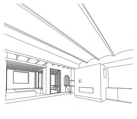
The day area was opened up completely by including what used to be a wide, semi-dark entrance space of the previous layout into the new bright living area.
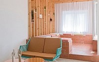
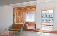
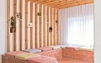
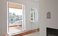
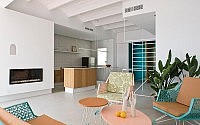
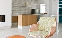
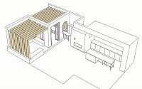
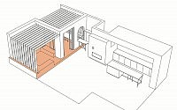
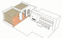
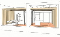
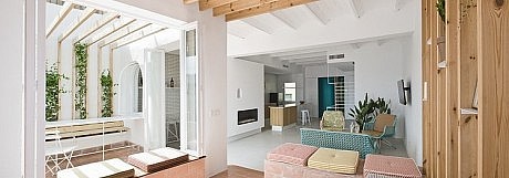
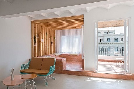
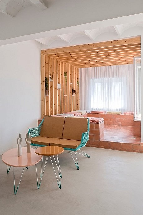
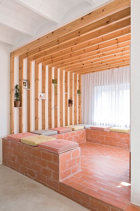
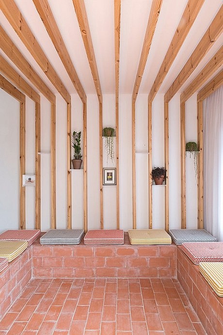
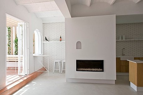
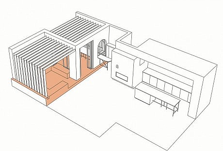
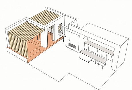
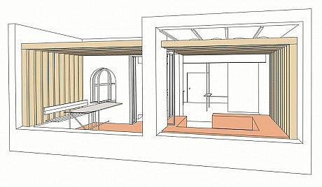
Special attention has been given to the creation a new zone, a relax area across interior and exterior. The terrace that had been closed years ago with a roof and aluminium window frames, has now been resumed, opened and extended towards the interior, in the living room, by treating part of the indoor space as outdoor. The inner area has been lifted at the same level as the exterior. We used the typical “rasilla” terracotta tiles to clad the floor as well as the new masonry seats folding all around the relax area. One of these seats is is right below a window, allowing to seat looking inside or outside.
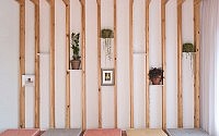
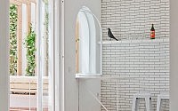
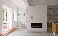
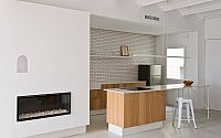
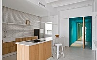
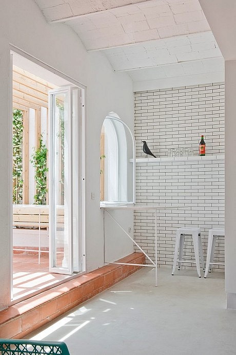
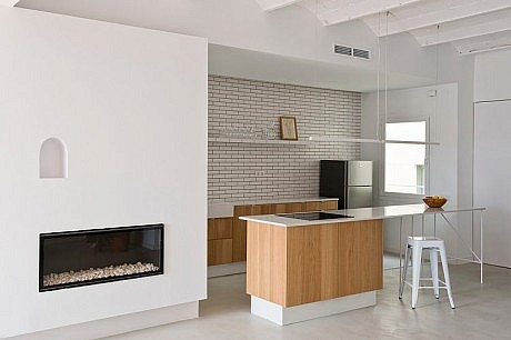
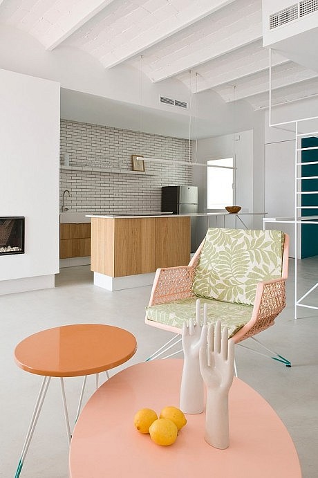
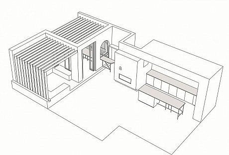
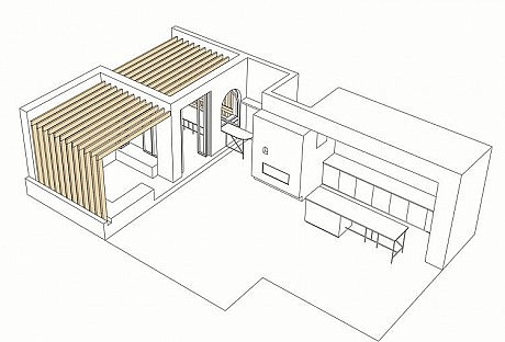
By extending the wooden slats canopy across the facade wall, the portion of the terrace has been visually extended to the indoor relax area. Walls were also treated on the inside with the same rough plaster used for the terrace walls. On the opposite side, a bar table prolongs on the outside through the newly opened arc window, to form an outdoor dining table. The arched window that had been bricked has been opened again to insert a pivoting arched window that allows the arch to appear clearly. The arched shape reappears in the curved outline of the bar and in the relief given to the outdoor table surface. The white tubes structures are one of the themes carried through the whole project. They were designed and custom made with white tubes and light coloured Compac surfaces, and form the terrace table and bar, as well as in the kitchen island, the entrance screen, and all the bathrooms. The kitchen island block is intended to allow to cook facing the living area and the same surface of the electric fires continues to create dining table suitable for six people, lit subtly by the streamlined Line lamp by Cronek, hanging above.
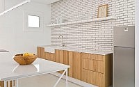
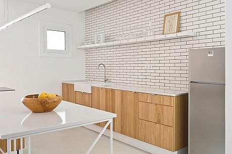
The kitchen wall is finished in matt white ceramic tiles that also cover the shelf that project on top of the kitchen plan. This shelf carries a light to illuminate the kitchen worktop.
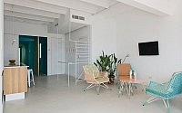
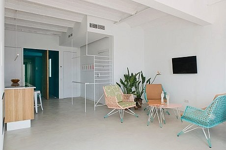
Both the tiled wall surface and shelf pass from the kitchen to the bar, unifying visually the two areas. The volume that separates them incorporates a gas fireplace. A great wooden pivoting door spins to give access to the night area. When the door is closed, the teal colour of the walls and ceiling appears framing the wood and through the white hole used as door handle. The same white tube detail reappears in the handles of the corridor closet, hiding the washing machine and house appliances, and again in the led spotlights on the ceiling, by Cronek. The First bedroom is the smallest one and does not have a bathroom. But two of its walls have floor-to-ceiling curtains. The communal bathroom, tiled with blue ceramics and a bright yellow grout, opens on a small light well patio that’s been retrieved and filled with plants, its shower has a window overlooking the green.
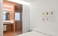
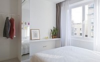
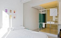
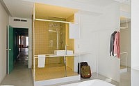
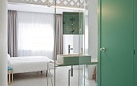
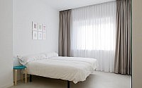
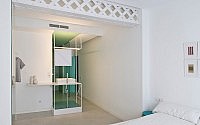
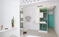
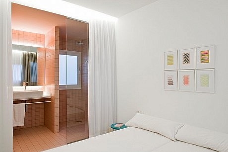
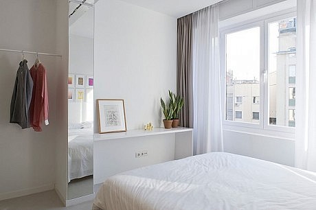
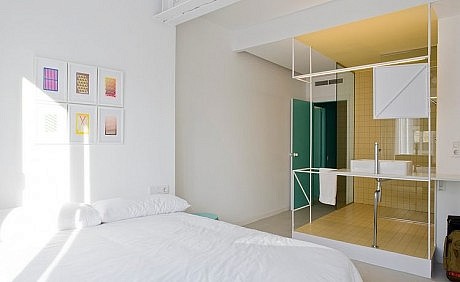
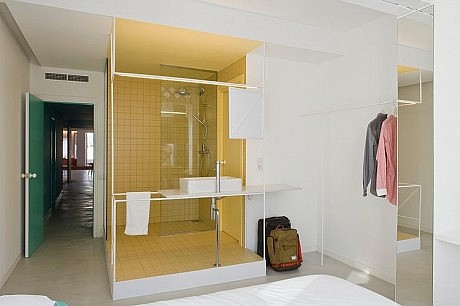
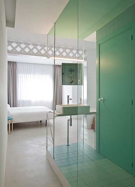
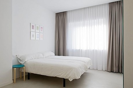
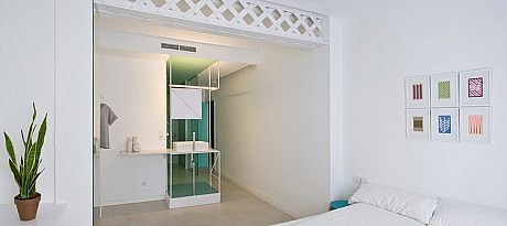
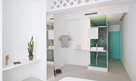
The four double bedrooms are simple and almost basic, but detailed. Two layers of floor-to-ceiling drapery soften the matt light grey micro-cement that covers the floors of the whole apartment; these curtains either diffuse the light or block it. Stools painted with shades of the teal colour of the corridor are used as bedside tables. In two of the three rooms the bathrooms open onto the space to reveal a dash of coloured ceramic tiles, pink, yellow or light green, grouted with a contrast colour. Showers are open on the bedrooms too, separated by a great glass partition. In the last two suites the washbasins are mounted on the specially designed white tube structures, in order to leave the space open. The tilted square mirrors allow one to reflect without blocking the natural light. The same tubes are used to create towel hangers and very simple racks to hang the clothes. On walls above the beds and in the entrance we chose to hang the beautiful graphic work of Dutch artist Sigrid Calon, that matches beautifully the language of the apartment.
Living room seats and tea table are by Barcelona-based furniture firm Lobster’s Day. The relax area’s cushions are made-by-measure with a Japanese fabric featuring an arch motif recalling the window, the niche and the dome on the outside.


Photography by Roberto Ruiz
- by Matt Watts