17 Blair Road Home by ONG&ONG
Situated in Singapore, this three-storey house was completely redesigned in 2013 by ONG&ONG.


Description by ONG&ONG
INTRODUCTION
17 Blair Road is located within the Blair Plain Conservation area. The Blair Plain Residential Historic District, located to the west of the Downtown Core, is still an attractive residential area with some commercial activities along Kampong Bahru Road. It is a compact cluster of two-and three-storey shophouses and residential terrace houses of the Early, Transitional, Late Shophouse and Art Deco Styles. This particular unit is of a Late Shophouse style.
Originally built between 1900 to 1940, the houses are best known for the use of spectacular ornamentation. Many of the houses have changed ownership with most having been restored. Now the area is an exclusive residential enclave. Along with two friends, the current owner won an auction for the combined sale of units 15, 17 and 19 on Blair Road, with him taking ownership of the middle unit. Prior to the auction, the houses had been renovated for office use.
BACKGROUND
The owners, a French Singaporean family, were deeply involved in numerous aspects of the conservation project. What they wanted was a warm family home that would also display much of its historical character.
This shophouse had been renovated before but no records of the work done from that time exist. However, it was clear that the building had been gutted and drastically altered from its original state to make way for offices. Thus, the house was not adequate for residential use nor had it retained much of its original architecture and materials, save for its traditional-looking façade.
FIRST STOREY
Prior to conservation works, the ground floor was what remained of a long office unit. Bound by two party walls, the result was a very poorly-lit mono-space that stretched all the way to the back of the site.
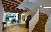
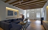
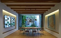
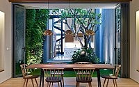
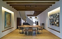
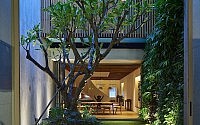
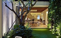
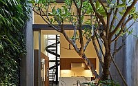
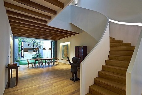
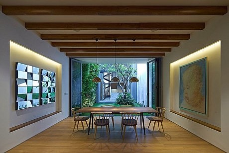
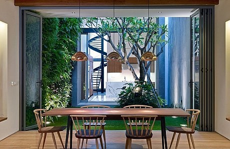
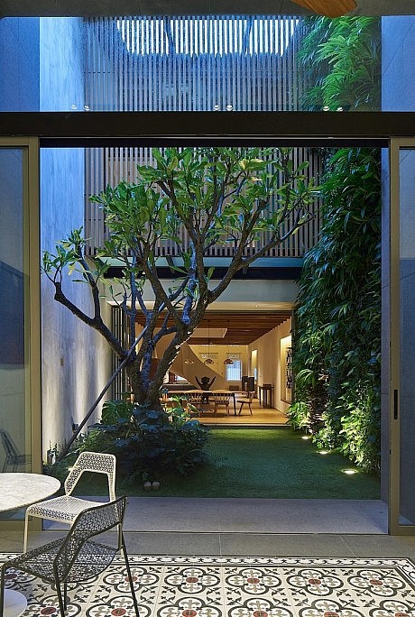
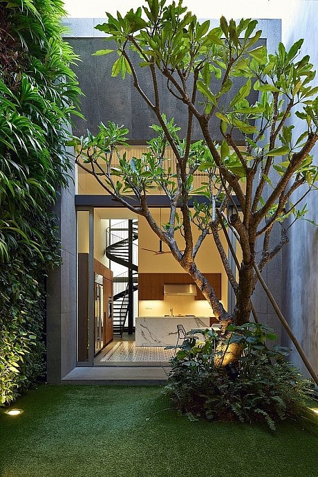
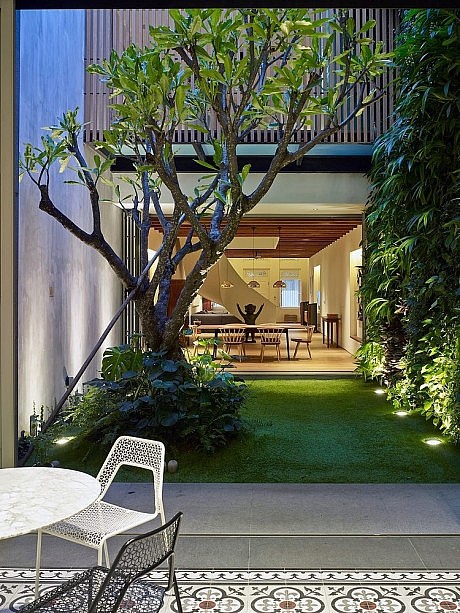
To bring in much needed light, a courtyard was created through which sunlight and wind could enter and naturally ventilate the house. With a green wall to one side, a young tree in the opposite corner, and the floor covered entirely in carpet grass, the setting forms a charming indoor garden for the children to play within. This green space forms the visual focus of the first floor and because there are no partition walls, the garden can be visually enjoyed from the kitchen at the back all the way to the living room at the front of the house.
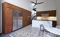
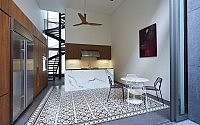
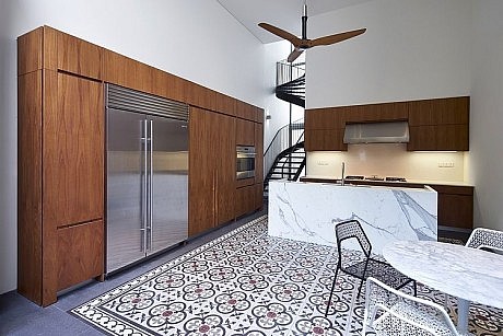
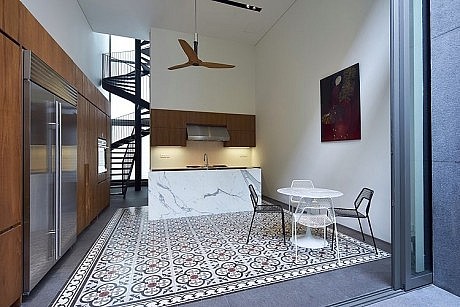
Since the client is both a family man as well as an avid cook, it was important for him to be able to interact with his children at play in the garden whilst working in the kitchen, so that is why there is a seamless transition between the two spaces. There is also ample lounging space for family activities at the front of the kitchen.
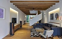
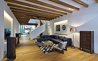
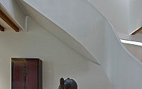
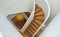
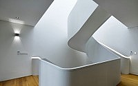
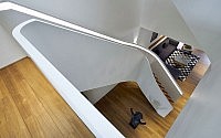
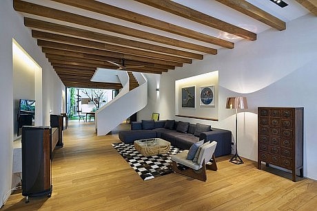
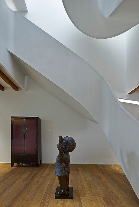
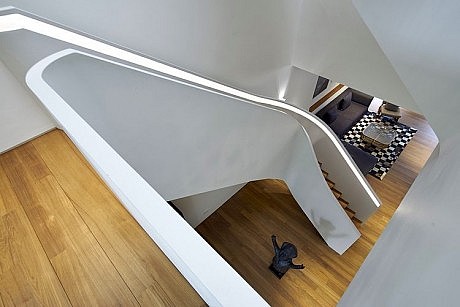
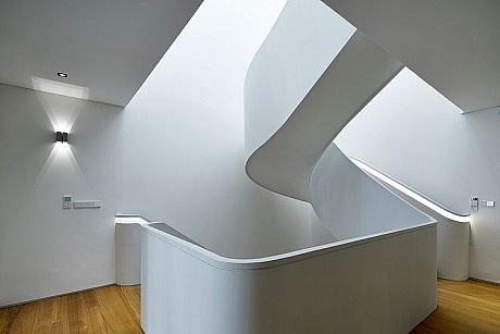
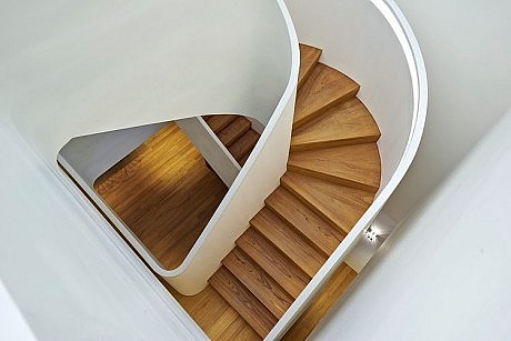
The vertical circulation at the front of the house divides the living and dining spaces by way of a dramatic geometrical staircase that spans all three levels. This is also another important source of illumination as sunlight streams in from the skylights in the jack roof directly above the staircase.
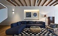
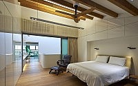
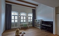
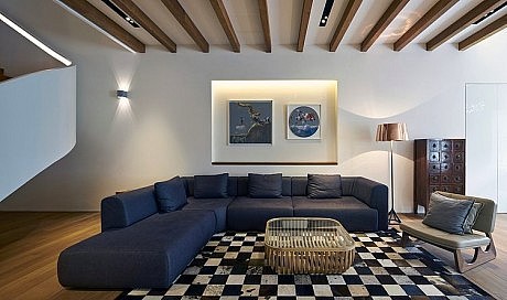
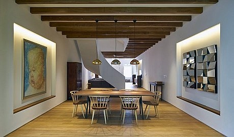
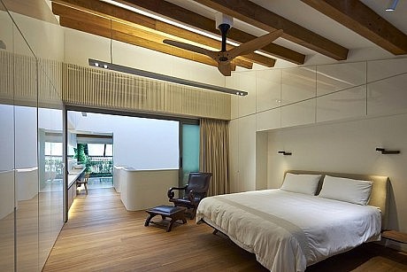
As the client was insistent on bringing back the house’s old world charm wherever possible, timber beams were installed in the ceiling of the first floor and also the roof.
SECOND STOREY
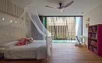
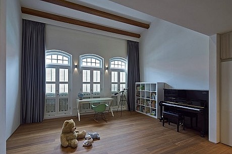
To the rear is one bedroom while the front houses another bedroom along with a bathroom that is shared between the two rooms. At the stairwell between the two bedrooms is a long corridor filled with bookshelves and storage space – this area also conveniently hides both rooms’ services.
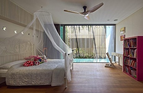
Since the roof had been restored to its original shape, the architects endeavoured to add a wall at the end of the roof so as to mimic the front half of the house at the back to form a symmetrical envelope. However, conservation regulations stipulate that a partition wall cannot be erected directly at the back edge of the roof. In order to circumvent that, a balcony was constructed for the second floor’s hind bedroom, stretching right to the horizontal length of the roof. Instead of concrete, a timber screen forms a see-through layer that functions as a dividing wall whilst keeping well in line with conservation restrictions.
Both rooms have equally enjoyable views, as the front room looks out towards the traditional façade while the rear room takes in the beauty of the green wall in the courtyard.
THIRD STOREY
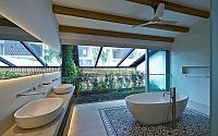
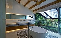
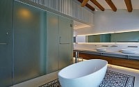
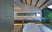
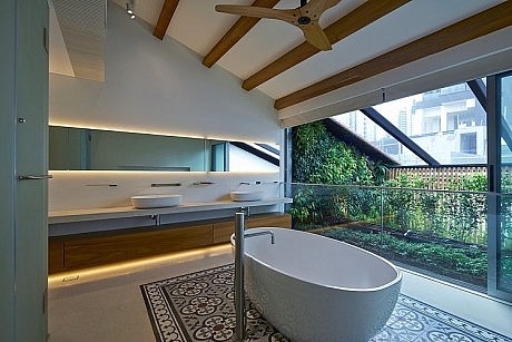
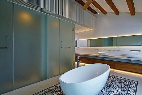
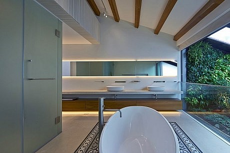
On the top floor is the master bedroom with a special configuration. Typically the master bedroom comes with an en suite bathroom. However, for this house, the master bathroom is kept separate from the main sleeping area because of the vertical circulation that divides the two spaces. Interestingly enough, the sheer height of this floor seems to afford the floor adequate privacy despite the fact that the bedroom and bathroom are disrupted by what would appear to be a communal or public space (ie. the geometrical staircase and corridor).
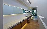
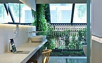
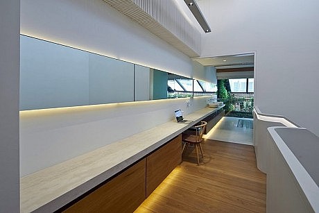
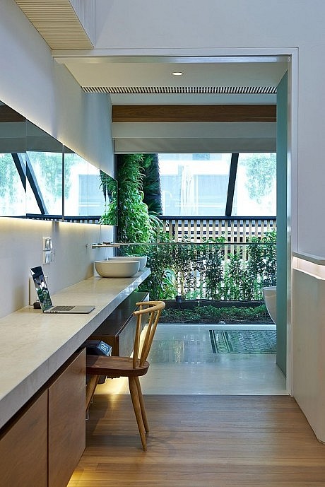
Another interesting point to note is that the top counter of the master bathroom’s vanity is a long slab of limestone that continues out of the bathroom and into the corridor, forming a functional desk area.
There is also a skylight in the master bathroom to further illuminate both this room as well as the second floor balcony. And similar to the first floor’s incorporation of historical elements, timber beams were installed into sections of the roof. The greenwall also reaches up to this level for a touch of nature.
REAR BLOCK
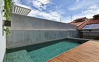
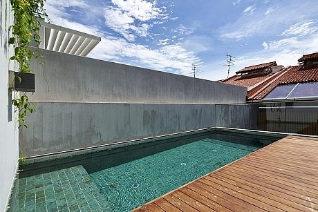
The rear block comprises of the kitchen, which was previously mentioned, as well as the 7-metre long swimming pool and service quarters. In terms of conservation, traditional glazed tiles line the floor whilst a replica geometrical service staircase at the back are reminiscent of the shophouse’s early days. The staircase leads all the way to the top where the servant’s room and pool area are located.
FAÇADE
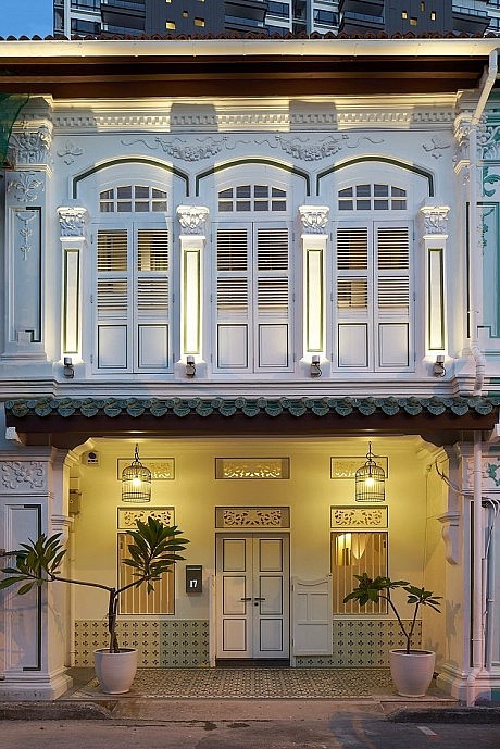
As mentioned before, extensive restoration work was necessary since the shophouse had lost much of its original elements, especially since the house had been converted to office use previously. Although the façade still retained a traditional look, it also required a fair amount of restoration.
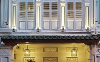
The office frontage’s two main doors (possibly meant for various office tenants) were replaced with a single door with ornamented details from a late shop house design, in accordance with URA’s conservation facade guidelines for façades such as these. The door is a painted double leaf timber panel with timber frame while the Pintu Pagar is of an original design.
For the first floor, double casement timber panel windows were reinstated with vertical iron bars in front of the glass panel screen framed in timber. Painted rectangular transoms with carved panels and frames were also reinstated.
The second floor’s façade was also returned to a late shop house style that required all windows and fanlights to be reinstated – namely the longer double french windows with operable louvers, the timber carved posts and rail balustrade and the segmental arch fanlights with clear glazed panels. Existing molded cornices, composite column capitals and decorative façade reliefs were also carefully repaired and restored. Shiny enamel-finished dado tiles were also used in the façade to restore the shophouse to its Peranakan roots.
ROOF
Through the course of time as well as the massive change in use that 17 Blair Road underwent, the façade and its roof form had varied greatly from its original ornamented beginnings. Prior to this round of renovation works, the roof structure, material and design had been significantly altered to facilitate office usage by allowing for more internal headroom.
During the renovation works the team of designers did careful studies of the shophouse and also had thorough discussions with conservation authorities in order to bring back the correct roof design and also to reinstate the original unglazed tiles that had been originally used on the roof.
To satisfy the client’s requirement of bringing in more light into the centre of the house, a jack roof was incorporated along with a skylight in the rear section of the roof.
CONCLUSION
The shophouse had been in a bad state, having been stripped of its historical characteristics and renovated for office use. With much support from the client, the architects made a conscious effort to bring these traditional elements back while also reinstating the shophouse to residential use. Considering the scale of the restorative work required the final product is both a perfect home for the modern family as well as a fitting tribute to the shophouse’s history.
Photography by Aaron Pocock
- by Matt Watts