Kent Road House by bureau^proberts
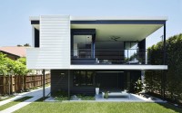
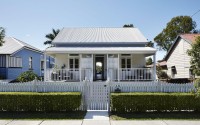
bureau^proberts transformed a simple cottage with a 60s extension into a stylish modern home.
The property is situated in Brisbane, Queensland, Australia.

Description by bureau^proberts
Summary
The Kent Road project is Architect Terry McQuillan and his wife’s home in Brisbane. Terry has transformed a simple cottage with a 60’s extension into a stylish modern home with a couple of surprises.
Highlights of the project include:
– the bathroom opens up to the backyard
– the simple design opens the house up and creates a strong connection with the outdoors as well as maximising the light, space and breezes
– sliding wall panels create a flexible space that challenges ideas about public and private space
– the construction process was a family affair involving Terry and his father.
Q&A with Architect / Owner — Terry McQuillan, Director, bureau^proberts
What was the design brief?
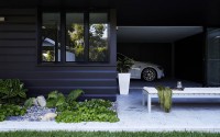
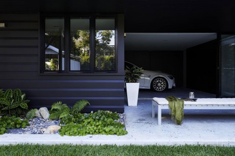
– The brief evolved over time. The original house was an old cottage with a 60’s extension at the rear. The extension had a skillion roof at the rear that came down very low and few windows, making the house feel very detached from its surroundings. Another issue common to houses of that type, was that the covered rear deck had a set of stairs down to the separate laundry at the bottom. Because the access was not fully covered you’d get wet in the rain. We also wanted a garage and gym space underneath the house so the underneath is a more useable space.
To address these issues the brief was to:
– create a connection to the outside and open up the house to the back yard, letting in more light and breezes
– create an internal stairwell to get to the laundry
– retain the existing character of the cottage
What is special about this project?
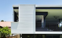
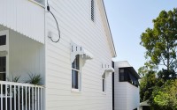
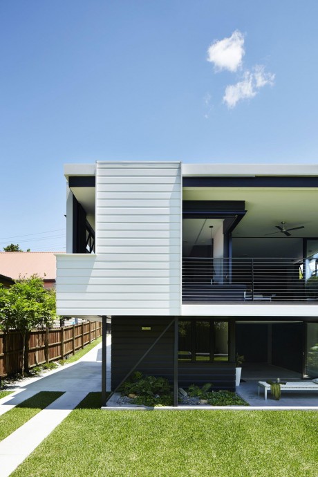
– The simplicity of the design highlights the old cottage. The design created a break between the old cottage and the new with a breezeway on the western side. The louvres and break before the simple new box addition makes the old cottage section more prominent. Chamfer boards were used to clad both the old and new sections, which allows you to appreciate the shape of the new extension more.
– The construction process was a family affair. Terry’s parents lived with him and his wife in the old cottage using a temporary bathroom while the steel frame was being built in the new section. Terry’s father built the house and he helped on weekends. The raw steel was delivered to the site, and Terry’s father crafted all the pieces of the frame, and then a crane stood it all up in one day. This meant the design had to be simple enough to be constructed easily but still needed interesting details. E.g. the chamfer boards have 45 degree mitres and cut-outs
– Another issue was how to get enough privacy in the building while still creating a very open and flexible space. Terry designed sliding wall panels inside other panels to create walls that close off sections of the house not being used, make rooms more private, as well as open up to the outside when required. For example, the front or back of the house can be closed off when it’s not being used.
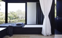
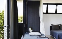
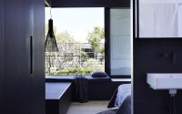
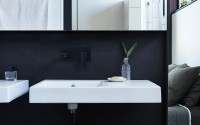
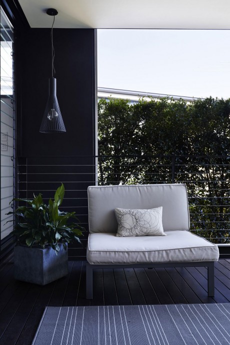
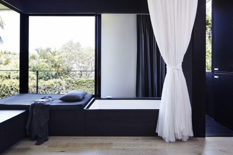
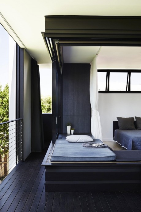
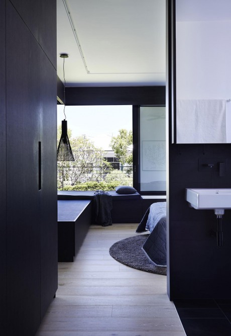
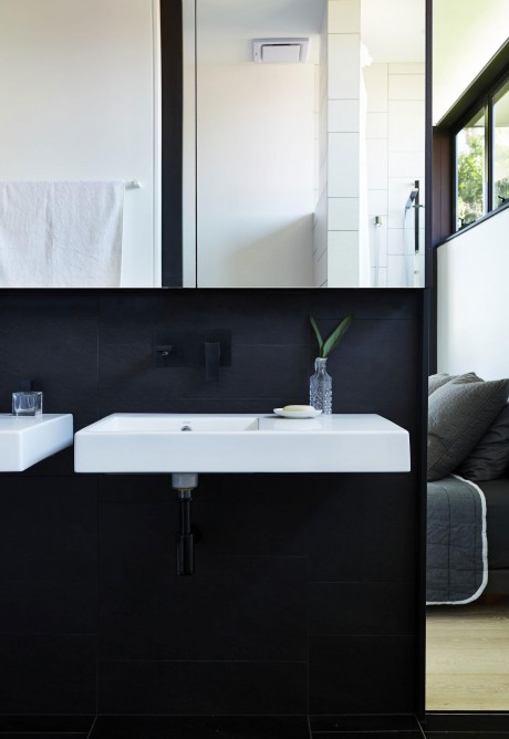
– Hidden bathroom – Terry wanted to create some special places you usually don’t find in a residential setting. He used wall panels and sliding doors to put the bath in a more ‘public’ location – at the back of the house. The balcony makes the house feel like it’s part of the outside, and the shower feels like it’s in the backyard because you can open it right up and let the outdoors in. These usually hidden spaces are exposed in this design.
– Initially, Terry had to do a lot of modelling looking at where the neighbours’ lines of site were in order to work out the best places to sit privately where the neighbours can’t see you.
Benefits for the owners
– The connection to the outside, and light and amount of breeze is amazing and unexpected. Now that the rear of the house opens up, it cools down in minutes. This means the usability has increased because it is cool all over.
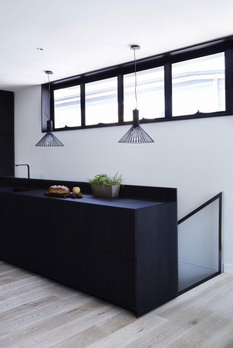
– Mishka, the owners’ Russian blue cat, was an important driver in the design — she always used to sit on the staircase and the back deck of the old house looking out. So Terry built windows low into the internal staircase so she can look out, and built viewing places for her on the deck so she can watch the world go by without going outside.
Project Background
Located in the north Brisbane suburb of Wooloowin, Kent Road residence is a contemporary extension to an existing character residential cottage. Originally constructed in 1906 and extended in the 1960’s the renovation included recladding and finishing the existing cottage, demolition of the ageing extension, and construction of a new two storey wing at the rear. Incorporated in the build was a new kitchen, master bedroom and outdoor living space at the upper level, a gymnasium and garage at the lower level and an internal stair to connect the spaces.
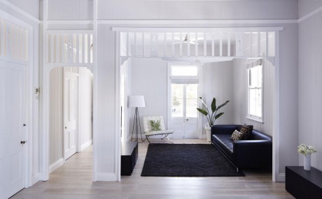
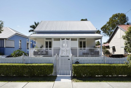
Important to the brief was that the character of the cottage was retained and that the extension utilized sympathetic materials to the original. The response is a simple weatherboard clad extension broken from the original cottage by a louvered breezeway that extends into the rear yard of the small lot. A hint of the extension is visible from the street as it pears out from behind the cottage while the scale is restrained so as to not dominate original dwelling.
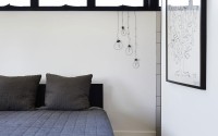
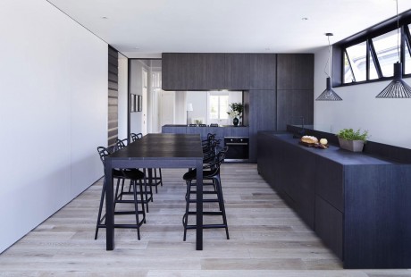
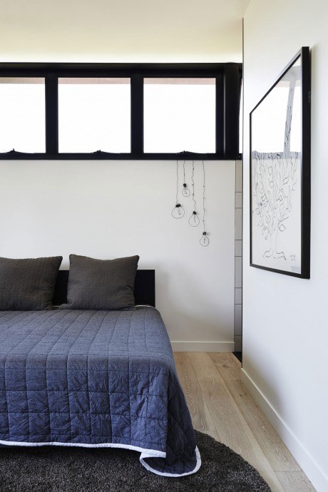
A strong connection between inside and out was an integral part of the design. Achieving this required fixed and sliding privacy elements to screen from the closely located neighbors. The bedroom and kitchen open to the backyard; enhancing views, breezes and light. Located along the edge of the bedroom is a hidden bath, opening to the landscaped backyard.
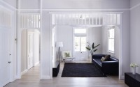
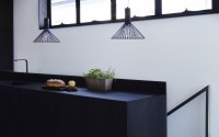
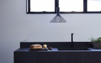
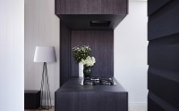
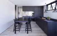
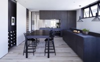
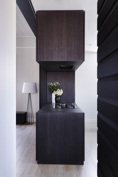
The interiors reflect the simplicity of the exterior language and are arranged to define or divide spaces. The opening between the new kitchen and existing living spaces acts as a portal between the new which can be closed of entirely via large concealed sliding panels. The minimalist preference of the owners is reflected in the design of the joinery and the selection of the simple yet contrasting material palette.
Cost / Value / Outcome
For the project to be viable it had to be extremely cost effective. The occupants also needed to live in the house during the construction process, as did the builder and his wife (the couple’s parents), to make the project feasible. Much consideration was given to the timing and staging of the works, including construction of a temporary kitchen and wet areas to make the house livable for the duration. To limit the costs much of the fabrication occurred on site under the agreed contract with the builder. The steel was delivered as raw black steel before it was welded on site and craned into position. The reinforcement cages were constructed on site and reinforcement and slab preparation was carried out by the builder and the owner. Much of the laboring assistance was provided by the owners throughout including the painting and finishing trades. Living on site allowed the builder and the owner a greater level of involvement in the process and detail which has resulted in a fantastic outcome.
Sustainability
Much of the existing timber from the 1960’s extension was retained, cleaned and reused for the structure. Second hand timber was also sourced from within the local area for the remainder of the structure. Finger jointed plantation pine chamfers were used for the exterior cladding of the house and much of the insulation was recycled from the roof space of the demolished renovation. To achieve the requirements of the building code lighter colored finishes are used on the roof and upper storey living areas to reduce the heat gain of the building.
Photography by Alicia Taylor
- by Matt Watts