Lejeune Residence by Architecture Open Form
Located in Montreal, Canada, this 1890s residence was completely redesigned in 2013 by Architecture Open Form.

Description by Architecture Open Form
The LeJeune Residence, located in the heart of the Plateau-Mont-Royal Borough of Montreal, Canada, was built in 1890. Its transformation carried out in 2013, involved a play between municipal constraints and the clients’ vision.
The borough’s bylaws called for the preservation and reconstruction of the façade’s original architectural components and the clients wanted a resolutely contemporary project. Architecture Open Form addressed the challenge of these seemingly contradictory demands with a creative solution that catered to both.
The clients, a couple of established professionals with a penchant for photography, art and architecture, had considerable experience with residential projects. They had modernized their previous homes themselves, paying great attention to detail and materials. With the LeJeune Residence, however, they decided to hire an architect to ensure that the design would reflect and respond to their minimalist lifestyle, embodied by their simple but elegant taste.
In 2012, they decided to sell their modern home in the suburbs to return to live in Montreal’s Plateau-Mont-Royal Borough, one of the city’s most creative neighborhoods. They purchased a duplex that originally housed the grooms who cared for the horses and carriages of citizens who lived on the nearby prestigious Saint Joseph Boulevard. Their goal was to transform the building, which was in an advanced state of deterioration, into a single-family residence with open living spaces, flexibility in the use of rooms and an interior architecture that opened to an exterior garden.
Despite the fragility of the existing building and its structure, the owners envisioned an architectural approach that was sustainable, bold and high-quality, and at the same time respectful of the historic characteristics of the 125-year-old building.
Although the exterior walls of the building, including the façade, had been covered with metal cladding in the mid-20th century to protect the original wood clapboard and to reduce the risk of flame spread, the borough required the return of the façade’s wood siding in its original form. It also required the restoration of the façade’s wooden cornice and its six-section solid pine windows framed by wood moldings.
Armed with the desire both to recall the façade’s evolution, and thus respect of the borough’s Site Planning and Architectural Integration bylaw, and to apply a contemporary and audacious architectural language to it, architect Maxime Moreau considered the façade as an experiment that would respect and rejuvenate existing features with bold new interventions.
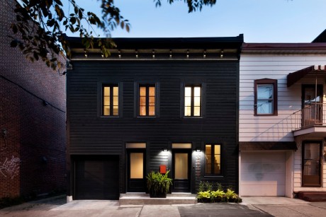
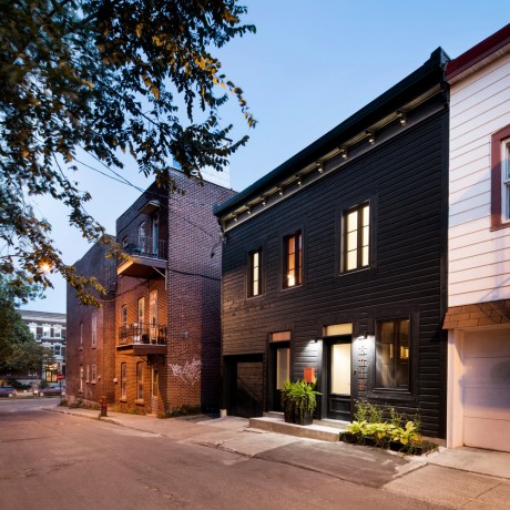
He proposed that the façade’s original architectural components be restored and stained with a black hue (reminiscent of avant-garde art and architecture). This approach satisfied both the borough’s preservation requirements and the owners’ adventurous tastes. Furthermore, the monochrome façade appropriately suggested an enigmatic work, a point-zero, a new beginning for both the building and its owners.
In the daytime, the black stain makes the details of the façade difficult to discern but its most elementary forms are made evident. The mosquito screens, which produce a timeless effect with different shades of black, conceal the ancestral windows. At night, however, the building is transformed into an historic house, and the windows come alive. Interior light exposes their divisions and exterior lighting reveals their details, as well as the form of the façade’s clapboard and the ornamentation of its cornice.
(in collaboration with Christian Bélanger Design)
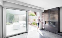
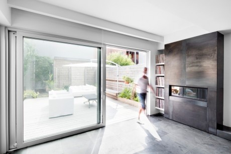
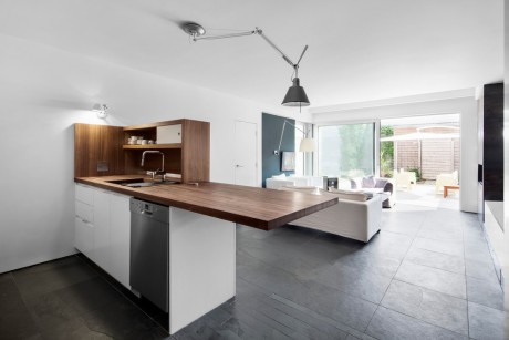
As the building is tiny (only 77 m2, or 835 square feet), the optimization of its interior spaces was a crucial and integral part of the design process. In addition, the owners’ vision and lifestyle called for open living spaces on the ground floor and the interaction of the interior with the backyard. Their desire to “live outside” during the warmer seasons led to the extension of the interior living spaces onto a terrace that was designed with the same attention to comfort and quality as the home’s interior. The distinction between inside and outside is subtle since the space was considered a whole. The rear exterior wall was opened along the entire width of the living room thanks to a 13-foot-wide, floor-to-ceiling sliding door. During the summer, the living room furniture is moved outside to the terrace, which is at the same level. This natural extension of the home’s living space allows the owners to enjoy living outdoors as much as possible. Furthermore, even in the colder seasons, the fireplace and the garden can be enjoyed as much from the inside as from the outside, blurring the boundaries between the two.
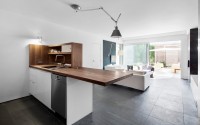
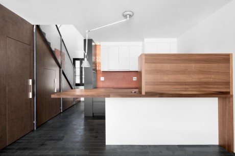
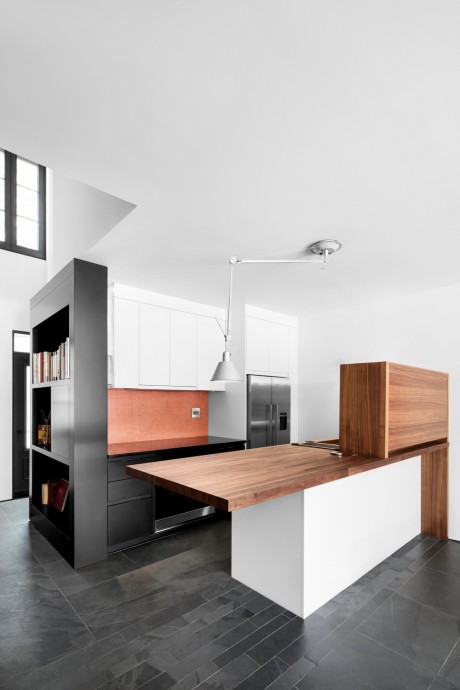
The optimization of living space allowed the architect to meet their clients’ desire for a unique and minimalist lifestyle. Spaces and furniture serve untraditional functions. For example, instead of a typical dining room, there is an open space area between the kitchen, living room and terrace, with furniture tailored to the occupants’ needs. While they generally eat at the kitchen island, they also have the option of serving meals on a low coffee table that folds and rises to form a more traditional dining room table. This flexibility of functional space and simple furnishings makes it even easier to turn outward and move the dining area outside during the summer. The contemporary white furniture juxtaposes perfectly with the wood terrace, with its long bench, its light concealed in a niche and its fence for privacy.
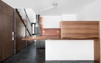
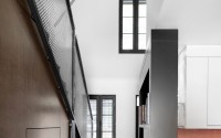
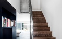
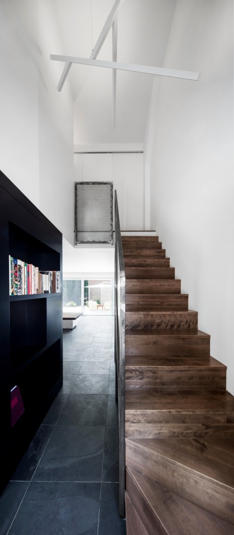
The home’s two-storey entrance vestibule, brightly lit by a suspended work of art that doubles as a light fixture, welcomes visitors and provides an illusion of grandeur. The black library provides a contrast in the transition between the entrance and living areas. The built-in furniture structures the spaces by connecting functions to each other in a coherent architectural ensemble. The materials and colours of the furniture define different areas and enhance the sense of grandeur and fluidity of the interior spaces.
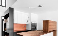
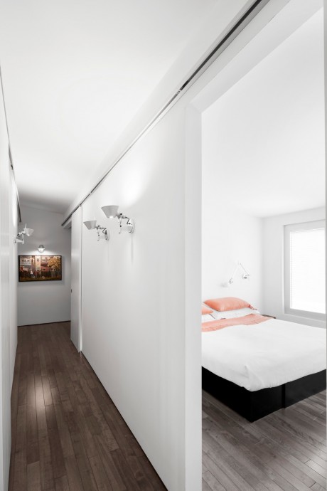
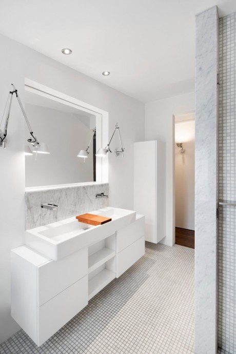
Wise lighting is essential to good design, and this is particularly true in small spaces. In this residence, the absence of physical boundaries between the functions not only increases the living space, but also responds to the dynamic lifestyle of its occupants. A variety of fixed and movable lighting fixtures were installed on the ceiling and walls to create the possibility of several lighting ambiances that can be adjusted according to the use of the space and the mood and comfort of its occupants. These ambiances range from full illumination for work to soft lighting for relaxation.
Thus, in a minimalist space with little decoration, Architecture Open Form has created a complete space that meets the owners’ different needs and invites serenity and inner peace. The simplicity of the space does not limit in any way the quality and the comfort of the home. The furniture is minimalist and understated, further aligning to its users’ lifestyle.
Photography by Adrien Williams
- by Matt Watts
