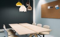
Office Space by Atelier Pro Architects
Located in Hague, Netherlands, this contemporary office space was designed in 2014 by Atelier Pro Architects.

About Office Space
The Prinsenhof is a versatile building in Beatrixkwartier, The Hague. Completed in 2005, this brick-clad complex features towers for living, working, and leisure. After ten years, original tenants relocated or downsized. Bouwinvest and property manager CBRE then commissioned atelier PRO to renovate a vacant office floor in Tower C within one season and a specified budget. This renovation aimed to showcase the space’s potential to new tenants.
Challenges of Outdated Offices
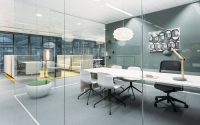
Old photographs show past fashion trends, just as vacated offices reveal outdated layouts. Corridors lined with small offices waste internal travel time. Frosted film covered transparent partitions, while ‘inefficient’ open-plan sections were forbidden. Workspaces usually featured two- to four-person offices with fixed partitions. Potential tenants found it challenging to overlook the frosted film, worn carpet patches, and old signage.
Maximizing Spatial Quality
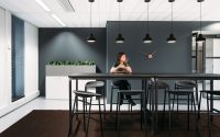
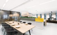
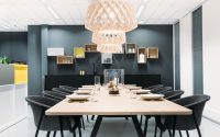
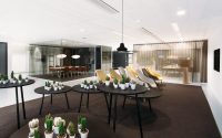
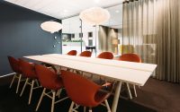
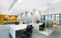
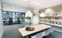
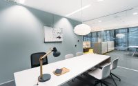
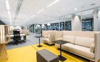
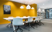
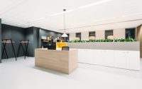
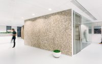
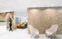
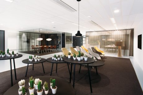
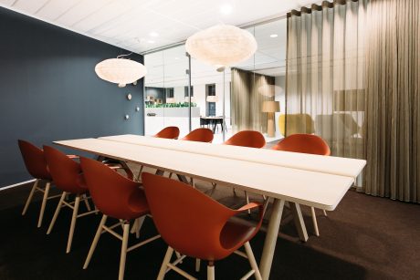
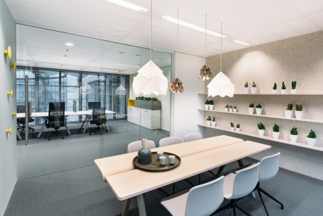
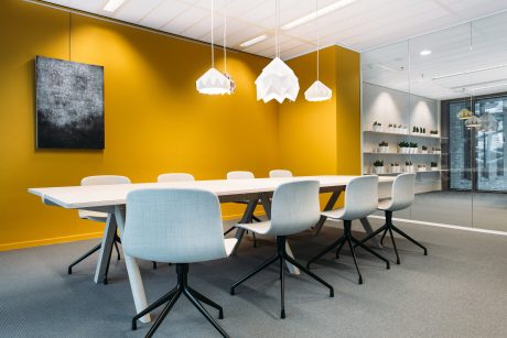
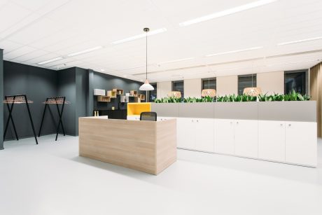
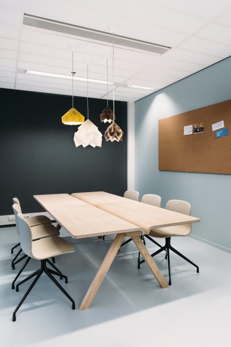
Atelier PRO reorganized the layout for the best logistics, orientation, and light. The floor transformed from conventional corridors into an open space, facilitating flexible work processes. The workspace variety includes lounges, boardrooms, multipurpose presentation rooms, and quiet areas. Conventional office units for up to six people were replaced by hot desks for calls, informal meetings, or short breaks. Additionally, the floor features a meeting zone with a reception, waiting lounge, lunch area, and kitchen.
Four Interior Styles
Atelier PRO researched and designed four styles to inspire potential tenants. Rendered perspectives on large panels showcased these styles:
– Icy White
– Industrial Brut
– Italian Chic
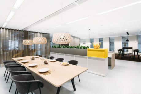
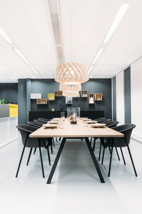
– Simply Scandinavian (realized for the display office floor)
Creating a Welcoming Display Floor
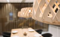
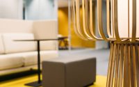
Atelier PRO styled the interior with a set lunch table, operational kitchen, indoor plants, art, and accessories. This made visitors feel they could move in immediately. During construction, existing tenants visited to see the changes, creating buzz. Events will be held on the display floor, enhancing PR value. Clients and their team also worked in the new office until the floor was leased.
Project-Specific Customization
The goal was to create a ‘display office floor’ to show how a modern company could use the space. The project included:
– Demolition and removal of the old layout
– Structural renovation of the entire floor
– A completely new interior design
Renovation on a Budget
Atelier PRO collaborated with a contractor to maximize the limited budget. They repaired the ceiling instead of renovating it completely. Necessary installations for heating, lighting, ventilation, fireproofing, electricity, and data were adapted for safety and aesthetics. After demolishing the old interior, the floor was leveled.
Atelier PRO began redesigning the 1050m2 (11,302 sq ft) space in June 2014. The project was completed in four months.
Photography courtesy of Atelier Pro Architects
Visit Atelier Pro Architects
- by Matt Watts