Potafiori by Storage Associati
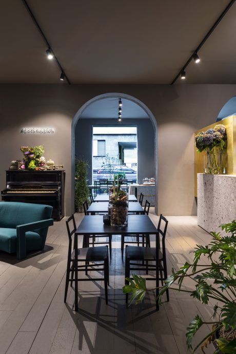
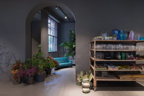
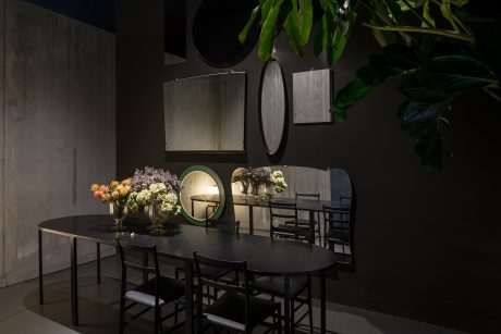
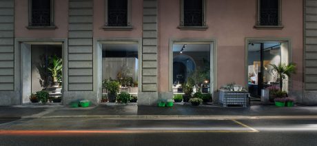
Potafiori is a beautiful restaurant / flower shop situated in Milan, Italy, designed in 2016 by Storage Associati.

About Potafiori
In the heart of Milan’s Bocconi University district, the bistro POTAFIORI flowers opened its doors. Rosalba Piccinni, a singer and florist, owns three shops in Milan and Bergamo. Over the years, she developed a passion for welcoming customers. She transforms bouquet preparation into a moment to savor good music and good food. POTAFIORI offers a new way of being together. It’s a flower shop with a kitchen and a familiar atmosphere. Open seven days a week from 8 a.m. to midnight, you can visit for coffee in the morning or lunch, admiring seasonal flowers. In the evening, enjoy a good glass of wine while Rosalba’s solo singing takes you away.
Architectural Vision
Storageassociati, a Milan-based architectural firm, led the project. They have a long-term friendship with Rosalba. “She’s always been the florist to trust for special floral presents,” they say. Rosalba gave the architects carte blanche to interpret this new world of flowers and food.
Revealing Original Beauty
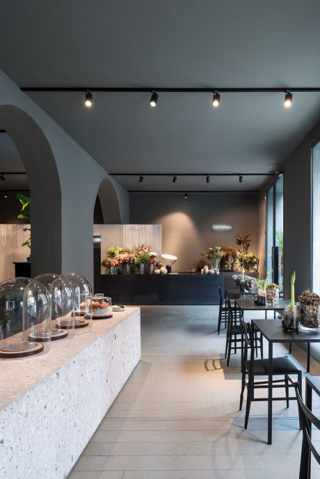
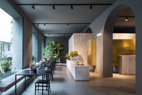
The original beauty of the site was hidden behind internal partitions and fragmented spaces. The first goal was to open up the space, giving new light to the early 20th-century building’s structure. They aimed to follow the flow of neat geometric forms and the voice of raw materials. Natural, soft light wraps the space during the day and night.
Design Elements
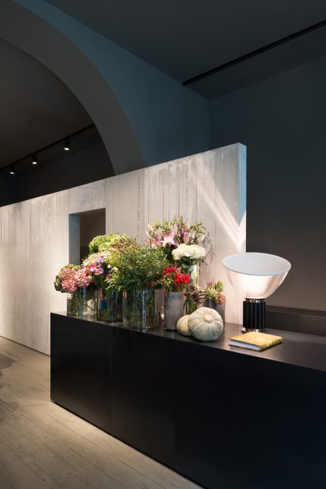
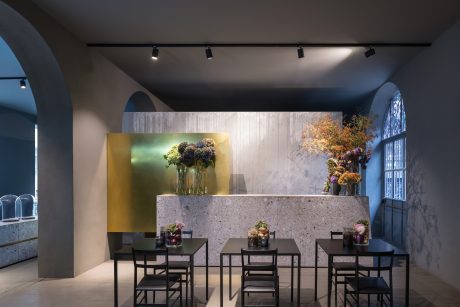
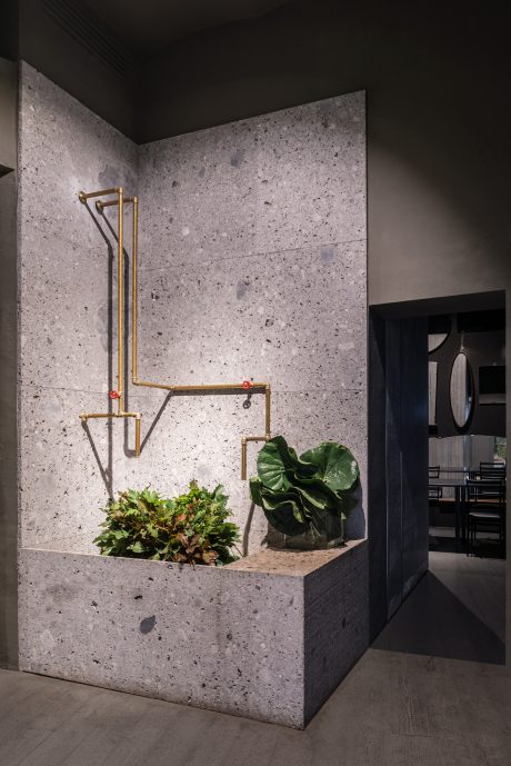
A dark, mellow casing features intersecting volumes of Ceppo Lombardo stone and black iron. Rough Placocem partitions fit between pre-existing arches, closing off the kitchen and leading to the lower floor. The design preserves the raw materials’ imperfections. The stone’s dug surface and the Placocem panels’ serial production codes remain exposed. These elements contrast with the elegance of smooth iron and brass.
Photography by Paola Pansini
Visit Storage Associati
- by Matt Watts