Double Bay Home by SAOTA
Double Bay Home is a contemporary home situated in Sydney’s harbourside suburb of Double Bay designed by SAOTA.

About Double Bay Home
Captivating Architecture in Sydney’s Harbour
Nestled in a north-facing cove within Sydney’s vast natural harbor, this stunning site neighbors a recreational park and a public pier that extends into the bay. A pristine beach lies directly in front of the site, providing another beautiful axis.
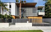
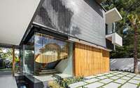
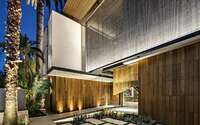
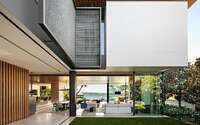
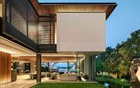
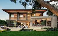
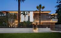
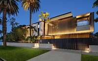
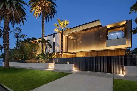
The new building emerges from the main park elevation as a dynamic collection of planes. These elements play with space, privacy, and threshold. Graphite grey sail screens, crafted from “Kaynemaile” — a polycarbonate chainmail developed in New Zealand for the “Lord of the Rings” movies — are strategically placed near the house. They offer privacy from the road while allowing light and views of the park. The façade combines timber cladding, plastered mass walls, and a wood-clad soffit. An exaggerated bay window sill punches through the screens, adding depth to the linear façade.
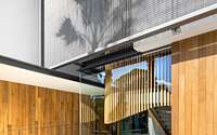
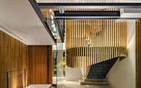
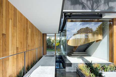
The stairwell in this façade is fully glazed but is wrapped in a cloak of timber louvres. Its gently curved outline contrasts the crystalline box, bridging the formal entrance and the bedrooms above.
Innovative Design and Strategic Layout
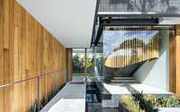
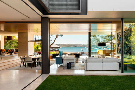
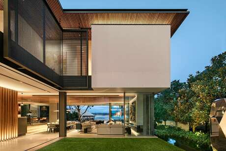
The entrance, set at a 90-degree angle to the bay and off the park, introduces a sense of arrival. A ramp, edged by water, slopes gently to the front door. The house’s “U” shaped plan becomes apparent here, with the entrance linking two wings around an internal garden. This garden acts as a visual corridor to the bay. The upper storey’s massive wall weighs on the ground floor’s glazed facade, enhancing the bay view beneath.
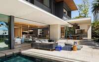
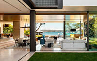
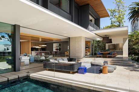
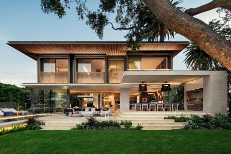
The bayside wing is an open-plan space. Stairs, not walls, separate the raised kitchen and family dining area from formal spaces. These stairs extend towards the sea, offering privacy from the adjacent public road. The garden, raised above the beach path, merges seamlessly with the bay. The pool’s orientation further emphasizes this connection.
Seamless Integration of Indoor and Outdoor Spaces
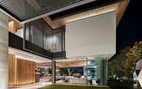
An oversailing timber roof canopy unites the street side with the garden and beach. It infiltrates the interior, revealing itself unexpectedly, and defines the spaces beneath. From the water, this canopy becomes a signature feature, mirroring the lightness of the sea and tree canopies.
From the street and bay, the house presents a striking contrast. The largely glazed lower story is overshadowed by crisp white walls, black-framed window boxes, and sail screens. A preserved Lilly-Pilly tree beautifully frames this elevation.
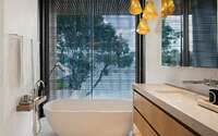
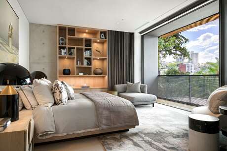
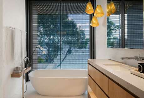
Materials like wood, white walls, and travertine floors were chosen to echo the seaside setting. Off-shutter concrete adds a playful touch, contrasting the soft textures of the walls with the crisp folds of screen and aluminium.
SAOTA’s South African signature is evident in the sharp lines, light forms, and lush integration of nature. This design balances a young family’s needs with the site’s extraordinary potential. ARRCC, SAOTA’s interior studio, developed a refined décor palette, complementing the client’s art collection.
TKD, architects in association, worked closely with the client, bringing SAOTA’s vision to life. Their dedication to design excellence was crucial. The home’s quality finish is a testament to the combined efforts of lighting designers Point Of View, landscapers Wyer & Co., and the main contractor, Horizon.
Photography courtesy of SAOTA
Visit SAOTA
- by Matt Watts