Deep by Nook Architects
Located in the Eixample district in Barcelona, Spain, this modern apartment has been redesigned in 2020 by Nook Architects.

About Deep
A First Glimpse into Their Urban Dream
Our first interaction with the couple came from a descriptive dossier they presented. The cover showcased a family photo: the couple and their children, all on bikes. While they loved weekend nature escapes, they craved an urban sanctuary. Previously, they inhabited a cozy apartment with two spacious terraces. Consequently, they yearned to swap city views for extra indoor space.
Unveiling a Vintage Eixample Gem
Upon our preliminary visit, we discovered the apartment’s unique placement on the fifth floor of a classic Eixample-style building in Barcelona. Yet, unlike the early 20th-century units below, this one hailed from the 1960s. A dive into the archives confirmed its late addition. Instead of traditional wood beams and filler blocks, this unit employed sturdy concrete beams.
Embracing Contemporary Design
Interestingly, this unit boasted wider façade voids than its counterparts. Additionally, most of its interior partitions were non-structural. This uniqueness steered us towards a modern architectural flair, contrasting with our earlier Eixample projects.
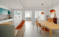
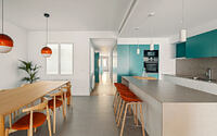
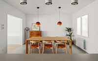
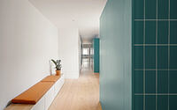
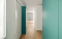
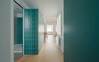
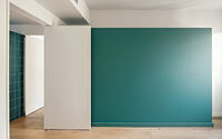
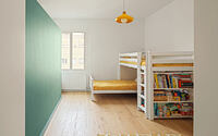
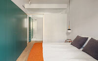
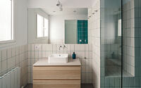
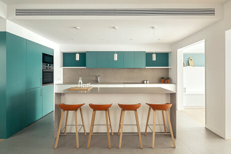
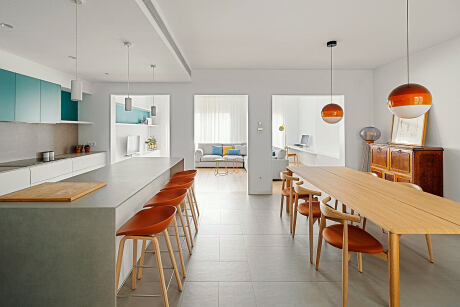
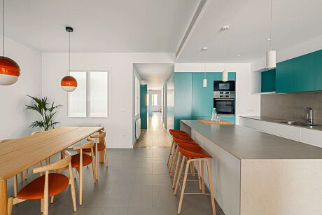
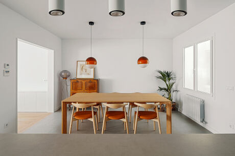
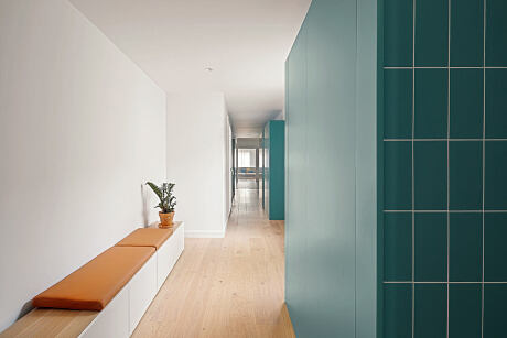
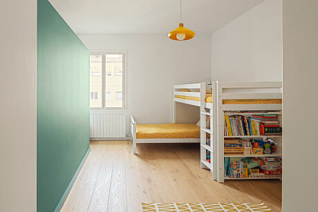
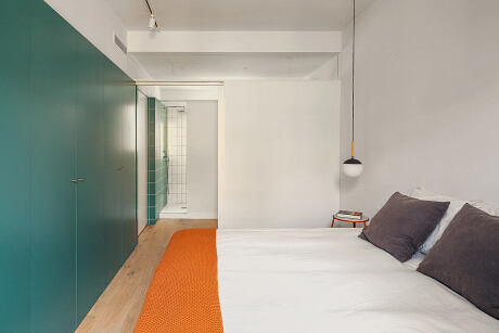
From the get-go, we admired its vastness, luminosity, and dual orientation. Spanning 150 m2 (about 1,614 sq ft), it offered sufficient space for their envisioned layout: three sizable bedrooms, two comprehensive bathrooms, an expansive kitchen-dining area, and a versatile living room with a study corner. The dual orientation seamlessly segregated the dwelling into communal and private zones. Strategically, we nestled the children’s bathroom, laundry, and a flexible third bedroom in the central strip. To delineate these areas, we installed prismatic storage units, adorned in eye-catching turquoise lacquer.
Infusing Color and Functionality
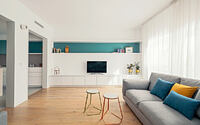
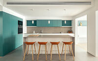
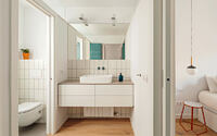
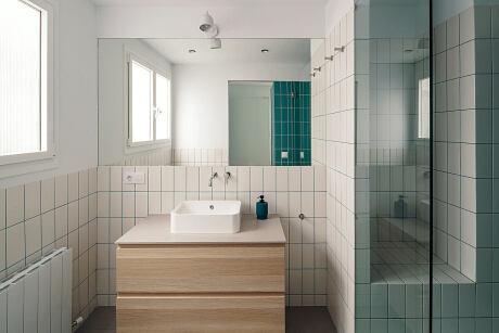
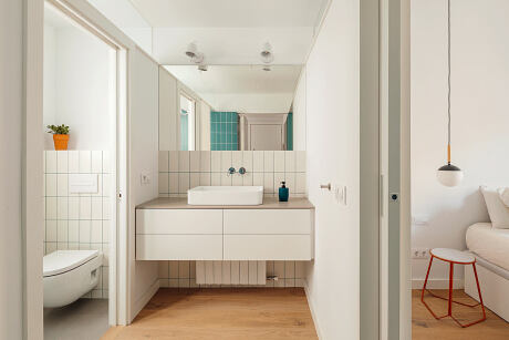
This turquoise motif persisted throughout the residence, bridging spaces harmoniously. In the kitchen and living areas, turquoise illuminated the cabinetry and shelves. In bathrooms, vibrant exterior paint morphed into matching tiles. Meanwhile, wood and grey tile floors presented a muted canvas for these vibrant inclusions.
Artfully, none of the central constructs touched the ceiling, making them pop as independent elements within a monochrome setting. For most other spaces, we chose subdued hues, sprinkling in terracotta and mustard accents for visual appeal.
Crafting a Modern Urban Refuge
Through this meticulous renovation, we crafted a contemporary sanctuary for the family. Most importantly, the design ensures effortless adaptability to cater to their evolving needs.
Photography by Yago Partal
- by Matt Watts