Wu House by Very Design
Wu House is a 166 sqm midcentury modern apartment located in the Chinese city of Dongguanm has been recently designed by Very Design.

About Wu House
Embracing Simplicity and Comfort
The project team eliminates unnecessary decorations and furniture, using clean, simple lines to create a natural and uncluttered space. This approach brings people, objects, and spaces closer together, with the goal of providing a relaxing and comfortable retreat for residents.
Versatile and Modern Living Spaces
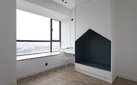
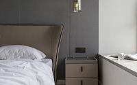
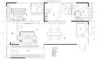
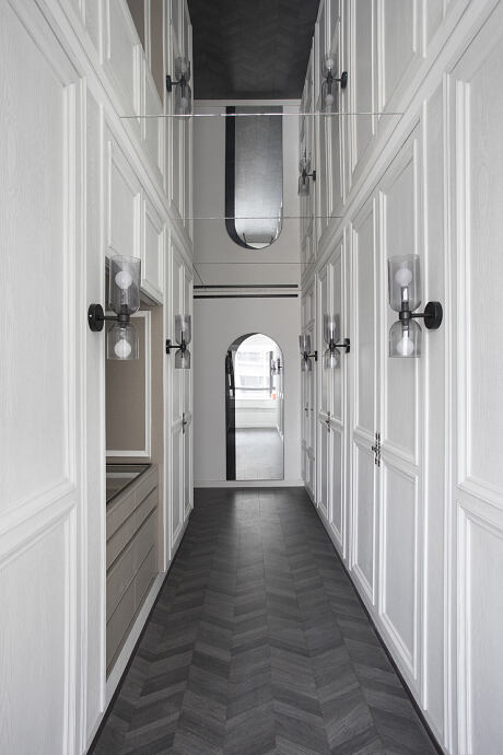
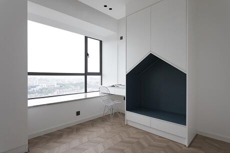
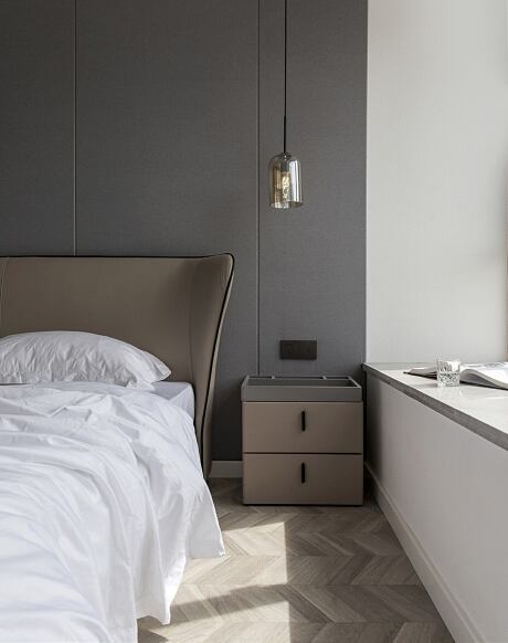
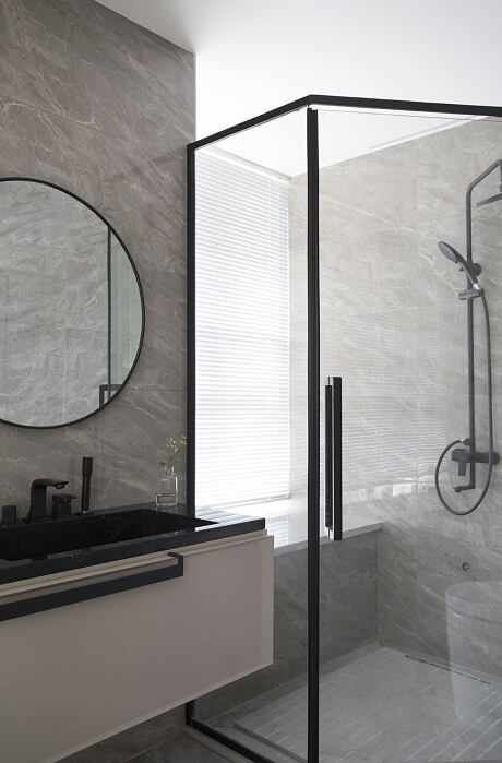
Designed by the team, the residence features not only functional and cozy meeting spaces, but also dining and kitchen areas, a bay window reading nook, a master bedroom with an ensuite bathroom, a playful children’s space, and a walk-in closet to accommodate modern urban family lifestyles.
Maximizing White Space for a Relaxing Atmosphere
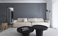
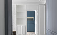
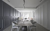
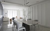
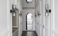
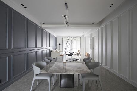
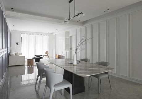
The design emphasizes maximizing white space, avoiding overly ornate European-style lines that could detract from the residence’s soothing ambiance. By leveraging the original architectural plan, the design team connects the living room and dining room, creating an open and flexible use area. The gray-toned wall accentuates the public area, defining the space’s function, while the understated white and calming gray tones add depth and sophistication, fostering a serene atmosphere. Wall panels with hidden doors exemplify the project’s attention to detail, as these concealed entrances replace clutter, eliminate wasted space, and promote a tidy living environment.
Distinguishing Private and Public Spaces
The design differentiates private and public spaces through unique finishes. In the living area, a distinctive color-patterned wooden floor and khaki furniture create a simple, inviting atmosphere. Conversely, the marble flooring in public spaces adds a touch of luxury. To address the family’s clothing storage needs, the team constructs a closet in an otherwise underutilized space.
Harmonious Color Palette and Design
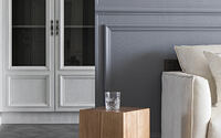
The design visually integrates space and color in both public and private areas, utilizing ceiling glass to maintain continuity. Warm white tones grace furniture surfaces that require direct contact, while gray tones cover the floor, imbuing the space with a clean, tranquil ambiance.
Photography by R.K Chen
- by Matt Watts