Carnegie Hill Apartment by MKCA – Michael K. Chen Architecture
Carnegie Hill Apartment is a contemporary home located in New York City, recently renovated by MKCA – Michael K. Chen Architecture.


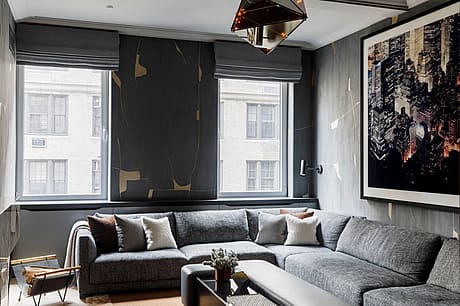
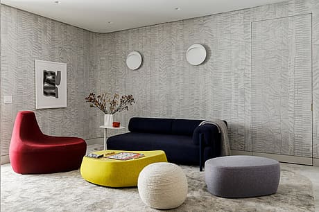
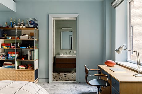
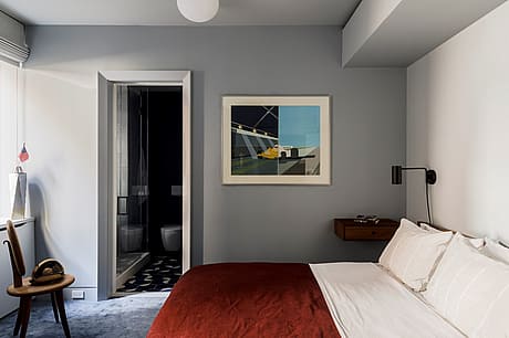
Description
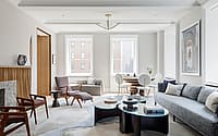
Michael K. Chen Architecture (MKCA) has designed the architectural renovation and interiors of a 4,000-square-foot apartment for a family of five on Park Avenue on Manhattan’s Upper East Side. The apartment has been reorganized to adapt to the lives of a busy New York family, while preserving and accentuating the inherent grandeur of the space.
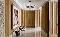
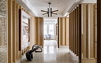
MKCA reshaped the apartment’s plan to optimize circulation and the seamless transformation of the home from a series of private, independent spaces into an interconnected, spacious landscape where the family of five can gather together as well as entertain guests. This layout hinges on a pinwheel-shaped circulation zone at the apartment’s core, which includes a central elevator landing, formal entrance gallery, and kitchen. Movement through these areas creates multiple opportunities to access the apartment’s living spaces, including the commodious formal living room, dining room/library, den, and bedrooms, all which encircle the core. “The regulated fluidity of circulation allows for sprawl across multiple rooms, while also celebrating and activating the formal gallery space, which is such a hallmark of a classic Park Avenue apartment,” says Michael K Chen, principal of Michael K Chen Architecture.
Throughout the residence, doors can be pivoted and slid away and rooms can be deliberately reconfigured as needed, affording space for the family to spend time together, which they described as a high priority, while also allowing for indipendent activities.
This strategy is introduced upon entering the apartment from the elevator, where a full-height entry door is engineered to be held open on its pivoting hinge, and a wall between the entrance vestibule and kitchen is designed to slide away, creating free circulation around the elevator core. Additionally, the standard sheetrock partition is almost entirely banished throughout the apartment, in favor of spaces that flow freely into each other, as in the entry-kitchen-gallery, or are demarcated through thickened volumes that one passes through to move from space to space.
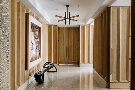
This overarching sense of fluidity is accentuated by the thoughtful application of materiality and volume across the residence, beginning in the entryway. A poured terrazzo floor greets visitors in the elevator vestibule, and continues through the kitchen, adjacent pantry space, mud room, rear bedroom hall, cloak room, powder room, and back to the gallery where it leads into the living, dining, and media rooms. Embedded with a custom pattern of curving brass spacers, the floor literally draws connections from space to space, through a playful and expressive pattern.
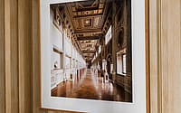
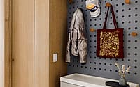
Cerused oak millwork with three-inch-deep coffers lines the entire gallery and circulation zone. While the paneling’s rigorous geometry contrasts with the fluid, curvilinear pattern of the floor, it is engineered to enhance the apartment’s flexibility. Leading to the den and dining room, the paneling swings closed as a pair of integrated doors with wood handles. In the gallery, lighting and hidden art hanging rails are integrated subtly into the millwork, creating a flexible display system for the family’s rotating collection of contemporary photography.
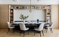
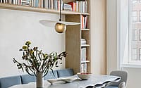
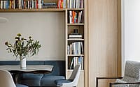
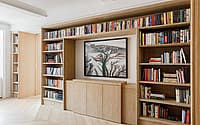
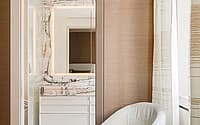
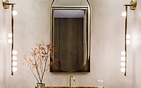
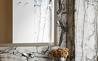
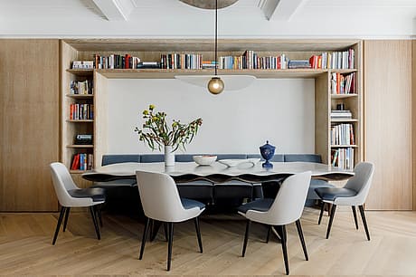
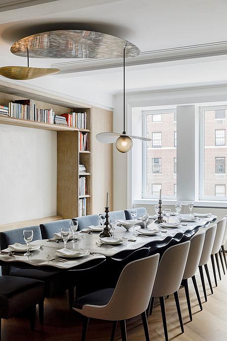
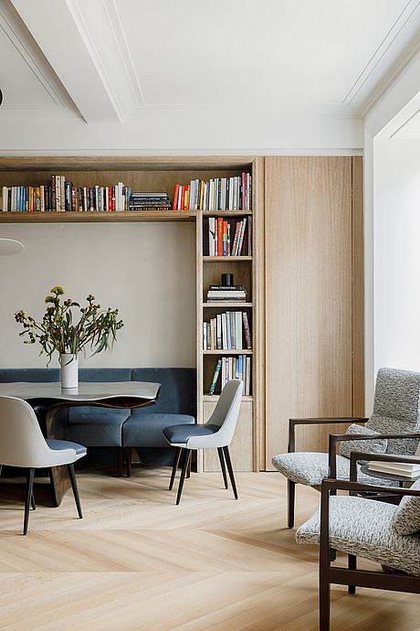
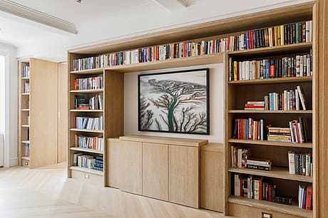
Elsewhere, millwork volumes open to reveal a hidden liquor cabinet in the living room, a home office in the den, and a concealed, lift-up television and integrated display for a collection of glass artworks by Yoichi Ohira in the dining room. Paneling likewise conceals a powder room with a spectacular blue marble vanity and integrated cove lighting. All can be opened and closed with ease, catering to a range of scenarios.
The subtle detailing of a millwork wall that reveals a pair of doors produces a visually rich and tactile environment that can be manipulated to create different spatial and social configurations. The merging of functions at all scales—from rooms that serve multiple purposes to shape- shifting furniture pieces—is a hallmark of MKCA’s overarching practice and an essential component of this residence. Here, it supports the family’s desire for flexible spaces that can be used either independently, by individual members of the family, or collectively.
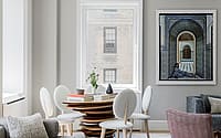
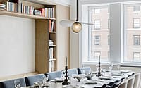
In keeping with MKCA’s overarching practice, the studio has designed and commissioned custom furniture across the home, with each piece bolstering the project’s emphasis on mutability, tactility, and elegance. The latest result of an ongoing collaboration between MKCA and Christopher Kurtz, the Hudson Valley-based sculptor and designer’s striking 12-foot-long dining table anchors the dining area/library. The piece features an undulating, carved aluminum top fused to a rippling underlayer and base in oxidized cherry, while a custom chandelier by Ladies and Gentlemen Studio hovers above, rotating softly on a custom mechanism.
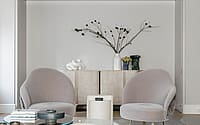
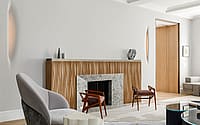
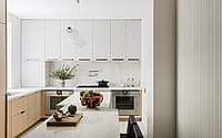
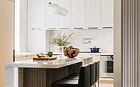
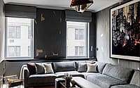
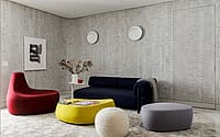
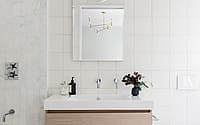
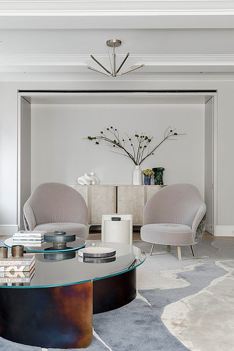
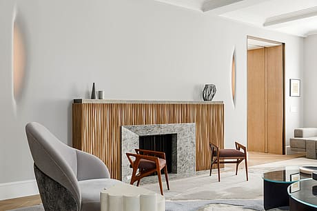
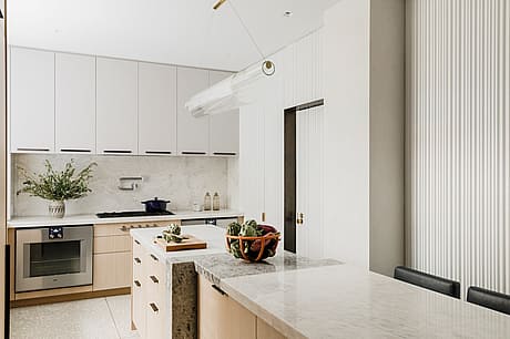
In the kitchen, a muscular island with hefty stone legs is set against ribbed walnut paneling, while the main bath is enveloped in rosy venetian plaster, pink Byzantine onyx, and Calacatta Vagli Rosato marble. Throughout the living room, Kurtz’s custom carved wood sconces are enveloped within the thickened wall around the fireplace and glow gently through an integrated LED array, while his game tables and chairs resemble stacks of “pebbles” made from a mix of woods (oak, walnut, maple, cherry) and metals (aluminum and bronze). These are paired with a Poritz and Company’s custom butterfly bar, whose tambour doors open to reveal a glitzy mirror and glass interior for entertaining, as well as a “Merrick” daybed by MKCA covered in a graphic chenille by Castel, a custom sofa by KGBL, covered in a Holland and Sherry wool jacquard, and a
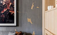
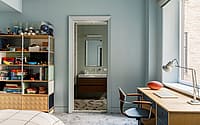
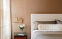
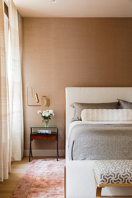
In the main bedroom, silk and sisal wallcoverings join a custom bed designed by MKCA and a custom silk carpet designed by MKCA and made by Tai Ping. The draperies are made from a custom loomed textile in wool, silk, and mohair by Hiroko Takeda. And across the playroom, a hand-printed wallcovering and graphic carpet MKCA created with Stark Carpet complement a range of vibrant, modern furnishings from Moroso and Hem.
Across the residence, each of MKCA’s architectural and interior interventions point back to the project’s original motivation: to transform the space into a fluid, elegant modern home while also making daring architectural and aesthetic choices. “From the very beginning, these were clients who asked us to take them outside of their comfort zone. The couple had very clear ideas about how they wanted to live, and how certain rooms should function, but were interested in an approach and an aesthetic that was more adventurous and expressive, but not kooky,” says Chen.
Photography by Max Burkhalter
Visit Michael K. Chen Architecture
- by Matt Watts