MB CS3 Private House by Raz Melamed Architect
MB CS3 Private House is a modern residence located in Israel, designed in 2021 by Raz Melamed Architect.


Description
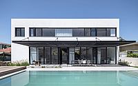
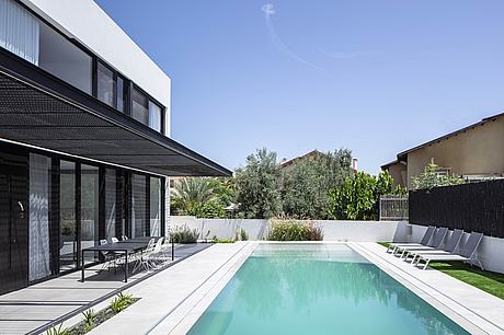
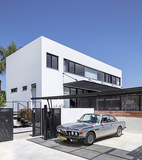
Upon entering this private house in the center of Israel designed by architect Raz Melamed, you are greeted by the pool that leads you directly to the entrance to the building, and immediately from the entrance sets the tone for an interesting architecture that knows how to combine simple lines to create a unique space like no other.
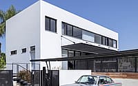
The whole architecture is a simple rectangle that materializes architectural richness thanks to an interesting cross-section design, which stands in contrast to the restraint of the colors and materials.
The house is designed for a family with 4 children, and is spread over 3 floors: basement, public space, and bedroom floor. When the homeowners came to the architect they were fully formed in their desires regarding the planning and design of the house. Melamed, for his part, wanted to show them his ideas that would meet their desires, and in the end a creative process was born that satisfied both the clients and the architect.
The family asked for a house that had a master bedroom on the ground floor that could eventually change functions and become a master or children’s room or family room. In addition, they wanted a room with a shower for each child and a movie corner.
The first challenge at the beginning was the nature of the area – the plot in question is behind another plot that only faces the street front, meaning the entrance to the future house is through a plot of another house, a situation that was complicated in terms of land partition laws in Israel.
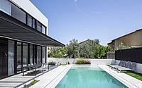
The architect found a creative solution to this challenge and used the conditions of the area for an interesting design of the pool, which if in most of the houses is in the backyard of the house, then here he planned its location already at the entrance. Another request that customers had was for the colors of the house, and since they were lovers of the white shades, it was clear that this white color palette would control the space, and indeed it did.
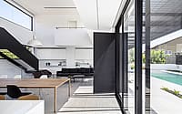
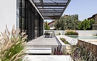
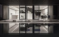
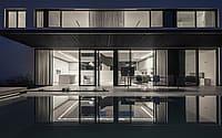
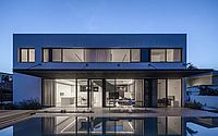
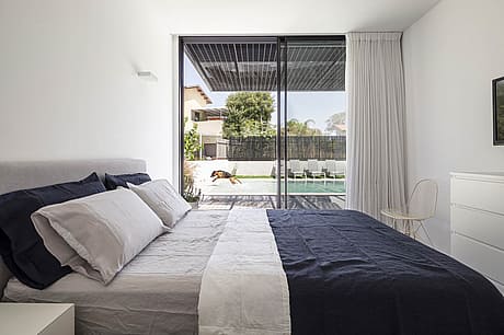
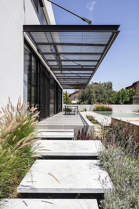
The entrance gate from the outside stands in the corner of the lot, and from there the stairs bend to the entrance path that runs along a path of low vegetation and leads to a large iron door. It is located in the center of the building and enters a space of double height, with quiet colors and minimal furniture. On both sides are huge showcase doors, through which it is possible to enter and leave the house from the pool without going through the main door at all. A cantilevered iron pergola with a lattice grille shades the outer entrance area and influences the geometry of the façade by breaking the straight outline of the architecture.
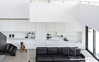
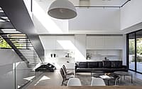
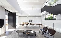
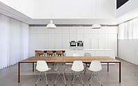
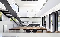
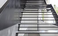
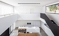
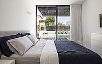
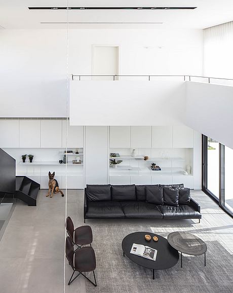
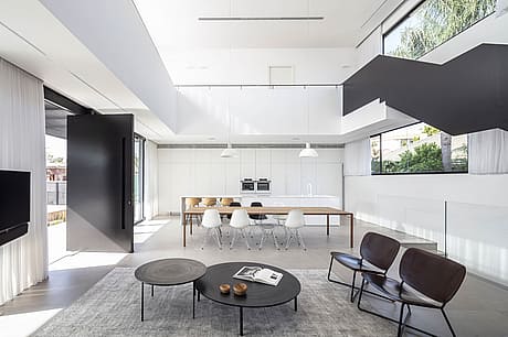
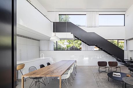
The entrance floor is tiled with a concrete look, with the first steps being in front of a thin iron stair railing, as if it were a spectacular environmental sculpture. The central space is spread over a double height, from which the stairs ascend and continue to 2 wings on both sides on the top floor. White carpentry was built on both sides of the ground floor – on one side of the main space a sleeping suite facing the pool was designed, hidden behind the white living room library, and on the other hand – the white kitchen hides service areas on the ground.
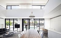
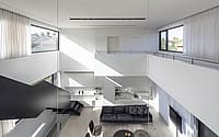
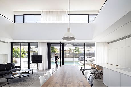
The double space is an airy meeting point between the 2 lateral sides that are actually architectural masses with a presence, and between the 2 transparent longitudinal sides that expose the backyard and front and flood the house with natural light and air.
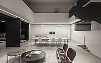
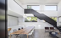
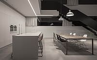
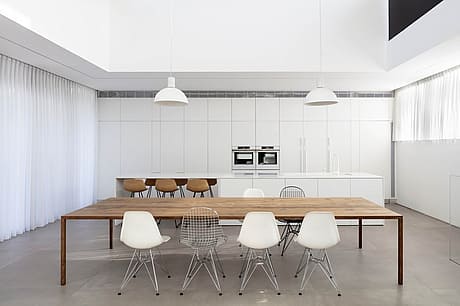
The kitchen is white in all its parts – the cabinets, the work surface and even the faucet. Wooden chairs were chosen for him, just like the wooden plate and legs of the dining room table next to it, with the thought of separating the temperature of materials: what the hand touches is a material as hot as wood, and what around it can be a cold material like metal or corian. The kitchen is the heart of the house and is a living area full of both cooking and eating when an active work surface hides inside removable doors. Next to it is the large guest table, which is surrounded by a variety of airy metal chairs that match the colors of the house to black and white. These chairs are from the same series of outdoor chairs, a practical choice that allows for missing and adding around the table according to the number of guests.
The living room in front of the kitchen is framed with a gray carpet the same as the color of the floor tiles, and on it sits light and minimalist furniture. In the design of the living room, the architect combined hard and soft materials, with the furniture made of black leather that adds softness on the one hand and preserves the colors of the house on the other hand.
The lighting above it is applied in recessed black-painted stripes inside which help to illuminate from a height of double space.
Above the dining area, the same lighting strip was chosen which, in addition to the spots, 2 white light fixtures descended from the profile and intimately illuminated the dining area. Another recessed strip is found in the lowered kitchen ceiling and unlike others was chosen as a very delicate profile. Its color is white and its contour continues along the lowering towards the outside and draws the view to the front yard. Next to it, the pergola lighting comes on, a design that emphasizes the front entrance in the evening.
On the entrance level in front of the main door inside the house, a transparent glass railing is drawn towards the basement, which is an acoustic buffer from the lower cinema room, and its presence seems to disappear in front of the massive iron railing above it.
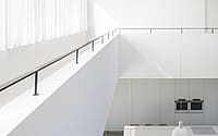
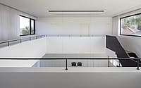
The iron railing serves as the construction of the staircase and hides thin iron stairs that stretch behind it and ascend to the first floor. On its inner side is a bent railing that maintains the clean line of the entire element, creating a comfortable and aesthetic handhold. At the end it meets in an elegant detachment in a white wall that continues along the floor and becomes a perimeter railing combined with an open iron handhold that allows a wide view downwards. This leads the walking route between the 2 wings and ties them together, while making the architectural cross-section interesting.
The bridge that connects the 2 masses of the upper wings is detached from the facades, and this detachment emphasizes the double space thanks to curtains that pass through it from the ceiling of the first floor to the floor of the ground floor.
This disconnect also strengthens the continuity of the structure and the connection between exterior and interior. There is a play here between openness and closure and between light and shadow, which stems from the architectural conception of Melamed who believes in open and transparent architecture and intentionally incorporates large developers in each of his projects.
The courtyard flooring is directly leveled with the water in the pool, an element that creates harmony already in the flooring that promotes the house. In designing the yard, the architect found an aesthetic solution to a complex plumbing problem related to rainwater drainage: a unique detail for rainwater drainage was designed in the form of a plant planter into which the water drains, without installing floor drainage channels that would impair the entrance visibility.
The attention to detail and the choice of elements that strengthen aesthetics is already in the first step for the entrance and continues in all parts of the building whether in meticulous architecture, or in the precise choice of furniture that reinforces the minimalist line present in the house in full force.
Photography by Amit Geron
Visit Raz Melamed Architect
- by Matt Watts