CK Home by Office Zhu

Description
There are already 240 million single adults in China, and the number of people living alone is expected to rise to 92 million by 2021. In Shanghai, the figure is close to 3 million.
This gradually expanding living alone population created a new market. Take-away apps, dating apps, pets…Services for single person are popping up all over the place, but the market is lagging far behind the times in terms of housing typology development. Most of the single apartment is more like an enlarged version of a dormitory than a customized design for adults. How to target emerging market, and design a distinctive, high-quality single apartment is what we want to explore in Blue Home.
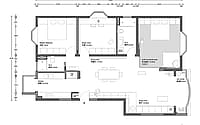
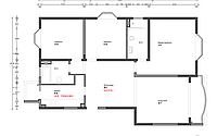
The apartment we faced has 3 bedrooms and 2 bathrooms, with all rooms organized by a central dining room with a simple flow. However, the dining room is located in the center of the apartment and lacks direct sunlight. To ensure the size of the bathroom, the width of the kitchen is sacrificed, resulting in limited operating and storage space.
This imperfect layout, originally designed for a family of three, could not be adapted to the needs of a single adults, so the team adjust the floor plan and programs to meet the client’s requirement.
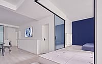
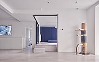
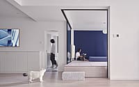
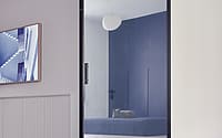
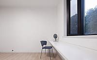
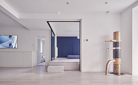
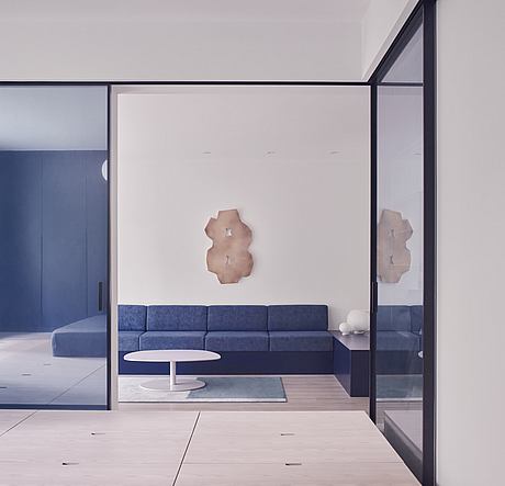
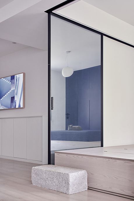
Since the owner only needed one bedroom, and occasional visits from friends/parents made the other one unnecessary, the team removed a portion of the master bedroom’s wall, raised room floor, and turned the room into an open/close multi-functional room (storage, bedroom, reading area). By doing these, the apartment becomes more spacious, the central dining area also get more light.
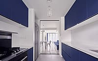
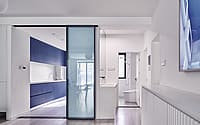
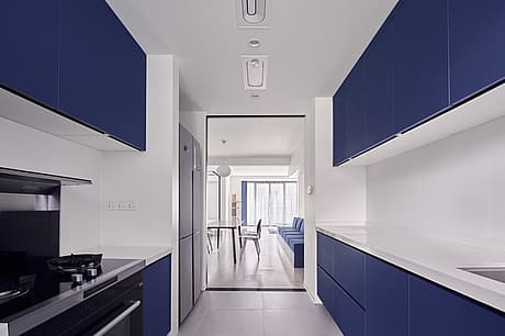
Besides, since two full bathrooms are redundant for a single man, the design reduces the bathroom area and expands the kitchen space. A spacious and fully functional kitchen not only improve the cooking experience, but also provides a platform for home cooking parties.
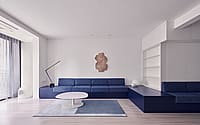
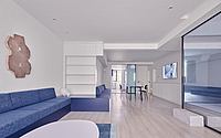
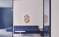
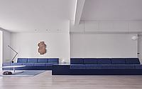
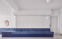
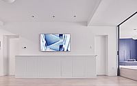
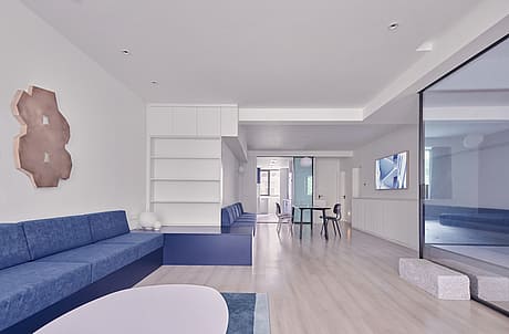
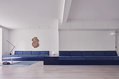
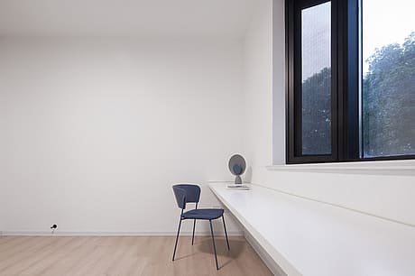
In interior design, we set aside the concept of soft/hard furnishings and designed the furniture as part of the space system. The custom-made hanging cabinets and sofas that wandered along the walls were clean and efficient, and fit into the shape of the apartment. The lighting is small and simple, so as not to disturb the sight. The pursuit of systematic design is also reflected in the relationship between different furniture. The long tables, side tables, and chairs in the dining rooms all have hard contour lines to fit with each other.
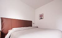
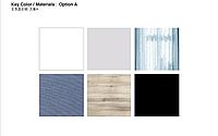
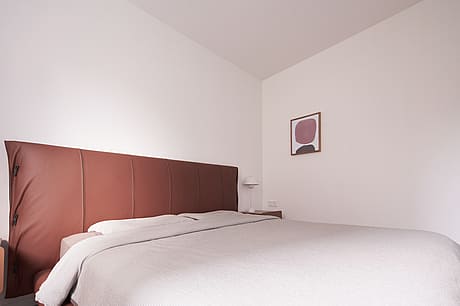
Considering the client likes a clean and fresh living atmosphere, white & wood are chosen as the background material, blue & black are used as accent, and only burgundy was used in the bedroom. Since he likes Wing Chun (Chinese boxing), a floor-to-ceiling mirrored sliding doors are installed in the living room to facilitate the practice. This choice of mirrored material also brings some highlights to the quiet space.
Photography courtesy of Office Zhu
Visit Office Zhu
- by Matt Watts