Always Better – The Second Time Around by Frenkel Nirit
Always Better – The Second Time Around is a modern country house located in Sharon, Israel, redesigned by Frenkel Nirit.

Description
Many people will find excuses as to why “now isn’t the right time” to renovate their home. But this family of five has realized, after 18 years, that their needs have changed since they first moved into their home. Almost two decades ago, their property was planned and designed by Sarah and Nirit Frenkel, when the latter and the homeowner were both pregnant together for the first time. The Frenkels revisited the property after all those years with the purpose of giving it a significant makeover. “The babies had grown and there was a need to update the rooms accordingly”, explains Nirit. “Suddenly you see this ‘baby’ all grown up, wanting her own en-suite bedroom”, she says smiling. Frenkel continues to explain that the need for an en-suite was the main driver behind the renovation. “In addition, another children’s room was required”. It was decided to add another level and staircase, which then led to the decision to renovate the entire 18-year-old outdated property. “The owners gave me design freedom. I redesigned it as I saw fit, and the owners went with the flow, whether it was Terrazzo, wooden wall cladding, choice of colors or lighting”, says Frenkel.
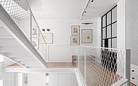
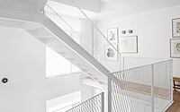
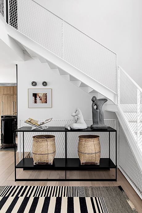
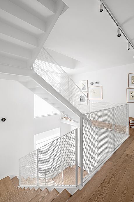
The property was built on a 300 sqm plot, the ground and first level extend across 90 sqm and the top floor, a loft, extends across 30 sqm. The couple loves to entertain and spend time with their immediate as well as extended family. They asked the designers to ensure the house was washed with natural daylight as much as possible, to make it visually bigger and in general to refresh it and make it more current. In fact, other than the loft and the staircase, not many structural changes were made. Everything stayed pretty much where it was, but everything changed from a design perspective: a new kitchen, new furniture, new tailor-made carpentry, new sanitaryware, new windows, a new air conditioning system, plastering, and more. Two things were changed and added to the original plan: an attic with a light staircase and a decorative mesh railing, replacing the previous heavy staircase, and a swimming pool. “The owners wanted to upgrade their outdoor entertaining area and so we decided to add the pool”, says Frenkel.
18 years ago, the budget and specifications matched the standards of their time for a young couple with a baby on the way. Now, the renovation was approached from a different position. The children have grown, and since the parents spend significant time at home, they wished to upgrade their quality of life. They wanted to enjoy their options and as a result, this second renovation was also much more relaxed.
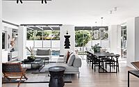
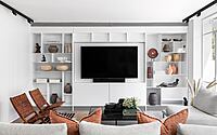
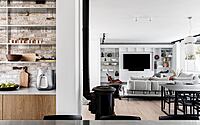
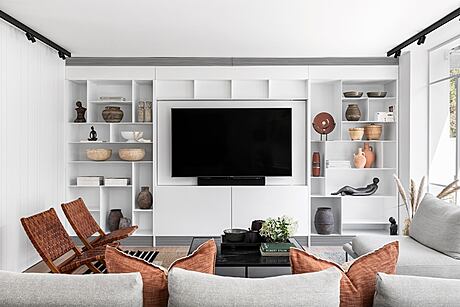
This cozy and relaxed feel is apparent from the very first moment you enter the property: with wooden floors and a “festival” of textiles in the main living area. A glimpse of the kitchen and the dining area can be caught from the entrance. The lounge is home to a wide range of materials; fabric sofas, brown leather seats that correspond with various other brown elements throughout the property, a custom-made steel library that displays the family’s decorative items and a white steel framed window that opens the lounge to the view and the swimming pool.
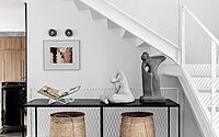
Across from the entrance is a steel sculpted banister, leading upstairs. The new staircase brings all elements of the house together and washes the property with an abundance of natural light.
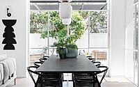
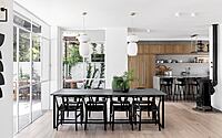
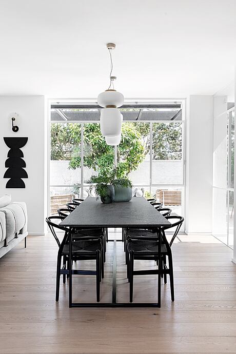
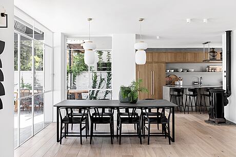
The dining area is located between the kitchen and the lounge. It is a black corner with light thin chairs. To make it unique and to accentuate it, two single dominant light fixtures were chosen, made of brass and milky glass. The chairs warm up the space with their rattan backrest. The small windows were opened up to the maximum, and anything that was not required, from a structural perspective, was demolished to maximize the view of the garden and make the dining area feel like a part of the outdoors.
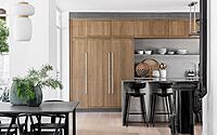
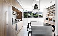
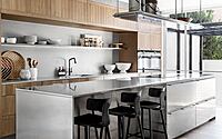
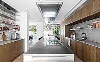
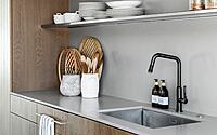
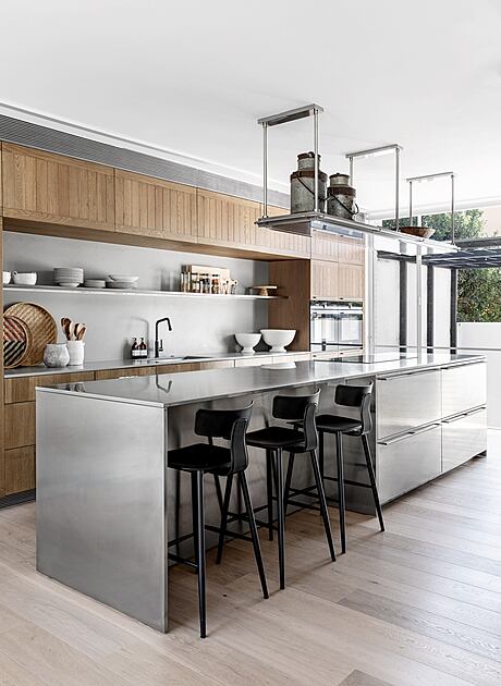
The kitchen, which is the heart of the house, was changed considerably. The owners wanted it to be cozier and have an industrial vibe to it. It was important to them that the furniture would be light, the openings would be floor-to-ceiling ones and that the old planning qualities would be kept but made more current and adapted to today’s standards. As a result, a large kitchen with clean straight lines and contrasting materials was designed. A stone wall cladding acts as a strong yet graceful backdrop for the wooden cupboards and matches the space with its shades of light-brown and gray.
The cozy wood cladded section of the kitchen together with bricks, stainless steel and other industrial elements all create a very unusual composition. The industrial looking kitchen island is made of stainless steel and brick. “We used unrefined wood, also for the fridge and cupboard facade”, emphasizes Frenkel. The island and the pot rack above it have an industrial stainless-steel finish, a bit like a restaurant kitchen, where one can work freely. In addition, a hanging stainless steel unit was fitted in the kitchen above a gray marble working top. “Just imagine yourself cooking and enjoying the view”, says Frenkel. “The kitchen island is one of my client’s favorite spots in the house. it simply makes her want to cook and spend time in the kitchen”, she adds.
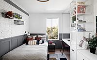
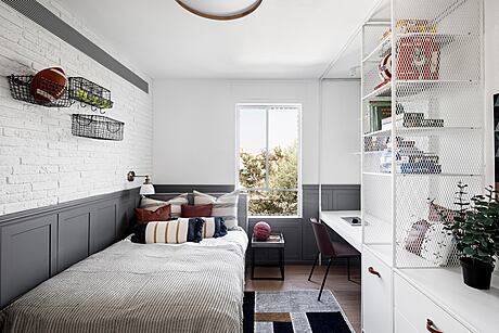
Two of the children’s bedrooms are located on the first floor. The feature wall in the youngest son’s room has brick cladding along the top and gray wood cladding along the bottom. Across from it is a steel library that includes a wardrobe and a study corner.
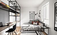
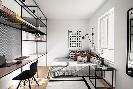
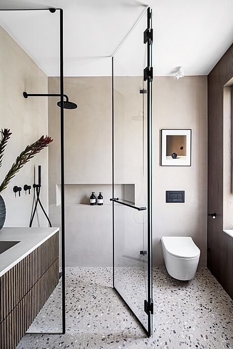
The older son’s room was fitted with a black steel library with a built-in study corner and a barn style wardrobe unit. Natural colors and terrazzo flooring were used in the boys’ shared bathroom that is combined with a laundry room.
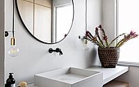
The guest toilets, which were completely redone and include a free-standing sink, are located behind an integral door adjacent to the lounge. The lower part of the wall is cladded with gray terrazzo and the top part with wood.
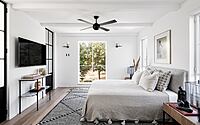
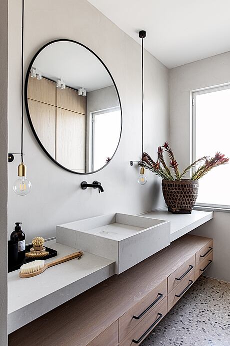
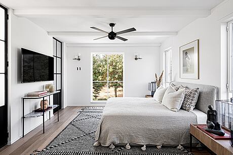
The parents’ room was spruced up with the help of wooden ceiling beams, a white wardrobe corner that makes the space appear bigger, an abundance of textiles that provide a sense of warmth, and a Belgian steel profile doorway that leads to a wood and terrazzo en-suite.
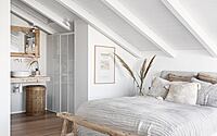
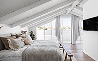
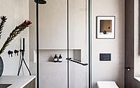
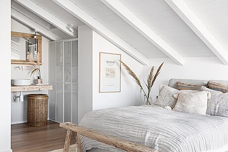
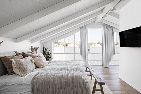
As we go up a level, to the loft, we enter the teenager’s living space. The area with the lowest headroom was dedicated to the sleeping area and across from it is a study corner situated against a clean white wall with a large exit to a roof terrace. The en-suite bathroom includes a shower, toilet and sink. “The loft is also a favorite in this house”, says the designer. “The extra space was very much needed, and sometimes the most interesting and creative spaces are born out of necessity. The result is a really unique and unusual loft”.
Photography courtesy of Frenkel Nirit
Visit Frenkel Nirit
- by Matt Watts