Upper West Side Residence by Worrell Yeung
The Upper West Side Residence is a charming New York City apartment designed by Worrell Yeung in 2022.


Description
Worrell Yeung has transformed a congested prewar apartment into a spacious and relaxed home, where tonal and material layers recall geological stratum. The renovation modernizes a traditional “Classic Six” layout, typical of the Upper West Side, enlarging rooms and maximizing daylight and views of the Natural History Museum below. Throughout, Worrell Yeung harmonizes old and new by restoring neglected historical details and inserting custom minimalist volumes and natural materials that brighten and articulate space.
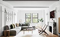
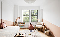
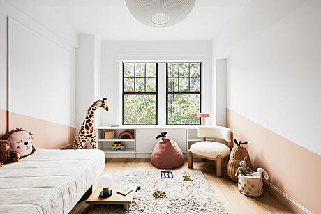
The homeowners, a young family with two children, approached Worrell Yeung to create an open and efficient living space within the historic apartment, which had also suffered a generic renovation in the 1990s. “The apartment was neglected, so we looked to revive the original spirit while restructuring the space and introducing a bright and minimal material palette,” says co-principal Jejon Yeung. The architects began reconfiguring the apartment’s “Classic Six” layout (a traditional pre-war plan segmented into six rooms) by removing walls to open and connect the kitchen and dining area to a living room overlooking the Natural History Museum. Additionally, a former “maid’s room” at the rear was expanded to create a third bedroom with an en-suite bath.
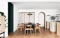
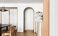
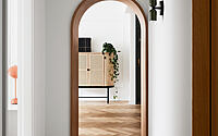
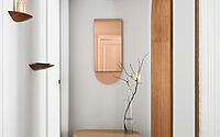
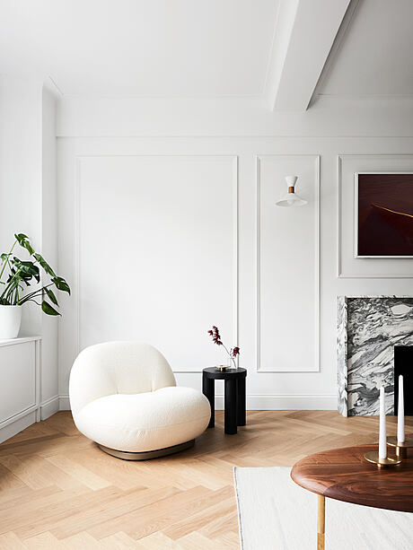
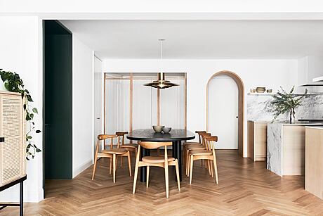
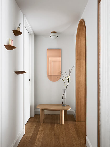
Throughout, Worrell Yeung inserts modern architectural elements to open space and guide circulation through the revised plan. In the entry foyer, a custom wood-and-fabric screen wall creates a porous divider revealing the newly open-format, light-flooded dining-living room beyond. Within, two new archways define transitions between the foyer and living area and the living area and bedrooms. Lined in minimalist arcs of dark wood, these thresholds translate traditional prewar arches into an emphatically contemporary form. Across the apartment, herringbone white oak replaces neglected floors, creating a timeless surface whose light hue brightens the space. “The apartment is light challenged, so the use of lighter oak helps brighten the space, while the darker oak of the thresholds highlights those transitional moments as contrasts,” says co-principal Max Worrell.
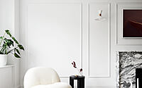
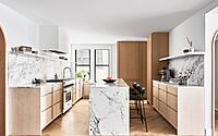
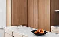
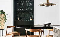
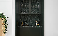
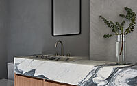
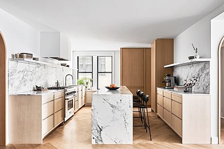
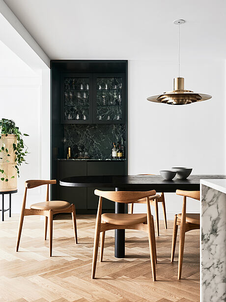
Elsewhere, angular blocks of veined marble are assembled into elegant built-ins and volumes inspired by geological stratum. In the living area, the fireplace is revitalized with a more modern marble hearth, while the kitchen receives white oak casework and a monolithic central island in Calacatta Turquoise Marble. In the living room, a dark bar lined in Verde St. Lucia marble embeds in the wall, contrasting otherwise understated material elements.
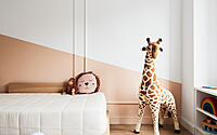
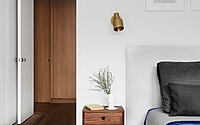
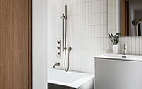
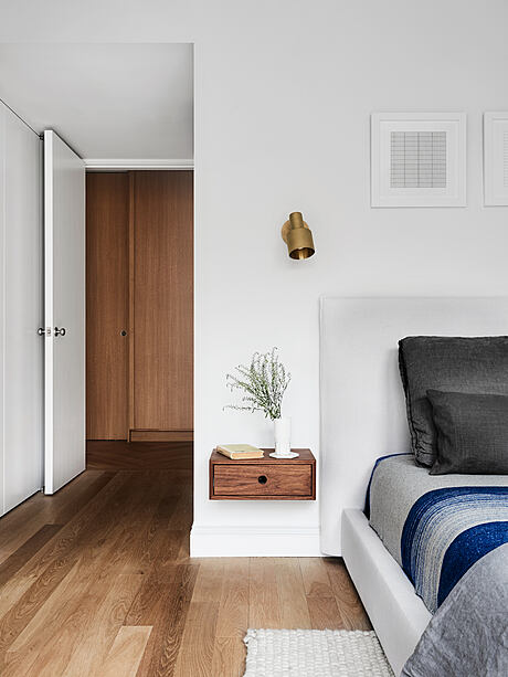
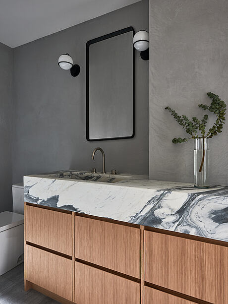
In the apartment’s more private areas, bedrooms and bathrooms are redesigned to maximize efficiency and harmonize color and texture. The main bedroom is reconfigured to take advantage of treetop views, while the main bathroom is finished with tadelakt walls, marble slab floors, and a marble-and-oak vanity. In these more private rooms, round and soft details contrast sharp and straight architectural forms.
Much like the architectural design, the furnishings strike a balance between old and new, where iconic Scandinavian pieces blend with new pieces largely by American designers. For instance,
in the dining area, a vintage brass Fabricius & Kastholm pendant is paired with a Blu Dot dining table and Carl Hansen dining chairs, while in the living room, a Muuto sofa is combined with classic Morten Gøttlerc chairs and a Pacha Lounge Chair by Pierre Paulin for Gubi.
Says Worrell: “This project allowed us to test some of our more minimal, elemental ideas within a prewar apartment—to create a subtle and sophisticated design that deftly adapts for a modern family but doesn’t overpower the charm of the prewar apartment.”
Adds Yeung: “Marrying prewar charm and contemporary sophistication, the minimal marble objects and natural oak elements create subtle, elegant contrasts against the historic herringbone floors and white walls of the apartment.”
Photography by Brooke Holm
Visit Worrell Yeung
- by Matt Watts