Privada 14 by Studio 91
Privada 14 is a luxury apartment located in Mexico City, Mexico, designed in 2021 by Studio 91.


Description
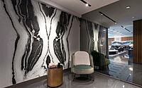
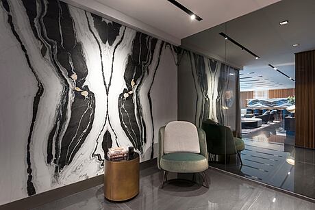
The elevator opens to the lobby. It outlines its spatial aesthetic with the visual prominence of the background wall: the natural pattern of the panda white marble in black and white evokes the sophistication of a Rorschach; it’s the first trace of the apartment’s singular design.
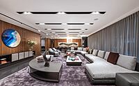
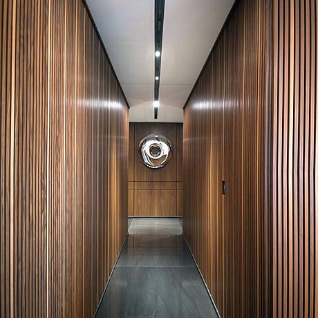
A floor to ceiling mirror welcomes us -covering what used to be a window- favoring an immediate intimacy of the lodging. The mirror-wall is arranged perpendicularly to the black and white marble wall. It reflects in turn the main hall to intensify the feeling of the infinite. The space opens and continues with a wooden lambrin, grooved, L-shaped wall that can be appreciated from the entrance: this wall is the vertebral axis which distributes the spaces. All along this wall we find the different doors that open and close, all-in high gloss, and the openings of the different rooms.
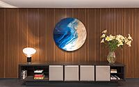
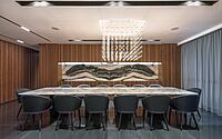
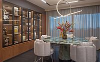
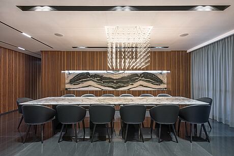
The living room and the main hall’s dining area concludes with another monochromatic white panda marble piece at the background. This detail clearly echoes the marble at the lobby; it works as well as a hidden credenza for the dining room that will provide service for future guests. The living room’s black macaubas quartzite contrasts the wood from the walls, strengthening a duality that provides equilibrium to the space.
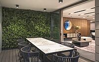
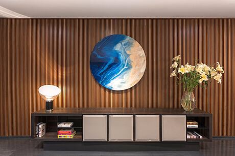
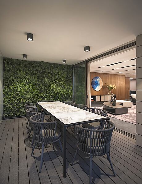
The modular living room furniture and a set of coffee tables -both with matching rounded corners- face a circular painting in a contrasting blue gradient from Atrium gallery. The group of curvy lines provides the interior with dynamism; a terrace functions as the lungs of the main hall by extending their social program to an outdoor dining room. A green wall enlivens the terrace, where a crystal door is the threshold to the connections between interior and exterior, thus enlarging the space visually.
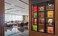
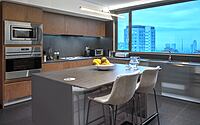
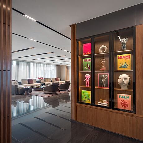
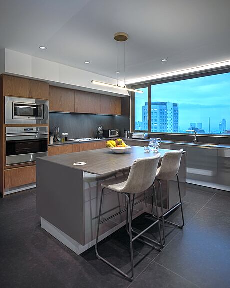
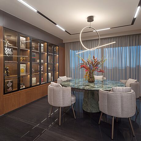
Each corner of the project possesses a careful, functional, and aesthetic design. It is detailed in its execution but subtle in its expression, including the service area, kitchen, and cupboards. On one side of the living room, the wooden grooved wall fades, forming a wooden lattice that gives way to the family room; it is framed by a display case-wall that works as a gallery that reminds us of antique cabinet of curiosities. This display case-wall is enlightened with a warmer color light than the breakfast area and the TV living room that make up the space. The wall displays books, hides the door to the kitchen and shows a collection objects and future art pieces, all displayed in a spectrum from intense colors to gradient blacks and whites. The gray and green sofa in the TV area matches the Verde Alpi marble monolith at the breakfast area’s table.
The general illumination in all the spaces comes from the recessed, linear magnetic tracks by the brand Ilux; they are immersed in the drop ceiling, emphasizing thus the sophistication of the wooden walls. The tracks extend from the living room to the hallways and the family room; there, they constitute the perimeter and then descend, as if trickling down on the wall towards the floor. In addition, there are dramatic hanging lamp accents over the tables of the respective areas such as the Baxter Q3 lamp with 300 light bulbs over the main table. A sculptural floor lamp pairs up with the only visible column between the living room and the dining room.
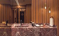
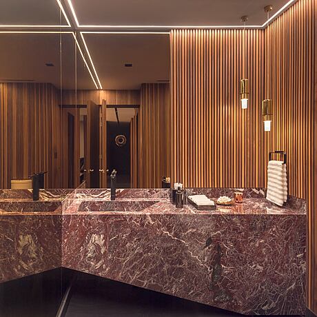
After discovering the doors leading to the different rooms -hidden behind the wooden grooved lambrin- we can appreciate the guest bathroom that duplicates the interior spatial sensation; bronze mirrors reflect the wood upon the wall and the rosso lepanto marble.
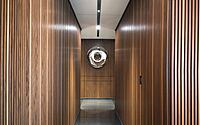
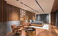
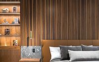
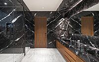
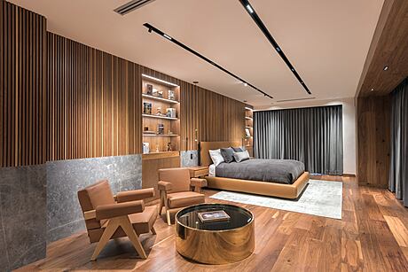
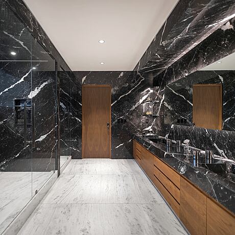
The wooden hallway that leads to the rooms is crowned with a reflecting donut-shaped-mirror piece that deforms the orthogonality and breaks with the rigidity of the transitory space. The rooms give continuity to the natural wood finishes on walls and floors, giving off a cozy impression. The headboard in the main room is framed by a grey era silver marble baseboard and by two built-in bookcases. A couple of capitol complex chairs by Cassina and a furry white chair for the dresser match with all the earth tones in the space, thus providing visual uniformity. The main bathroom is covered with black marquina marble on the walls and white thassos marble on the floor with illuminated shelves that resemble counters. These colors generate a contrast with a set of sumptuous materials but in simple ways.
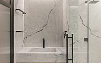
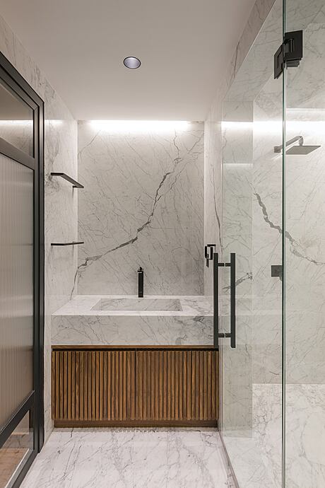
The other bathrooms in the secondary bedrooms are covered in white statuarietto marble; it contrasts with the accessories and the black aluminum screens which, along with the indirect illumination, generate a more intimate sensation. This is articulated in the language of what can be appreciated as a contemporary art deco gesture
Photography by LGM Studio | Luis Gallardo
Visit Studio 91
- by Matt Watts