Apartament in Wrocław by Aldona Banasiuk-Suchorzewska
Apartament in Wrocław is a chic home located in Poland, designed by Aldona Banasiuk-Suchorzewska.

Description
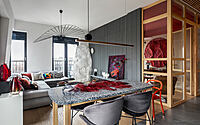
The apartment is placed in the heart of Wroclaw, located on the heighest building’s storey.
which is standing on an island surrounded by water. I live in this apartment with my family.
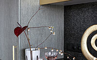
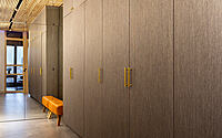
An entrance hall is almost invisible – it contains various facilities, such as laundry or functional cupboard working like a bar. Solid project, in my view, has to predict the needs, before they even come up – projecting for yourself is the hardest thing and I’m sure every designer will agree.
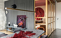
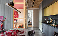
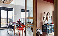
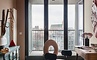
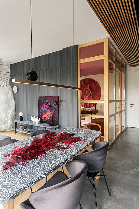
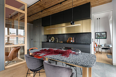
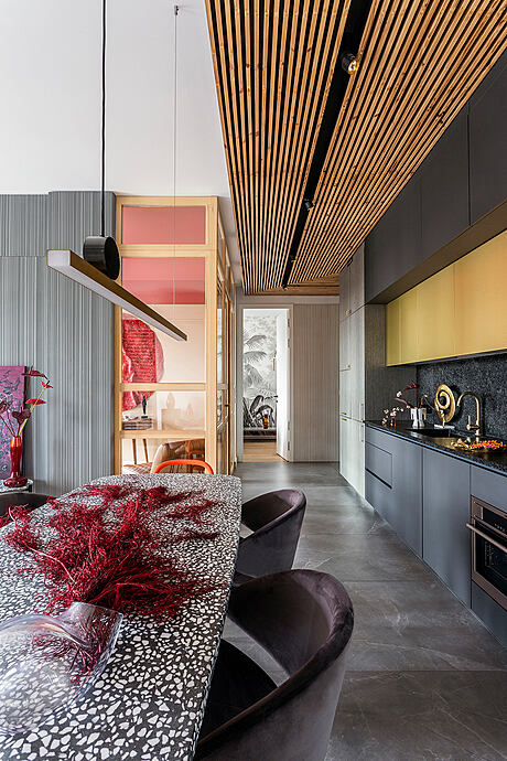
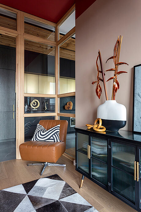
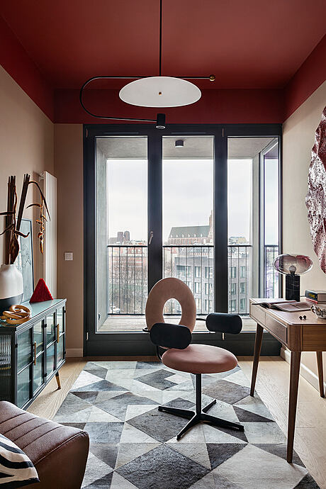
One of the main project targets was creating an office which will be connected with the rest of the daily area. I wanted to make the sunny apartment even brighter that’s why I decided to demolish the decent-sized wall and change it for a glass construction in a solid, wooden frame. It is very reliable, perfect from an acoustic point of view and also durable, which provides a comfortable opportunity to work inside the office. The main aim of creating the glazing was brightening a long hall – the view from the office is amazing, we will see it right after entering the apartment. I wanted the guests coming into this place to be greeted by the unforgettable view of Wroclaw skyline. At first the wall was supposed to be steel, but after analysing my family needs, I decided to make a solid,wooden wall, which will guarantee a proper acoustics inside the office.
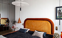
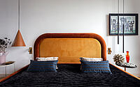
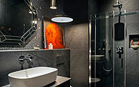
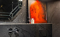
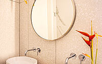
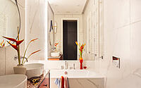
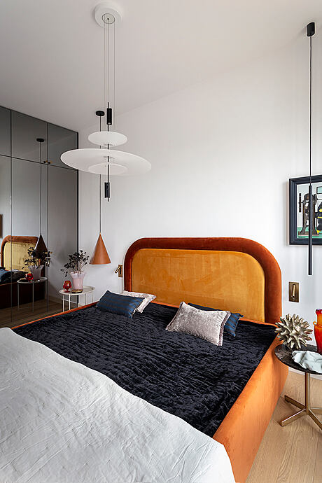
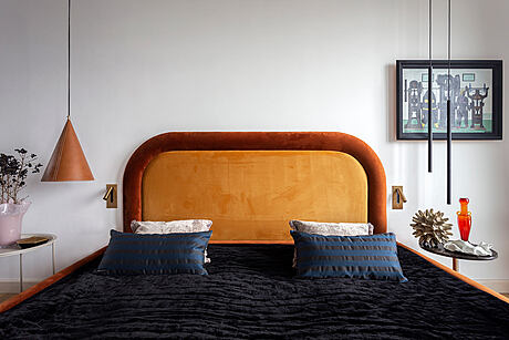
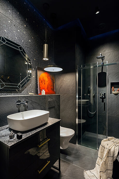
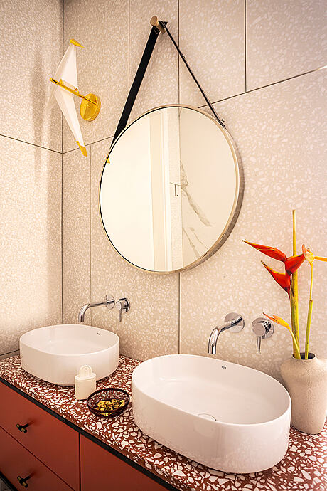
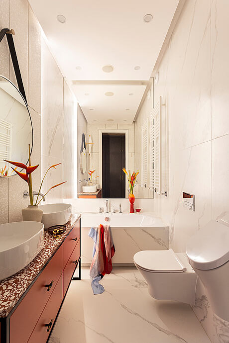
In order to gain extra space for storage, bedroom entrance was relocated near the living room. That’s how two capacious wardrobes were created. Another goal of the project was making two bathrooms – bright, feminine with a bathtub and dark, masculine with a shower.
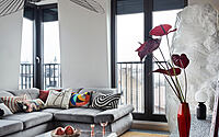
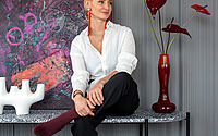
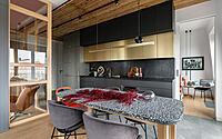
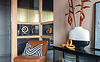
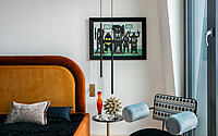
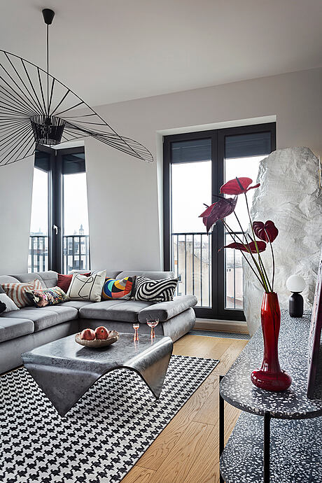
I am a graduate of Warsaw’s Academy of Fine Arts, due to this studies, I enjoy being surrounded by art. That’s why in the interior we will find lovely paintings and intriguing pictorial spatial forms. The first item which appeared inside and which around I made the whole story, was a spatial painting/ pictorial form made by Robert Jaworski (later another one appeared, its shape is really intriguing, organic, but this time the colours are toned down). Intense, red colour of the painting became the foundation of interior’s colour palette. Under an influence of the impulse the ceiling was painted red, and that’s how against the background of neutral basis in the shape of ubiquitous concrete, the colours
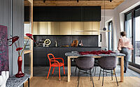
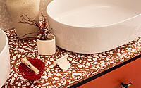
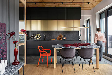
In every project carried out by me the starting point is functional project, it was the same in this case. It is the design stage that takes the most time but is not visible in the final stage – the photoshoot. The thing that is also not seen on the pictures is the size of the apartament which is over 90 m2.- I focused on creating as much place for storing as I could, I wanted to hide most of the items. The furniture, which is forming the whole wall in appeared – unique upholstered furniture from Happy Barok, orange chair or a cupboard in terracotta colour in the bathroom. I am not afraid of bold decisions, hence my choice about red ceiling, which sets the interior’s rhythm from an aesthetic point of view. In the apartment there is also a glass collection created by remarkable polish designers from 60/70s, in the same colour palette.
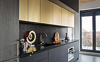
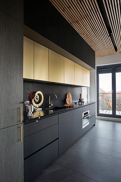
In my projects I always try to create an interior, which becomes a base for accessories and moveable furniture. I use precious materials, in our apartment it is concrete-a stone with an untypical brushed edging, oaken veneer stained grey, slat wooden pannels on the ceiling and fronts finished with brushed metal, which gives a trace of elegancy. My love to the natural materials, especially concrete is the core of the aesthetic given to my interior. My love to this material connected me with my husband. In the apartment it is concrete which dominates – it was fully designed for this project and it appears in many variations and colours (dining table, a small table from elastic concrete, rtv cupboard in the living room and a cupboard in a bathroom with a desktop from terazzo. Concrete also appears on the bathroom walls, it was placed with stone coloured tiles. Walls in the entrance hall and a huge wall in the living room is also made of concrete – but this time from roughen large format boards with classic colouring. All moveable furniture designed by me contains concrete elements, their realisation here was made by Pebek Design, which I am cooperating with since many years. This amazing material gives lots of options, it can be formed at choice, coloured, finished and that fascinates me.
Photography by Martyna Rudnicka
Visit Aldona Banasiuk-Suchorzewska
- by Matt Watts