House AMB by David Bulckaen Architect
House AMB is a modernist home located in Borgerhout, Belgium, redesigned in 2021 by David Bulckaen Architect.


Description
After a search of 7 years, my partner, Koen De Loos, and I bought this three-storey house in the suburbs of the city of Antwerp in Belgium.
We immediately fell in love with the open plan architecture of this ‘60’s house, and the fact that the house still had a lot of authentic and original details. The house has typical modernist features, and a quite unique internal organization.
The house, the former private residence of architect Hubert Semal, has been built in 1966. The architect lived there during his whole life, together with his wife, Mieke Poels. Shortly after he died, Mieke sold the house to us. Since the house only had one former owner (the architect and his wife), it remained very authentic and well preserved. A big plus!
– Interesting fact: Mieke was the daughter of Albert Poels, a locally known sculptor in Antwerp. She is born and raised in the house next to our house. When our house has been built, Albert Poels – Mieke’s father – made a “bas-relief” (217x144cm – red Indian sandstone) depicting “the seven free arts” (grammatica, dialectica/logica, retorica, arimetica, geometria, musica and astronomia), that has been integrated in the façade of the house, next to the front door. The fireplace and bar-cabinet on the first floor also have been ornamented with brass-drawings made by Albert Poels.
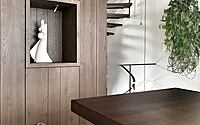
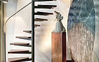
When we bought the house, Mieke offered us also some of his plaster sculptures (such as a mock up for a monument, a very nice Salome, a Tijl Uilenspiegel, a Madonna with child, …), which we placed all around in the house as a reminder of the former habitants.
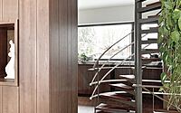
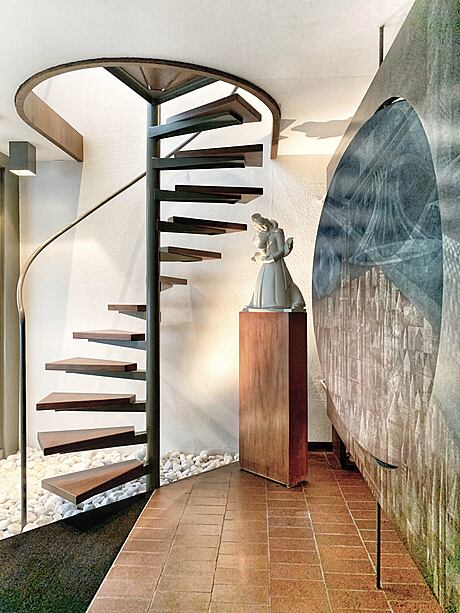
As mentioned before, we fell in love with the unconventional spatial organization. The house has two open spiral staircases (one small) spiral staircase going from the entrance hall on the ground floor leading to the first floor living area, and one bigger open spiral staircase in the back of the house, linking basement, ground floor office, kitchen and bedroom-floor). Therefore, the house has no traditional separate staircase, which creates a very interesting spatial sensation.
A second interesting fact is that the house has few bearing internal walls and few internal doors. Only the bedrooms, toilet/bathroom and garage have doors. All other spaces are linked with each other. Instead of walls, well considered/placed cabinets/cupboards help defining the different spaces with their own functions.
Organization wise, the house also is less conventional:
– ground floor: entrance hall, guest toilet, library, office, and garage.
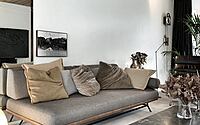
– first floor: living room, dining room, fireplace, kitchen, and small covered terrace overlooking the garden.
– second floor: master bedroom, second office (a former bedroom), guest room and bathroom.
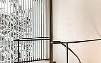
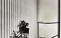
Due to this particular organization, the living- and dining room are linked by a huge window, covering the entire width of the house, overlooking the street. This allows nice views and a lot of natural light, without losing the feel of privacy. The ground floor office on the other hand also has a huge window covering the entire width of the house, but overlooking the garden, and thus maximizing the exterior/interior feel…
When we bought the house, it was clear it needed some renovation works. Especially the interior became outdated. The kitchen – although authentic and “lovely” – needed an update, cabinets/cupboards had had their best time, and the original wall-to-wall carpets on first/second floor were stained, foxed, and discolored.
We wanted to adapt the house to the needs and comfort requirements of the year ’21, but without losing its authentic and original touch and feel. Otherwise, one should not buy such a house…. On the other hand, we also didn’t just want to “renovate” the house. The changes had to feel very authentic and endogenous.
(Interior) Architecture:
As an architect, I always try to find the right balance between aesthetics, functionality, context, and specific requirements. That’s what I also did in my own house.
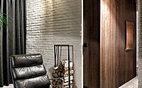
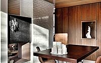
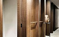
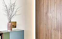
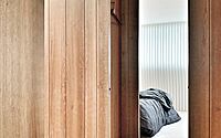
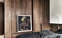
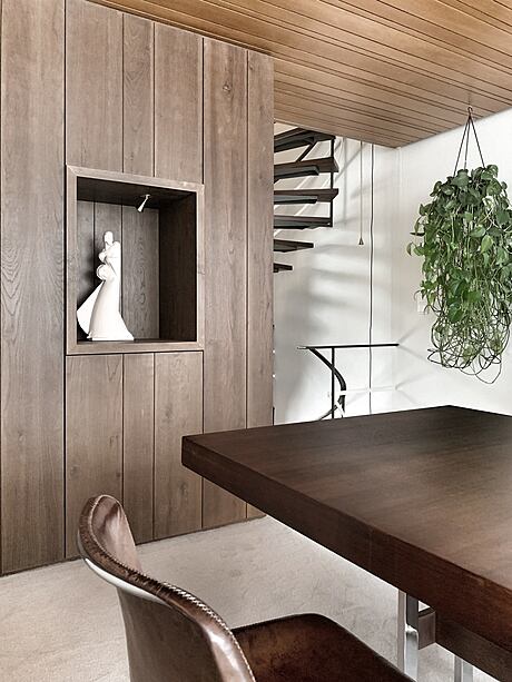
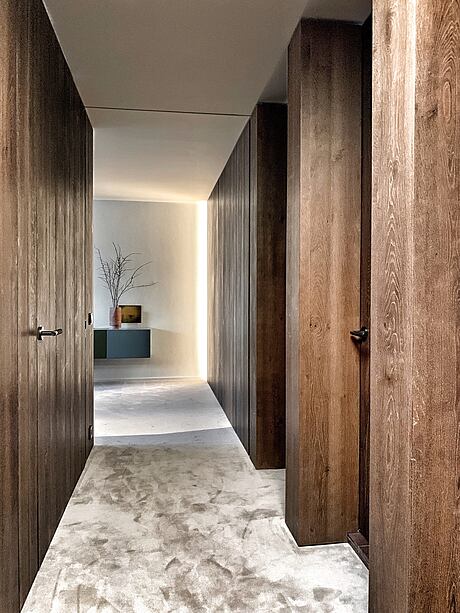
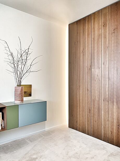
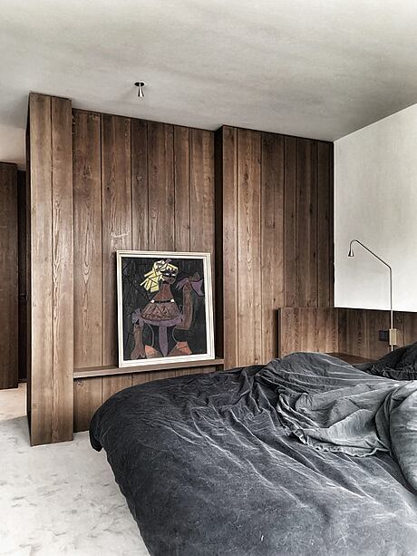
I kept the spatial organization of the house. Therefore, I kept the location of all the room-dividing cabinets/cupboards, but I replaced them by new ones. However, the new cabinets do not look any more like traditional cabinets. All doors are made invisible, thanks to the “trompe l’oeil” effect of the wooden planks.
I also wanted to add an architectural and more sculptural touch to the house. Making the cabinets look like walls was the first step to achieve that purpose. Secondly, I tried to merge and connect the spaces even more. By detaching some of the cabinets from the structural walls, and by taking out the conventional doors on the second floor (and replacing them by hidden doors), emphasizes the openness of the house. The third and final choice was to use consequently the same materials in the whole house (tuned/aligned on the original use of materials).
– ground floor: library and office are separated by a room dividing cabinet which is detached from the walls. A long book-shelve however connects the library with the office and makes the two separate spaces feel like one space.
– first floor: the existing cabinet in-between kitchen and dining/living area has been replaced by a new and more functional one (including the fridge in the kitchen area), executed in the same old oak wood-veneer as on the ground and second floor.
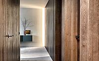
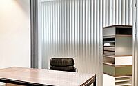
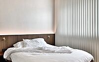
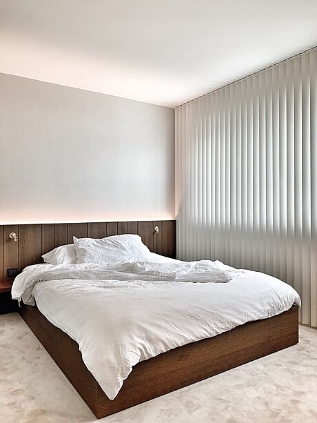
– second floor: the night hall has been opened to the second office (former bedroom), by taking away the traditional door which has been replaced by a hidden sliding door. All doors are ceiling high, and frameless. This simple gesture creates once again the connected feeling. By dethatching the cabinet in between master bedroom and office from the band window in the façade, both rooms also are widened up…
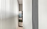
The former night-hallway became the dressing in the new design. The huge wall covering mirror is both functional and space emphasizing.
Materials:
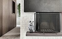
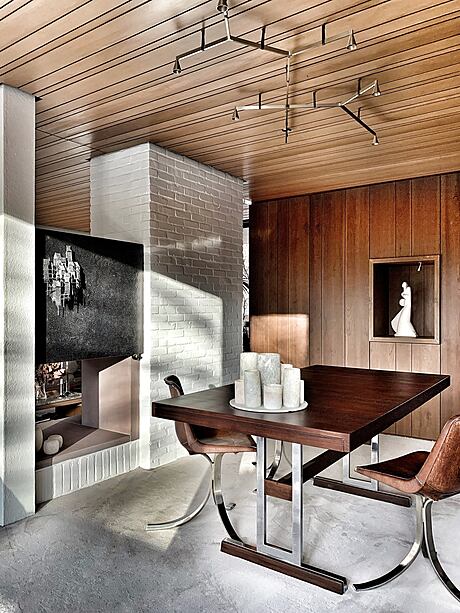
The existing house displayed a lot of nice and time-related materials. Typically for the modernist architecture is the use of white painted brick, ceramic tiles, wall-to-wall carpets, rice-paper wall finishes, and wooden ceilings. All of that has been kept, adding a certain “wabi-sabi” touch.
The color and pattern of the wooden steps of the spiral staircases have been used as a reference for the new additional wood-veneer cabinet-finish.
The wall-to-wall carpets have been replaced by a new – sandy colored – carpet from BIC.
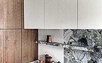
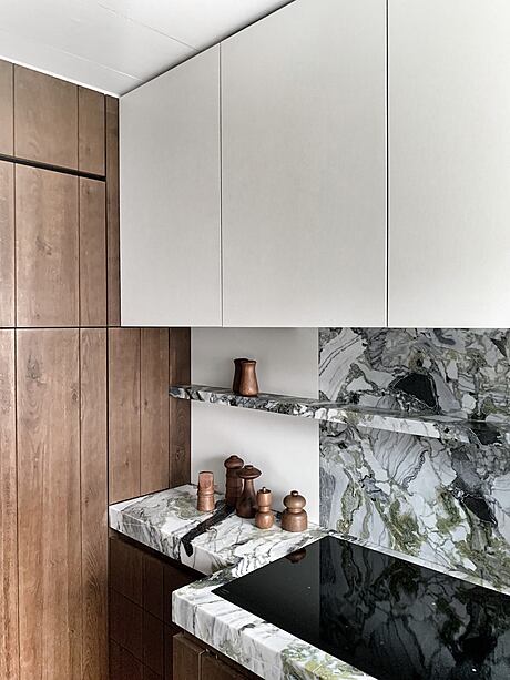
The choice of the marble countertop (by Belgian firm Van Den Weghe Stone) in the kitchen has been inspired by the existing green accents in the house (color of the windows, color of the existing doors, color of the steel structure of the spiral staircases…)
All newly added lighting (designed by Belgian Architect Hans Verstuyft for TRIZO), is made of brass, perfectly matching with the open staircase handrail / existing sideboard and fireplace details.
The newly added materials perfectly match with the existing materials, adding a contemporary touch. The finish of the new materials also aims to keep their natural feel and touch. Wood still feels like wood, stone is real stone, …
Functionality:
Although aesthetic and looks were very important in the design process, functionality never has been neglected. All bespoke furniture is designed to be functional, maintenance friendly and have integrated light, integrated sockets, and integrated heating/air-conditioning. In the kitchen a planter has been incorporated in the countertop for keeping fresh herbs,
Art:
As mentioned before, the house has some incorporated art pieces:
– façade: bas-relief by Albert Poels, depicting the “7 free arts”
– entrance hall: custom made fixed paravent/space divider made by Jozef Cornelis depicting the art of “architecture”
– custom made sideboard by Hubert Semal, with an incorporated drawing for the bar by Albert Poels (the sideboard was a wedding present from Hubert Semal for his wife Mieke Poels)
– custom made fireplace, with an incorporated drawing by Albert Poels
– several sculptures in plaster by Albert Poels
– custom made planter in the living room, originally from the 60’s, by Hubert Semal
Photography courtesy of David Bulckaen Architect
Visit David Bulckaen Architect
- by Matt Watts