Fassa Theatre House by Giacomo Nasini
Fassa Theatre House is a contemporary apartment located in Milan, Italy, designed in 2021 by Giacomo Nasini.

Description
The small size of the dwelling, only 75 square meters, and its location in a building with a double courtyard were the stimulus for a reflection on the ways in which space and interpersonal relationships are articulated. Casa Omar is an opportunity to confront again a post-industrial context and to reflect on the specificities and qualities of architectural spaces, developing a narrative that represents one architecture within another, multiple. An articulation of interior spaces and environments that are arranged as an exterior landscape: a flow of places and moments of daily life.
The solution identified made it possible to respond to the client’s request to have, although in a small space, a large living area and a sleeping area in which the rooms and furnishings can be modulated according to the inventiveness of those who inhabit them, allowing the house to be transformed: stage and intimate dwelling. Traditional hierarchies between spaces and those who inhabit them are thus disrupted, bringing to the forefront the relationships of the people who share moments of everydayness and exceptionality. Constituting the entire world of human stories unfolding in the home are the virtual fractionations and ever-changing visual cones that thus generate unusual spatial relationships.
Casa Omar was a project in the making, a game of detachments, with a connecting thread between each element. Structural elements such as walls, niches and pillars, were intimately integrated as furnishing elements, not as a disturbance but highlighted or hidden, seeing them as opportunities to mark the different use of the rooms.
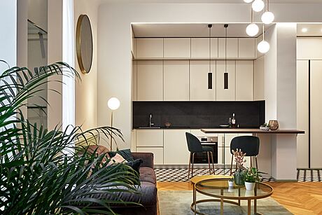
In fact, entering Omar’s house, one finds oneself in one large room subjected to all the functions of the rooms of a house: Entrance, living room, kitchen, study. Each with its own gestures, its own need for maneuvering space, its own light, the possibility of having everything in its place and the place for everything.
As in city life, the physical boundaries and cultural distances between people and related activities-from resting, to leisure time, to food consumption-become more blurred in the project. The spirit of sharing within the domestic space is thus facilitated.
The formal languages used to set up the spaces do not make the functions of the elements into which the apartment is divided immediately recognizable.
The volumetric box is thus organized through a sequence of “vital perimeters” everted toward the bordering areas, within which guests are welcomed, cooking, eating, sleeping, music lessons, washing, lovemaking, and playing.
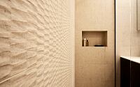
A kind of minimal living module where, depending on the activities and different forms taken, the materials used and their sensory qualities change. Thus the wood treatments change from the bedroom to the bathroom to the kitchen; the marbles enter the scene suspended or are kept a little concealed like abstract characters in a human comedy; and the bronzed surfaces, like silhouettes of Chinese shadows, hold together the pieces of the story by dialoguing, through their rigid geometries of vague graphic flavor, with the decoration of the upholstery on the surrounding walls.
The overall lighting plan was designed with Spazio Light while all the furniture is the result of the highly refined work of Ad Hoc Arredi and Zacchetti.
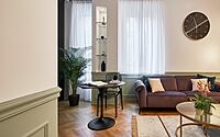
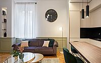
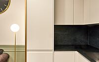
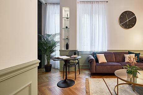
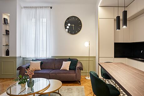
Thus upon entering the Omar home, one has a welcoming entrance demarcated on the ceiling by a sharp light line and on the floor by a flush threshold in etched brass. The living room is dominated by a cozy sofa, lots of natural light and several light sources, each designed for a different use. Once again the division between kitchen and living room is interpreted by a brass floor threshold that continues vertically on a wall shoulder and becomes a ceiling light line. The gap between parquet and tiles marked by brass is reminiscent of the cement tiles and brass details of yesteryear.
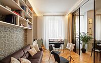
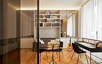
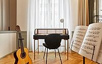
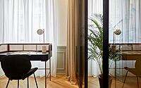
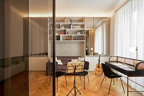
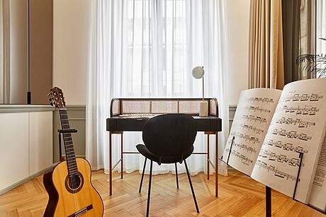
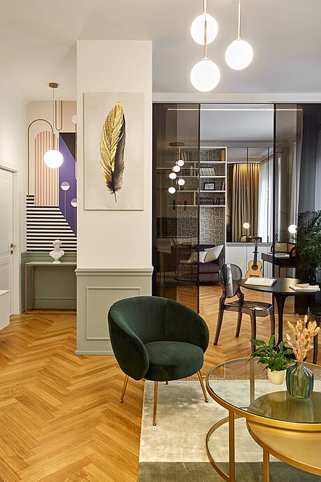
From the living room there is access to the artist’s studio, the owner in fact is a guitarist, and the studio where he plays and receives people is a key element of the house, divided from the living area with a smoked glass curtain and a softer blackout fabric curtain, so as to give the possibility to separate, soundproof and have a curtain for private concerts.
Inside the studio a bookcase with open and closed compartments, with doors covered in mirror and edged in black anodized aluminum. A sofa, desk, and seating make the room consonant with its intended use.
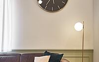
Throughout the living area runs a plaster paneling, composed of geometric moldings, and a frame at a height of ninety centimeters, the color, a particular tone of green, binds each room with the other allowing to understand the speech that is project of this whole area of the house.
Access to the sleeping area is given by a hallway, where an alcove has created the possibility of inserting a storage cabinet, partly for all cleaning materials and and partly shoe rack. Doors finished in matte enamel, and the house wainscoting that continues on the front of the closet do not let the clutter of the furniture be perceived, leading to the bathroom door and the master bedroom.
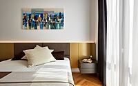
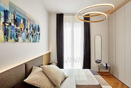
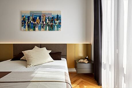
The most private rooms are again illuminated by different dimmable and non-dimmable light points to create atmospheres for different moments. In the bedroom, in addition to the sumptuous bed with upholstered and backlit headboard by Diotti, there is a full-width closet with lacquered doors and top lighting that bathes the ceiling. The storage allows you to have in one place, everything you need for the current season and the change of season, the internal division of the furniture takes into analysis the habits of the owner, the types of clothing and ways of storing the same, following his usual habits.
From a strictly functionalist program ultimately comes an entirely emotional declination of living. A performative transformism is demanded of the materials inserted in the space, so that screen-printed curtains are transformed into laminates that cover a piece of furniture, which becomes an autonomous architecture, a piece of equipment with changing morphology where functions are from time to time expressed in unusual ways. Space still appears, but perhaps little, dominated by reason.
The search for innovative and detailed solutions certainly required coordination among the different actors on the site: designers, workers, interior designers and suppliers, finding solutions that allowed for a mixture of thought and know-how.
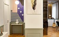
The general idea of the project is then followed by the materials used: from the natural Italian-spine oak of the great Bergamasque masters Parquet Clio Project, a wood strongly used in Milanese Art Nouveau, to the vintage wicker furniture and bronzed mirrored glass, to the more decorative elements such as the upholstery with abstract geometric patterns by Designer Gian Battista Andrea Marongiu, who reinterpreted some of his already well-known papers for us.
Gian Battista’s philosophy is to find a meeting between the simplicity of forms and the elegance of colors.
He recounts “these two aspects fuel my creativity in the productions of wallpapers, hand-painted wall decorations and fine art paintings. Two souls coexist inside me: that of the designer who transforms visions into work plans, and that of the artist who interprets tastes and sensations.”
“In this house I have included the ‘Beehive’ paper, which is part of a series of 4 graphics inspired by geometric shapes, especially those of the hexagon and the circle, shapes that are broken down and reshaped to create surreal and futuristic settings.” The palette chosen by Gian Battista, the same one that returns throughout the house, is a balance between warm-cold colors and pastel-intense tones, fundamental black and white that lend elegance and small hints of mustard that recall vintage style.
Numerous pieces of furniture embellish the interiors: from the Overshadow rug by Habiform to the Tulip table in matte black lacquered die-cast, from the brass light fixtures by Flos to the various artist’s works.
Photography courtesy of Giacomo Nasini
Visit Giacomo Nasini
- by Matt Watts