The Flat Above the Boqueria Market by Marco de Gregorio
Discover The Flat Above the Boqueria Market, located in the heart of Barcelona, Spain, and designed by Marco de Gregorio in 2020.
This eclectic apartment is situated above the iconic Mercat de la Boqueria food market, with stunning views of the Collserola and Tibidabo hills. The renovation of the 52m2 (566 sq ft) space focused on creating a functional central core with two big rooms and equal access to the bathroom, kitchen, and entrance.

About The Flat Above the Boqueria Market
Interior Design and Architecture in Barcelona: A 52m2 Apartment in the Center of the City
This 52m2 (560 sq ft) apartment is situated in the heart of Barcelona, just next to the Rambla. On top of the iconic Mercat de la Boqueria food market, the flat enjoys spectacular views of the Collserola and Tibidabo hills.
Aesthetic Simplicity and Openness
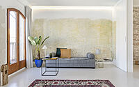
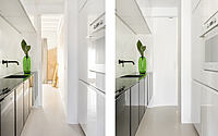
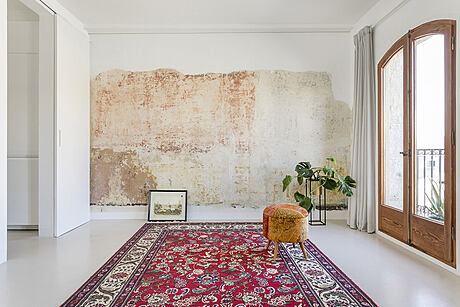
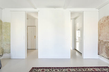
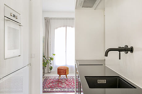
After a series of alterations, the apartment has been transformed with the focus on achieving spacial simplicity and openness. The functional core of the flat includes the entrance, bathroom, kitchen and two large rooms, one facing the street and one facing the market. Both rooms have equal access to the core facilities.
Adaptable Space
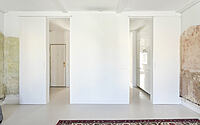
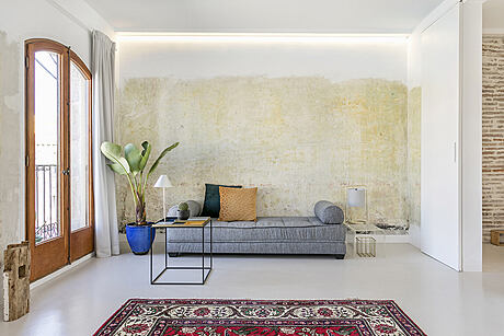
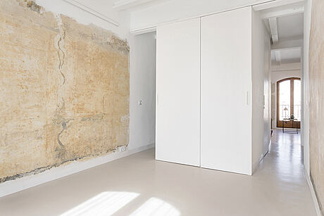
The space can be adapted to different needs, with four sliding wall/doors creating distinct areas as required. The two large rooms can be used as one flat or two individual flats, and have the capacity to be subdivided into two separate spaces.
Embracing the Past
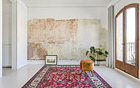
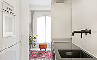
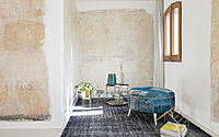
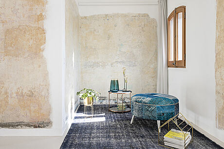
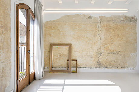
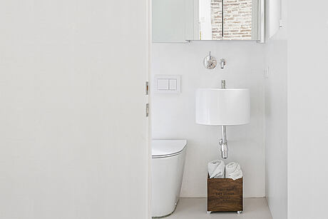
Original plaster and colors were uncovered during the renovation process, prompting the decision to restore them to achieve the desired unfinishing feeling. The exposed walls surfaces have become a reminder of the past, with the raw stone and plaster in contrast to the new sleek materials such as the contemporary bathroom, kitchen and micro cement flooring. The wooden double doors also enhance the original features.
Photography courtesy of DeGregorio Henriksen Architects
Visit Marco de Gregorio
- by Matt Watts
