Nau House: A Two-Story Dwelling in Ciudad Real
Discover Nau House, a two-story house designed by Muka Arquitectura and located in Ciudad Real, Spain.
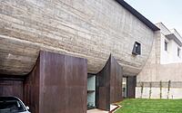
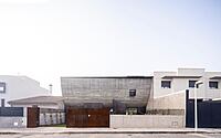
This remarkable property seeks to vindicate a different way of engaging with urban planning and approaching the potential forms of a single-family dwelling, as well as its relationship with its surroundings. Built in 2022, this concrete-style home features two small courtyards, blurring perceptions of the boundary between inside and outside. It is also designed with a curved volume which houses the bedrooms, offering visual continuity between the two courtyards from the inside. Experience a unique way of understanding the links between the parts and the whole, and the connections between the dwelling or the sum of multiple dwellings and the city in Nau House.

About Nau House
Rethinking Urban Planning: A Single-Family Dwelling in Ciudad Real
In urban areas, where adjoining houses share side walls to form a linear succession of juxtaposed volumes, it’s common to approach residential architecture in a similar way. However, this project takes a different perspective on urban planning, seeking to vindicate a unique approach to single-family dwellings and their relationship with their surroundings.
Creating Space in a Restrictive Context
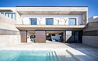
The minimum plot size established in Ciudad Real’s planning requirements was diminutive, and mandatory setback areas governed the building’s position on the plot. As a result, the design solution was to create two small courtyards at each end of the plot with the house interjecting between them. The front part of these plots generally offers very restricted possibilities for use, while the rear is most often turned into a cramped patio with little natural light due to the enclosures of the adjoining plots.
Blurring the Boundaries Between Inside and Outside
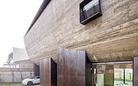
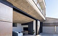
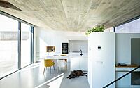
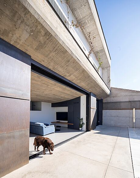
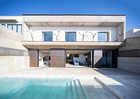
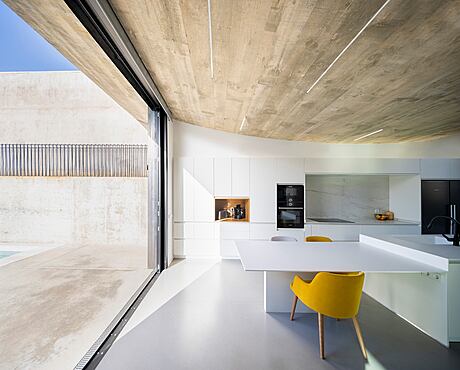
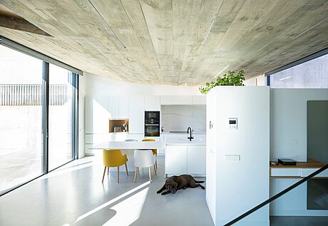
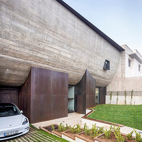
The design was fundamentally resolved in section in the clear gesture of a curved volume, which houses the bedrooms, opening up the ground floor and offering visual continuity between the two courtyards from the inside. This formal solution brought with it the possibility of concealing areas of glass by hiding them behind the steel pillars on which the concrete volume rests, blurring perceptions of the boundary between inside and outside.
Making the Most of Common Areas
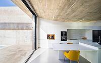
The carving out of the floor plan and elevation of the lawned areas at the ends of the plot are used as resources that ensure the limits of the plot can be perceived in their maximum extension from the living room and the kitchen, as areas where most of the family’s daily life takes place. The Corten steel supports holding up the concrete body serve to house secondary uses of the residence on the ground floor, while the slightly rotated position of some of these supports emphasizes the geometry and curvature of the whole.
Contrasting Relationships with the Urban Environment
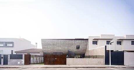
The distribution of volumes on the first floor works to establish contrasting relationships with the urban environment between the main and rear façades. The façade on calle Villahermosa seeks to disrupt links between the more private uses of the first floor and the rest of the adjoining buildings and their nearby windows. This urban reclamation aims to speak for an alternative manner of understanding the links between the parts and the whole and the connections between the dwelling or the sum of multiple dwellings and the city.
Blending with the Environment
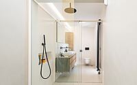
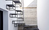
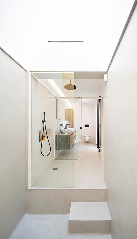
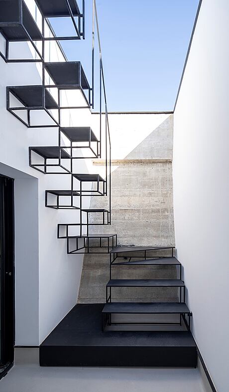
In the rear courtyard, the concrete shell ends asymmetrically compared to the main façade, at a lower point, to give a more permeable aspect. Bioclimatic solutions in the form of steel cables interspersed with plant growth screen and regulate the entry of direct natural light. The curved gesture of the main façade allows natural zenithal lighting in rooms for secondary uses and facilities, the staircase hall, and a courtyard that lights up one of the bedrooms. The bathtub in the master bedroom, carved out of the very tip of the curve, has a skylight allowing natural light in while maintaining necessary privacy.
Design Opportunities for Enhanced Living
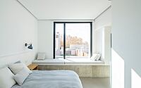
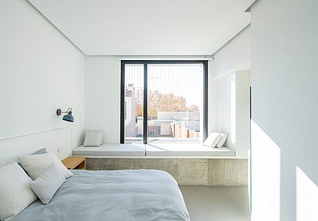
The concrete curve is staggered at its ends, allowing design opportunities that improve how people can use the house and its relationship with the exterior. Window sills extended into seating in the interior function as reading and resting points next to the windows. Planters inserted into the geometry and concavity of the floor itself, desks, work tables, and additional storage areas in the home are just some of the design features that enhance the living experience.
Overall, this project challenges traditional approaches to urban planning and single-family dwellings by offering a unique perspective on how we can live in an urban environment.
Photography courtesy of Muka Arquitectura
Visit Muka Arquitectura
- by Matt Watts