Black House: A Striking Example of Contemporary Design
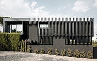
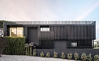
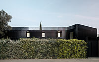
Nestled on the outskirts of Sant Cugat, Spain, the Black House is a remarkable transformation of a two-story single-family home. Designed by Marc Duran Studio in 2022, this contemporary makeover breathes new life into a once nondescript dwelling.
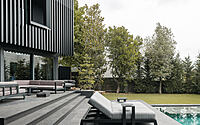
The unique V-shaped structure wraps around a lush garden, creating an eye-catching blend of modern design and natural beauty.

About Black House
Revitalizing a Home with a Monochromatic Design Concept
The clients introduced us to their recently purchased single-family home on the outskirts of Sant Cugat. Built in 2010, the house had an unremarkable appearance, with vertical exposed brick in ochre tones and grey accents in various finishes. However, the unique V-shaped layout wrapped around the garden caught our attention, and the interior design suited the clients’ needs.
Transforming the Space Without Altering the Structure
Our proposal centered on the idea of redesigning the existing volume without making structural changes. We aimed to update and modernize the outdated and obsolete finishes and colors of the original materials. Our intervention focused on highlighting the home’s unique features while letting the rest blend into the background.
Key Elements of the Redesign
– Monochromatic Palette
– Emphasis on Openings
– Verticality
– Capillarity
– Monochromatic Palette and Emphasis on Openings
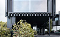
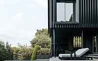
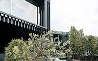
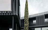
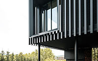
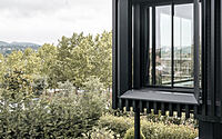
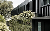
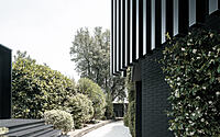
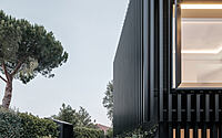
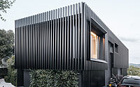
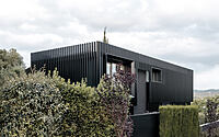
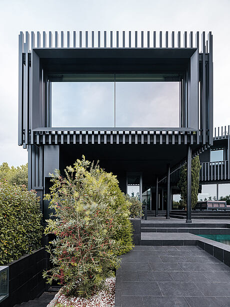
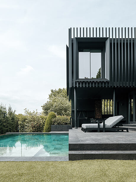
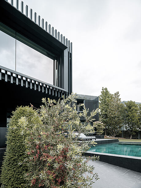
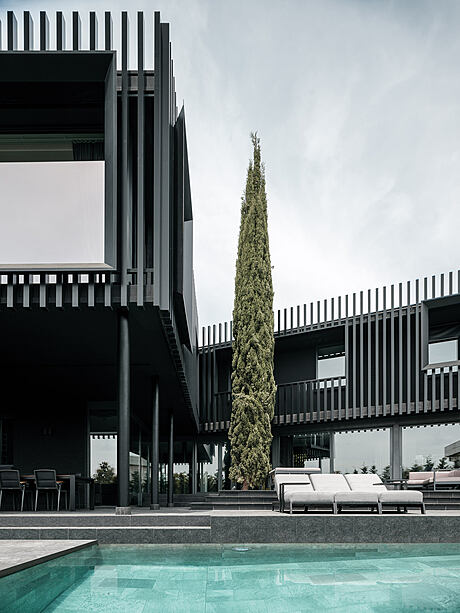
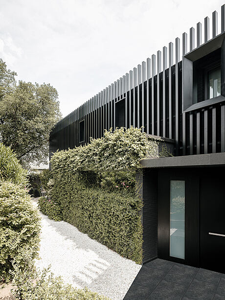
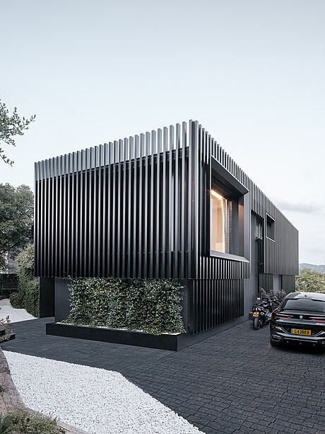
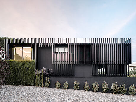
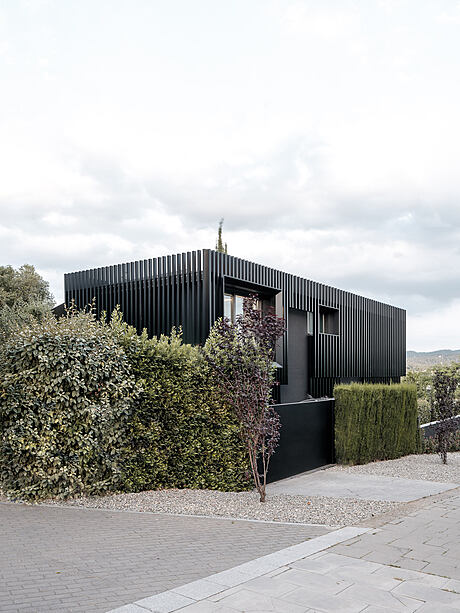
We decided to maintain the original volume and paint all exterior elements black to create a striking contrast with the surrounding greenery. To accentuate the openings, we installed large, protruding sheet metal angular frames that projected over vertical lathing with hollow sections, creating a double skin on the building.
A Bold, Graphic Statement
By varying the cadences and lengths of the sections, we increased the number of vertical planes on the façades, giving the home a more dynamic look. The separation of the sections from the façade added depth and lightness to the structure, making it appear more versatile. During the day, shifting shadows dance across the building as the sun moves, while at night, interior lighting illuminates the exterior, creating a captivating visual effect.
Photography by Filippo Poli
Visit Marc Duran Studio
- by Matt Watts