Family House Hlubočepy: Where Nature and Contemporary Design Collide
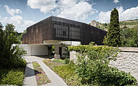
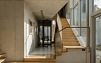
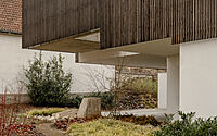
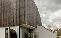
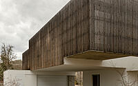
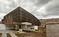
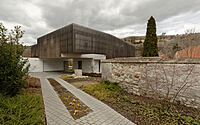
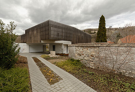
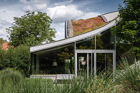
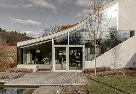
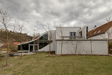
Immerse yourself in the world of Family House Hlubočepy, a contemporary concrete two-story house nestled between the urban and natural landscapes of Hlubočepy, Czech Republic.
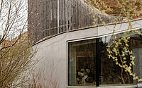
Designed by RO_AR Szymon Rozwalka Architects in 2021, this unique home effortlessly merges with its surroundings, drawing inspiration from the nearby Hlubočepské Rocks and Dalejský Brook. Experience a seamless blend of natural and urban design elements, as well as innovative solutions for illumination, space, and budget challenges.

About Family House Hlubočepy
Bridging Urban and Natural Worlds
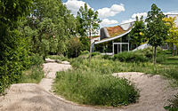
The proposed building straddles the border of two contrasting realms: the urban and the natural. The north-western side of the site adjoins a bio-corridor that extends along the Dalejský Brook, enriched by the striking Hlubočepské Rocks.
Responding to the Urban Context
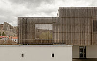
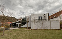
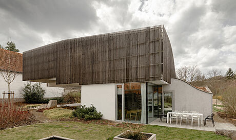
Chaotic and random development characterizes the urban space surrounding the site on the south and east sides, often negatively impacting the value of the projected terrain. The house’s form and spatial layout directly respond to this context.
Integrating Nature into the Design
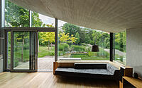
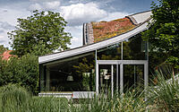
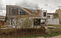
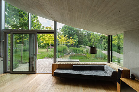
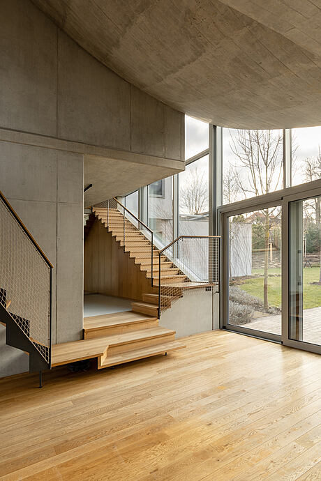
The proposed house design aims to extend the natural context into the site’s interior and the interiors of the house. In contrast, the house separates itself from the ‘urban world’, becoming an abstract structure that mirrors the surrounding rocks in form and scale.
Addressing Natural Light and Site Challenges
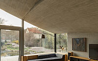
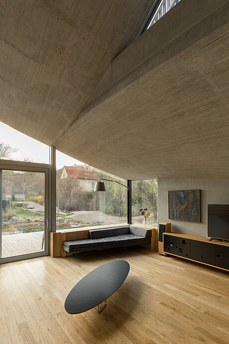
Simultaneously, the building’s form addresses the need for ample natural light in the rooms, the issue of a ‘narrow’ entrance, and the problematic location of the neighboring building on the southern boundary of the site.
Initial Design Concept: Merging with the Terrain
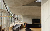
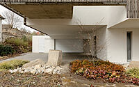
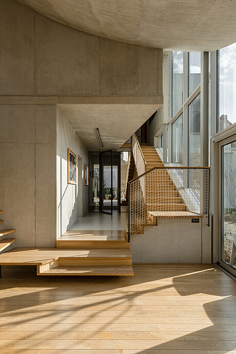
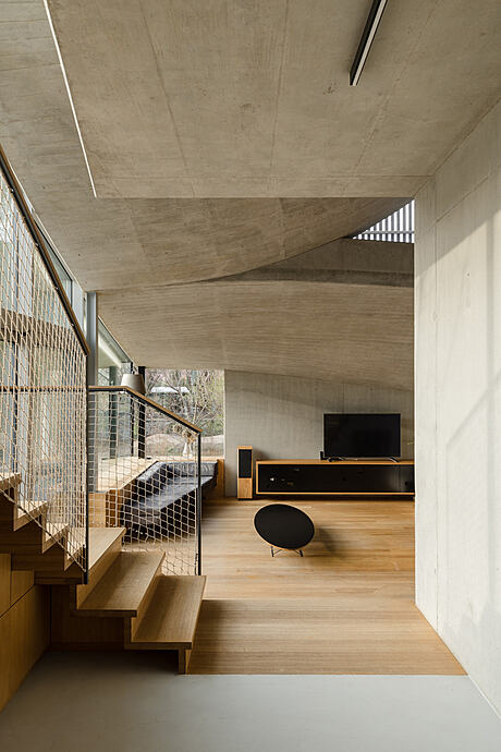
We initially designed a building created through land deformation. The terrain was meant to transition smoothly from the north-west side into an artificial hill, with the house nestled within. From the southeast side, the ‘hill’ would be undercut, allowing for the creation of an entrance patio beneath the building, shaped by a contrasting rectangular geometry.
Adapting to Budget Constraints
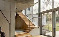
Due to budget limitations, we significantly scaled down the initial building proposal. We opted for the risky method of directly cutting away ‘unnecessary’ elements, which inevitably affected the final result. This deliberate, primitive cut-off yielded surprisingly positive effects in some areas and less desirable outcomes in others. The alterations primarily impacted the building’s organic, rear portion, leaving the interior spaces mostly untouched. These spaces, according to the original concept, emerged from the clash between two geometries: organic and rectangular.
Photography by Viola Hertelová
Visit RO_AR Szymon Rozwalka Architects
- by Matt Watts