Meet Nail Flag Store: A Masterclass in Space Optimization
Discover the innovative design of Meet Nail Flag Store, a high-end nail salon situated along the picturesque Xuhui Riverside in Shanghai, China.
Designed by the talented 8877 Interiors in 2022, this store combines modern design techniques and sustainable materials to create a visually stunning and functional space that delights both customers and staff alike.

About Meet Nail Flag Store
01. Borrowed Light: A Creative Design Concept
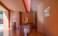
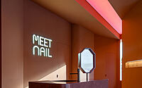
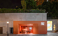
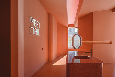
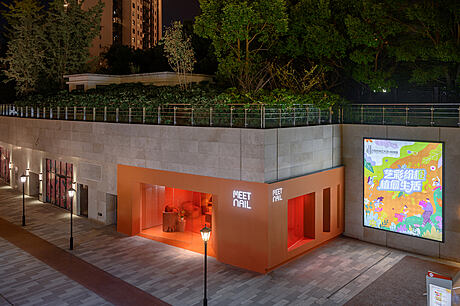
MEET NAIL is a high-end chain nail brand store located in Shanghai along the Xuhui Riverside. With the basement floor serving as the outdoor setting, the site lacks natural lighting. Consequently, the initial design concept focused on “borrowing light” from various angles to maximize indoor illumination.
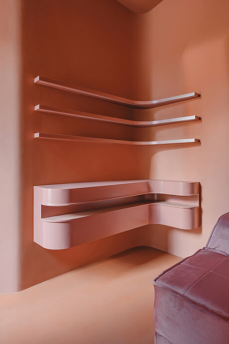
The chosen design theme, “Light in the views,” primarily uses angled corners on the facade, roof, wall, and ground to create a multidimensional perspective with diverse structures. The design combines lighting and natural light to optimize the limited space, showcasing the brand’s unique aesthetic vision through the efficient use of functional areas at different times of the day.
02. Functionalization Scenario: Spatial Division and Optimization
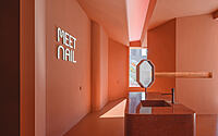
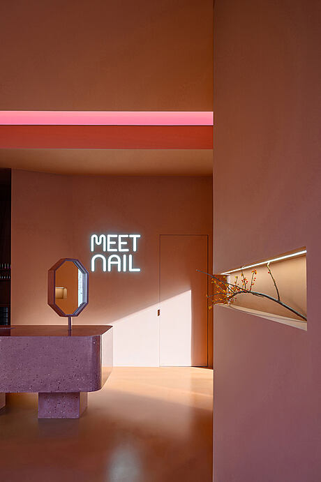
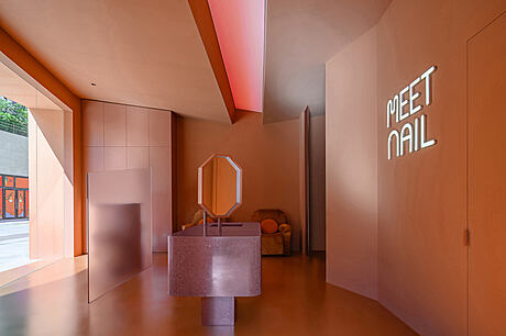
A widescreen light strip in the middle of the ceiling separates the left and right sides by sloping the roof inward. This design takes advantage of the space’s height, optimizing the proportion of the top and bottom structures while showcasing structural richness through layering.
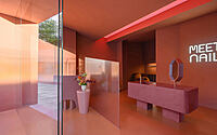
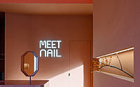
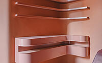
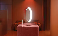
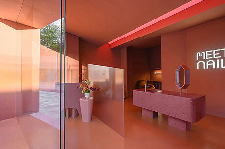
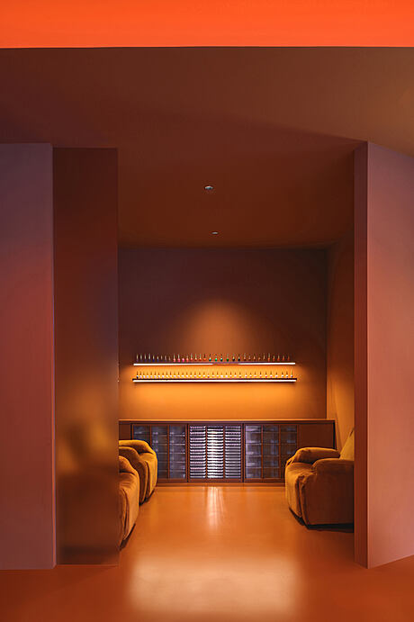
Based on the brand’s functional requirements, the interior space is divided into six sections. To avoid interfering with lighting, plexiglass partitions are installed in the reception desk and waiting area, while folded corners of the walls separate the remaining sections.
03. Recycled Materials: A Sustainable and Unique Touch
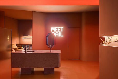
The central operating desk and reception desk are constructed from a self-created, recycled terrazzo material, specially customized for the brand. This unique material features a distinctive surface roughness and consists mainly of recycled plastic and stone particles.
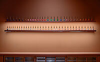
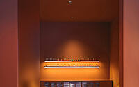
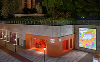
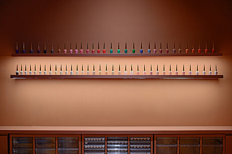
Most of the space is colored in Amber Brown, creating a peaceful and pleasant ambiance. At night, the widescreen, multicolored light strip complements the space, producing a sophisticated atmosphere.
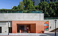
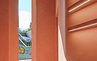
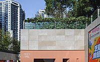
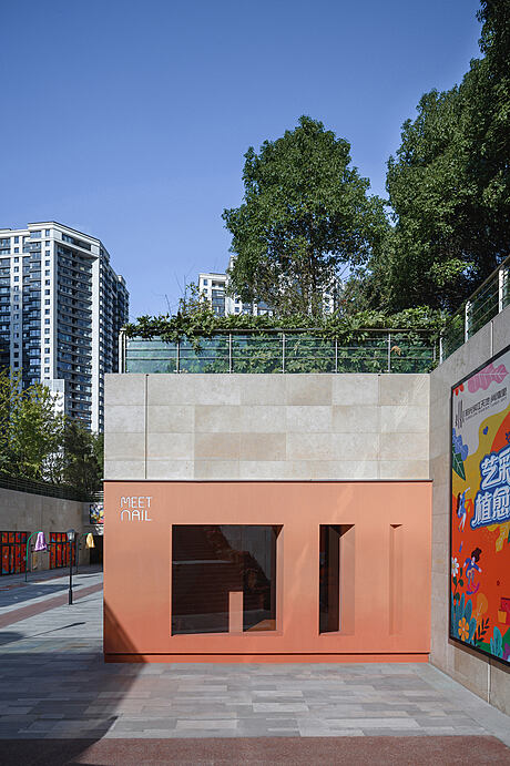
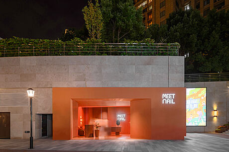
To optimize outdoor natural light, an automatic induction floor-to-ceiling glass sliding door is used, increasing the amount of daylight indoors and amplifying the contrast between the interior and exterior environments. The exterior facade features a gradient color scheme, with the front side structured using the original inclined surface and vertical sides, and the right side employing a triangular inward-cut structure to enhance the sense of hierarchy.
Photography by Freeman
Visit 8877 Interiors
- by Matt Watts