Snigeri by Geometrium
Designed by Geometrium, this stylish apartment is located in Moscow, Russia.



Description by Geometrium
The project was implemented for a young girl. She bought an apartment in the Moscow suburbs. Our task was to make a modern and functional apartment to avoid complex agreement process. Make it comfortable and functional layout, to make it fully consistent way of life ordered it.
During technical requirements compiling we have defined a style, functional zoning, and clearly present all the processes taking place in the apartment. How will the process of cooking, where and how will be located guests well thought out all the possible scenarios rooms. Technical requirements for this project can be found here.
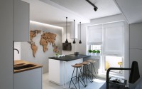
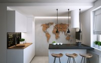
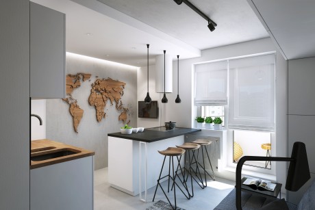
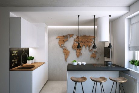
In the kitchen area, we placed the island at will of owner. The idea was that the kitchen area was also living area. A place to chat with friends, discuss plans and drink coffee.
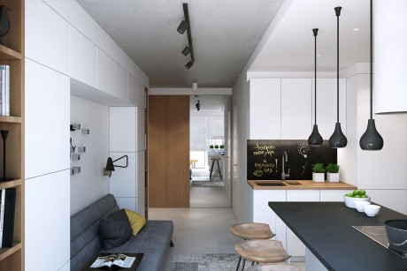
The island is made so that you can chat while cooking with resting on the couch or at the bar. Kitchen turned out to be small but very functional. It has all the essentials that you need for cooking.
TV in the room – the background. In most cases the owner of the apartment does not watch it. So we put it on the arm in the area of cooking. A central element of the wall of the island became the world map, carved, laser-cut plywood. A client travels frequently and she plans to attach photos of places she visited on the map. The idea seemed to us very interesting, and we beat it in a way.
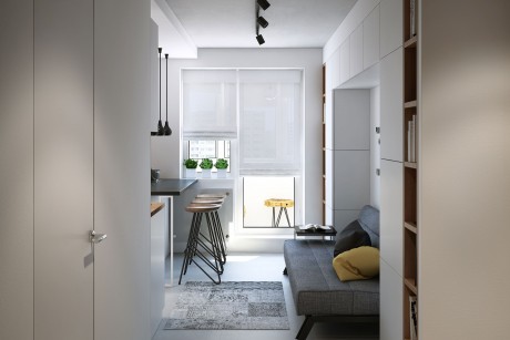
Some of the walls, ceiling and floor are made under the concrete cover. The walls and ceiling – plaster for concrete and floor porcelain tiles seamless concrete under the same tone. Concrete makes the loft a background on which advantageous to look white walls and furniture. This increases the space by combining hall with kitchen and makes the room lighter. We tried to avoid a large number of dark elements, as the natural light falls over the balcony in a small amount.
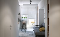
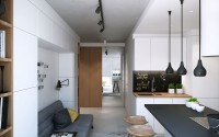
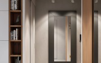
In the hallway there is wardrobe, one door is a mirror. This technique is not random. Firstly, the mirror at this point increases the space, creating the effect of continuing the kitchen space. Secondly, the mirror reflects light from a window, which makes the room lighter.
Apron kitchen we made a special paint that forms a surface, like a chalk board. You can chalk to write “wash their dishes,” some prescription or wish for the day.
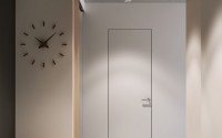
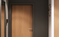
The door to the bathroom, we have hidden to preserve the effect of a homogeneous white surface.
In the hallway there is only necessary. The task was to release the input space of unnecessary items, all can be removed once the cabinet.
Accent a wall with the front door – black. She is in the same plane as the kitchen apron. Thus, the pacemaker in the rooms and they are visually merged. Also, oddly enough, in this case, the black wall enhances the space hallway.
Directly in front of the living room the sliding door
The sliding door does not clutter the space when opens. It is made of white, as a continuation of a white wall. Most often it will be opened and will give the impression of one large space of the kitchen, living room, hallway.
Let us go to the living room-bedroom.
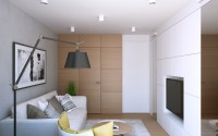
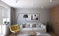
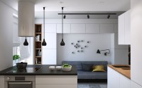
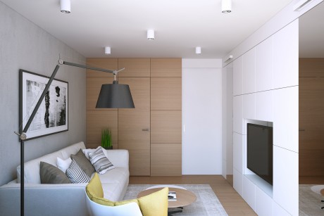
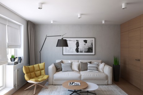
It was important to use the bedroom as a living area, where you could get together with friends, watch TV. It is important to make space for yoga. Therefore ordered it was decided not to put the bed, and the sofa with the mechanism used to sleep every day.
Since client – a girl, naturally it is necessary to place a large amount of clothing and accessories.
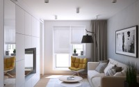
The living room has access to the dressing room. The door to the dressing room hidden in the composition of veneered panels in the same light oak, as in all areas. The wall behind the sofa is made of the same plaster for concrete, visually uniting all the rooms together. The rest of the background in the room is white.
The wall opposite the sofa is composed entirely of hidden storage, which increases the space visually and make it minimalist. All the excess can be removed and nothing will stop. Mirrored doors have two vertical cabinets chance:
1. They increase the space.
2. Give more light.
3. They are functionally justified (one mirror closer to the sliding door, it is necessary for yoga, the second mirror, closer to the window, to be used for make-up, as important natural light).
Above the mirror is light, which gives more functional lighting.
The color scheme remained the same as in the kitchen and hallway, this is done on purpose, to unite these areas. Thus, the apartment seems bigger.
The light in the apartment resolved overhead lights with diffused light, allowing you to keep the height of the ceiling and provide general lighting is bright enough. Graphic black elements – lighting, legs of tables, picture frame – also set a consistent style throughout the apartment.
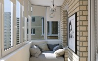
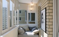
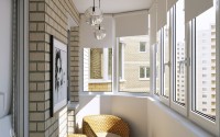
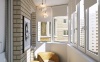
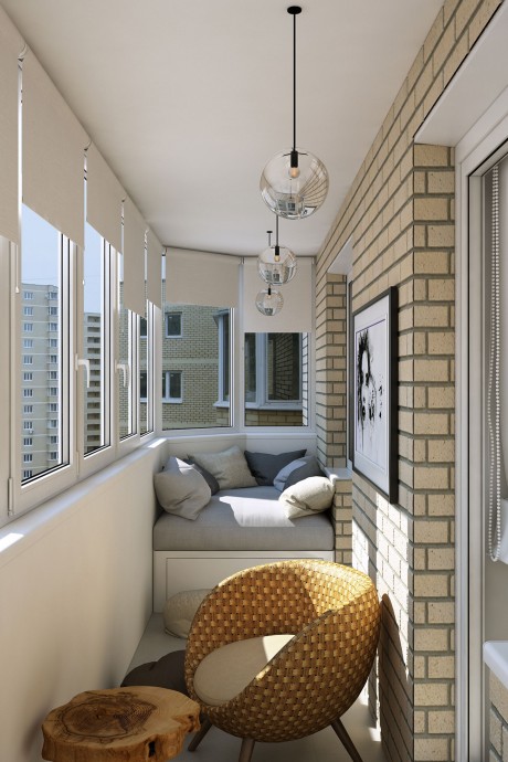
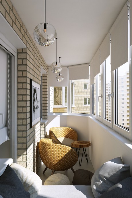
Balcony functionally need to drink coffee and chat with friends, lie in the sun and read a book.
We did a couch in the corner of the room with cushions, where you can lie down and read a book with a cup of coffee.
Also we placed two chairs and a table to retire and talk about life with someone.
The room also has a small ottomans, pillows, which, if desired, can be moved to any of the buildings that housed the company of friends.
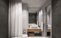
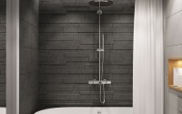
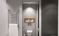
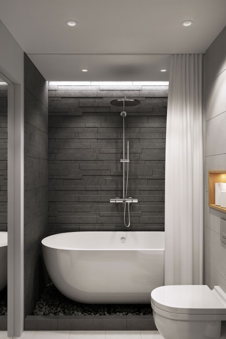
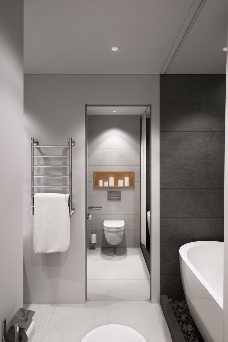
In the bathroom, the main wish was ordered to make a free-standing bath. The decoration of the walls and floor with natural stone slate, on the wall behind the bathroom – 3D-panels from the same slate. Under the bathroom made the slope and drain the water to drip down. On this plane of the floor we put the stones. Thus, we have created an atmosphere of genuine nature, using natural stone and a free-standing bath.
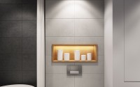
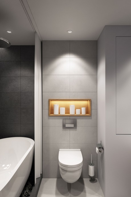
The rest of the floor finish of the same tiles under concrete in the corridor. This tile goes to the wall built sanitary ware.
Opposite the bath has a sink and cabinet. Behind cabinet – a mirror on the wall. Thus, we visually increase the space in half and creates the effect of soaring stone.
Photography courtesy of Geometrium
- by Matt Watts