Apartment in Budapest by Margeza Design Studio
Located in Budapest, Hungary, this contemporary 1,410 sq ft apartment was designed by Margeza Design Studio.


Description by Margeza Design Studio
On the western bank of the Danube, in a building built in the 1890s, we found this dilapidated apartment. We demolished everything inside, including the walls, then rebuilt it.
Our goal was to create a well-functioning, airy, joyful home, where it feels good to wake up, and where one gladly arrives after a tiring day.
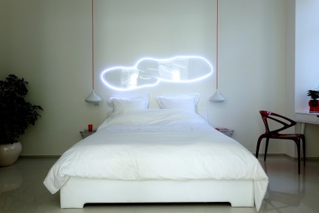
The keyword of the basic design was functionality. We had a 131 sqm apartment to play with, where the biggest advantages were the windows: 8 opening on the street, and two more on the courtyard, and the west-east orientation of the apartment. Because of the proximity of the Danube, we chose the wave as the main motif.
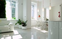
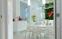
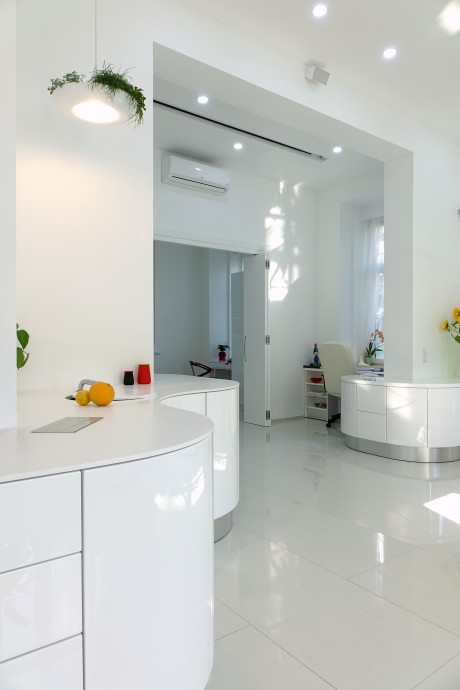
In any event, we wanted 3 bedrooms and a living room. After some concessions, we managed to do this by putting the kitchen and the living room in the same space. This is an often used design in modern furnishings, but was made more difficult by the irregular, ‘T’ shaped support coloumn in the middle of the apartment.
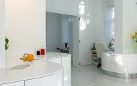
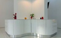
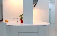
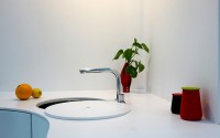
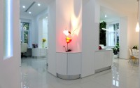
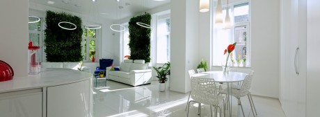
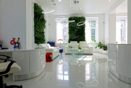
Since we could not alter this, we ‘surrounded’ the coloumn with the kitchen. We did not put in any upper pieces, as we wanted to emphasise the nature of the room. The material of the Corian counter was made using invisible connections, and truly flows around the pillar.
The kitchen furniture was both designed and built to be here. 8,5 metres, it conceals a great amount of holding space.
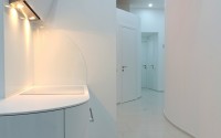
For us, a room does not have to be a square, any form will do, its walls could even be wavy, but the important part is: they must be functional.
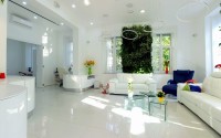
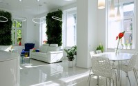
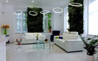
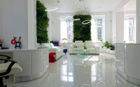
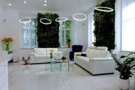
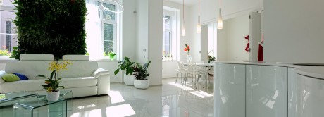
The living room is not walled off from the bordering dining room and workspace on the other side. Neither is really separate from the central area, the living room, which is crowned by the two living green walls.
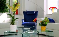
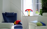
These are each equipped with automatic watering systems and lights. They create wonderful microsystems, it is not a surprise that the blue armchair between them is almost always ‘occupied’. This spot is the favourite for all members of the family.
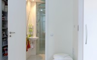
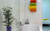
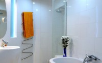
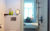
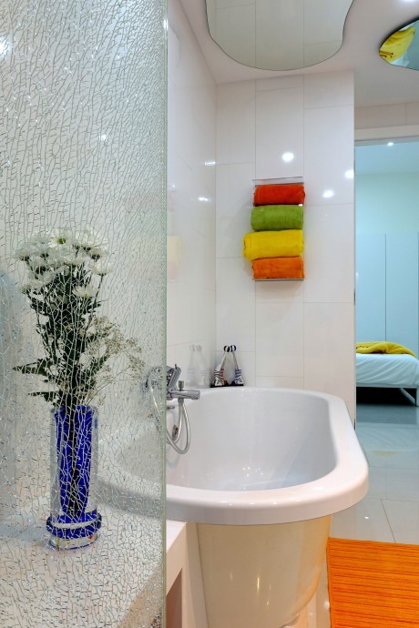
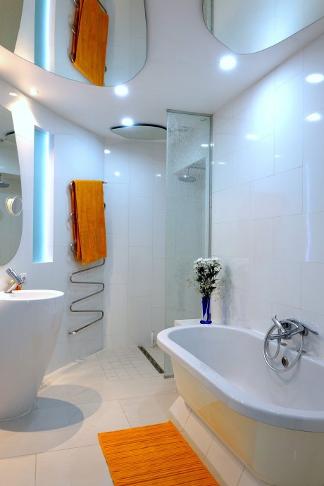
The ceiling height is 3.6 m, so we lowered it in the bathrooms, and thus created storerooms above them, which hold many miscellaneous things (luggage, ski bars, rarely used items). In the bathrooms, mirrors were placed on the ceilings, to make them seem larger. Both main bedrooms have their own bathrooms. One of the bathrooms is open on two sides, providing entry from the bedroom and the sauna as well.
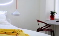
We put the guestroom on the courtyard side, where the less light is ‘boosted’ by the colour yellow. Next to it is the guest toilet and a household storeroom. Here are the controls for the floor heating, the inner-outer watering systems, the heater, a washing machine-dryer, the cleaning robot, the water purifying system, a wine cooler, and a classic pantry shelf. It is a very useful part of the apartment.
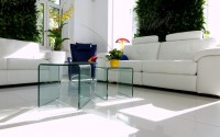
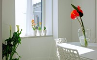
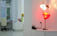
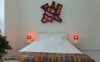
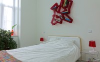
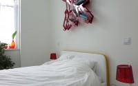
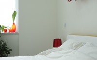
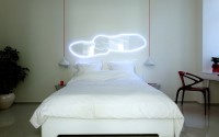
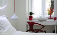
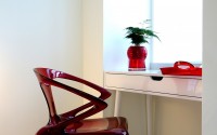
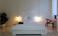
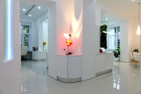
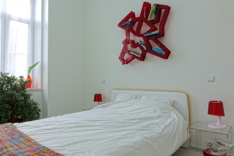
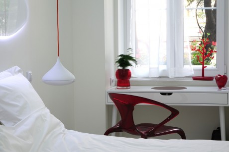
The main paint is white, which was made livelier by spots of colour. The vivid vases and decorative items make the white background more joyful. The many plants bring nature to mind.
The furnishings were designed or collected by us to provide an airy, young, happy atmosphere mixed with the elegance of the noble materials. Living in the apartment we believe we managed to reach our goal: to create harmony
Photography courtesy of Margeza Design Studio
- by Matt Watts