Mais! Bistrô by Syndrome
Located in Porto Alegre, Brazil, this inspiring restaurant was designed by Syndrome.

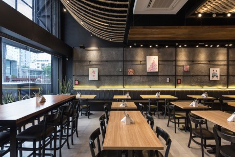
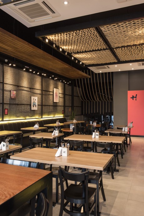
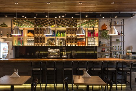
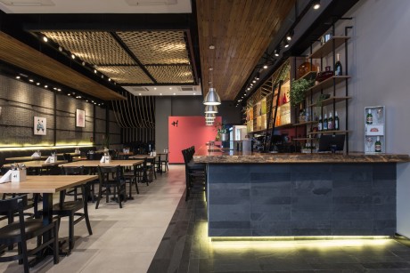

Description by Syndrome
The project Mais! Bistro Impermanente emerged in co-creation with the dream and the client’s willingness to create a business and a space that made sense in a broader way. Mais Bistro Impermanente assumes that we – as a society – offer a little more to our context, regardless of the proportion of our attitudes.
The strong business purpose in generating welfare reflected and contributed directly to the development and concept of the architectural design. The initial inspiration from Venice Beach, California, was adapted to the city and the public of Porto Alegre. The goal was to develop a democratic and versatile space, in which everyone felt the urge to connect and interact at all times, combining the idea of creating a single place of young and contemporary language.
Demand was straightforward: designing a bar / restaurant and an outdoor living space on a property located at Rua Silva Jardim, 298 – Auxiliadora –
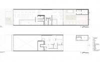
with 270 square meters of built area and 110 square meters of open area. In the building it was necessary to distribute a broad program of needs that has been separated into different spaces: the ground floor, upstairs, downstairs, front outside area and back outer area.
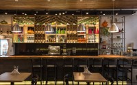
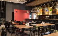
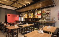
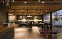
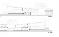
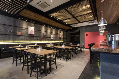
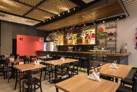
On the upper floor is where all the production part is located: kitchen, warehouses, pizza oven, freezer, toilet for staff and office. The outdoor area of the front – besides concentrating all water facilities, gas, energy and waste storage – was designed to receive a bike rack. On the ground floor (at ground level) there is the main hall with seating for the public, a large counter for bar service and cash, the bar support area, a small deposit and a toilet for people with special needs.
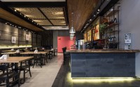
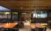
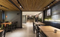
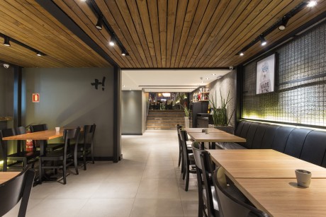
A wide staircase lined in pinewood directs the audience to the hall tables downstairs (same level as the back area). In this space there is an area of support to the waiters, male and female toilets, one second lower bar reception desk, lounge and tables area.
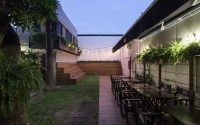
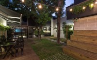
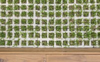
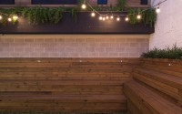
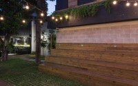
On the same level of the lower hall, but in the outside area of the restaurant, there is the living area. A wide deck area, wooden bleachers and projection screen videos make up the space that uses plenty of green, through grass, ferns and climbing vegetation. A structure of concrete blocks was built to be used as support and backup for the restaurant; there are the deposit, laundry, toilet and cloakroom staff.
Materials:
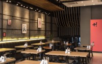
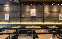
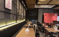
Simple materials and to great effect, transform the whole atmosphere of the place. The slurry mortar with black dye came as a low cost alternative to coating the walls with wire mesh structure for the exhibition of paintings. The counters of bars and pathways on the floor to mark the environments were covered with stone strips natural black slate. The tops of the branches of the bars are in Angelin wood tinged with lacquer glossy PU paint.
Lining:
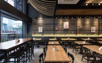
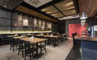
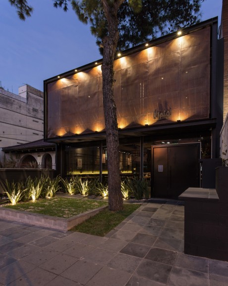
Sisal ropes give a strong identity to the project. The effect and reaction of surprise by the unusual use of this material impresses with simplicity. In front of the restaurant, where the walk right is more than 5 meters, the ropes were installed to bring more comfort and generate an interesting aesthetic effect on at the moment of arrival at the restaurant, reducing the walk right with a power element and at the same time offering visual permeability. In the central area of the restaurant, the ropes were woven in a metallic mesh structure in different directions, creating movement and rhythm. This structure, in addition to aesthetics, has the luminaire according to the environment, since all assembly lamps are directed towards the ropes to reflect the effect of the hall light and shade. Dyed pinewood planks were used in the lining of the lower hall and structures suspended in the upper hall. The installation with spacing between the rules eliminates the monotony of the liner.
Facade:
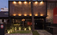
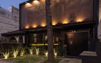
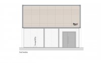
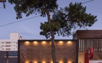
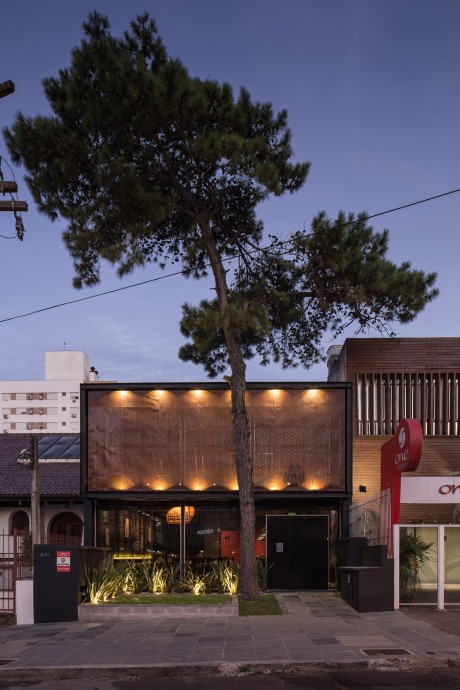
The goal was to generate identity and highlight the project without deconstructing the existing glass layer facade on the property. The visual permeability between the interior and exterior and natural lighting were desired, but would need to be alleviated. The solution was made by creating a frame metal structure and applying perforated steel sheets therein, leading to the “brise soleil” concept. The choice of this element allowed the reduction of sunlight inside the restaurant, and even then, the view of the elements of the rope lining with night lighting.
Furniture / Color:
Since the goal of the bistro is impermanence by constantly changing menu, decoration, exhibition boards, layout tables, among others, we opted for the choice of furniture and materials with neutral and timeless colors (wood, gray, black and white), so as not to interfere with this process of change and prevent unrestricted use of color and decor throughout the space.
Photography by Marcelo Donadussi
Architecture by Lívia Fonseca / Mariana Andrade
- by Matt Watts