Apartment in Ivry-sur-Seine by Prisca Pellerin
This cozy attic apartment located in Ivry-sur-Seine, France, was designed in 2013 by Prisca Pellerin Architecture & Intérieur.





Description by Prisca Pellerin Architecture & Intérieur
This project is a complete renovation of an apartment 2-room attic.
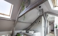
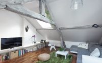
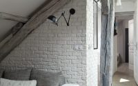
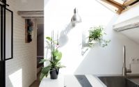
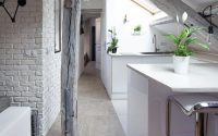
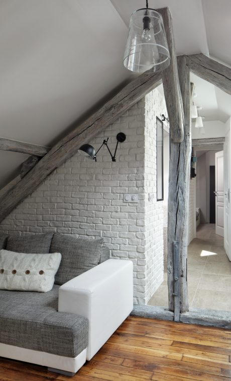
To enhance the quality of light of that “cocoon” housing, the bias has been to open up the spaces (decompartmentalisation, amplified perspectives, transparency of Parisian artist window frame… ) and playing on different shades of white and grey, specially thanks to different textures : glossy lacquer, matt and satin paint, polished concrete, leather and suede, linen, brick , white wood stain…
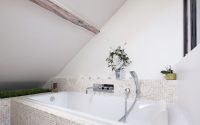
The choice of white color does not exclude the warm and welcoming character of this small space : clean and simple, the decor is complemented by the plant, which takes pride of place in the apartment, bringing freshness and a key outside .
Initial state
The apartment is full of defects and very damaged by time and the carelessness of former occupants : dirty floorings and black beams, low ceilings, levels differences, outdated coating, badly-planned bathroom and tiny kitchen area… The challenge was to convert this small and unhealthy attic into a worthy housing of the name !
The project
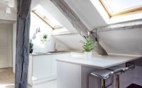
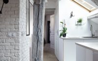
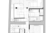
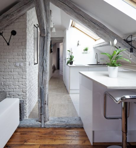
To offset the low height under sloped ceilings, the architect chose to decompartmentalize maximum space to let circulate the look and light. From the bedroom to the living room, the eye finds no obstacle in its way, thanks to the effect of “funnel” of the central corridor, which is the point of convergence between all the functions of the apartment. The walls, the floor tile design and the kitchen bar depart from the axis to accentuate the perspective, creating a space larger than it actually is. Increased printing with the choice of low-height furniture.
In order to create a warm and cocooning place, walls and sub-slopes are clothed in white and light gold grey. According to the path of the sun, the choice of textures (brick, gloss, matt and satin paint, polished concrete, leather and suede…) creates a dynamic play of shadows and lighting throughout the day, and strengthens the feeling of space, highlighting the sculptural structure.
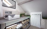
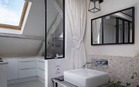
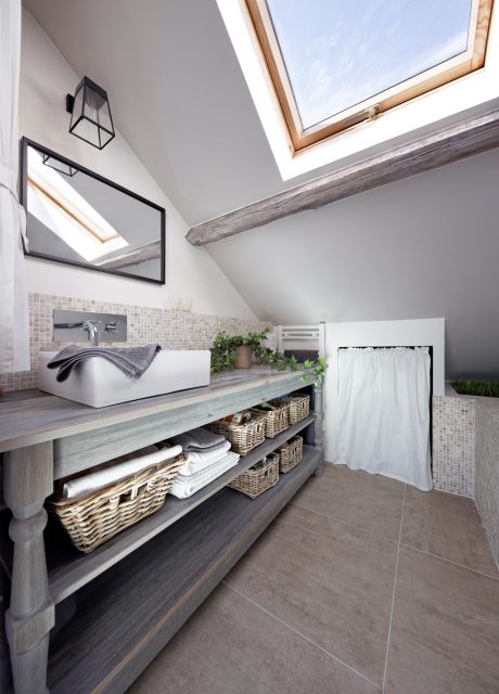
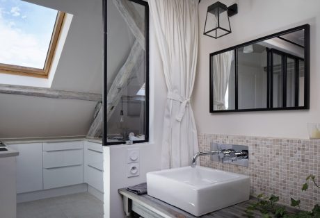
Behind the Parisian transparent frame and door metal workshop, the bathroom is the centerpiece of the apartment with his old clothier table. Winter garden with its plants the day and light box the night, the bathroom becomes an intimate space where the linen curtain is deployed. In the back of the bathroom, another curtain hides the washing machine.
Opposite, the cuisine is discreet and minimalist. But no question of losing in comfort : 2 meters away, a large combined fridge / freezer secretly took his place next to the hall closet .
Small but practical, the suspended toilet bowl even welcome a small green sink for hand washing, thanks to a low height support frame (H.82cm ), in which an extra flat siphon is integrated. The toilet is the only blind room of the apartment, painted in a dark gray paint to chalk. If the apartment is white and clean, the toilet is the place of all fantasies for guests !
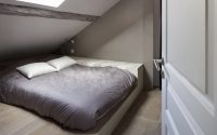
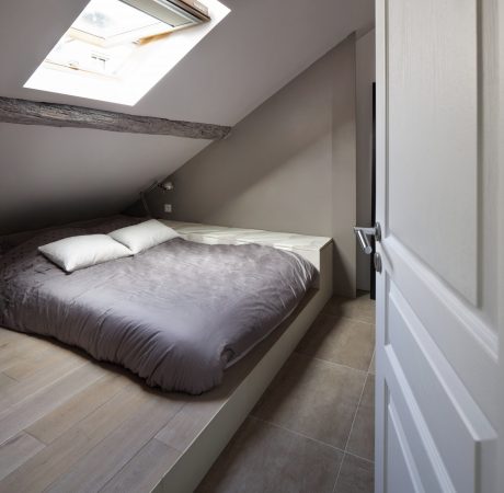
Finally, the bedroom is a cocoon space specially created customized with a wooden platform welcoming the bed and cupboards covered by leather and suede.
Details
If the floor of the living room has been kept after cleaning, sanding and vitrification, elsewhere the floor was substituted because of its poor condition. On the joists, a wooden waterproof flooring was laid to standardize the floor except under the stage of the room, to get deeper storage under and around the bed.
The insulation was completely redone (mineral wool + thin insulation).
Each square meter has been designed for optimal occupancy : in addition with the customized storage, the hot water tank is hidden in sub-slope.
The front door is at the bottom of the stairs.
Photography by Hugo Hébrard
Visit Prisca Pellerin Architecture & Intérieur
- by Matt Watts