Vidalta by Elias Kababie Kamhagi
This amazing Vidalta apartment is located in Mexico City. It was completely redesigned by local architect Elias Kababie Kamhagi this year (2012).


Description by Elias Kababie Kamhagi
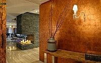
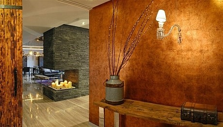
For the interior design of this apartment it was generated a full atmosphere that describes perfectly the lifestyle of the family who lives it. One of the major challenges was the selection of furniture and accessories that, in combination with the finishes and the color palette, shaped each one of the different ambiances. The first thing that catches your eye in the hall is a wall covered with copper foils that leads the view in to the apartment.
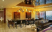
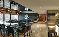
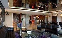
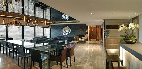
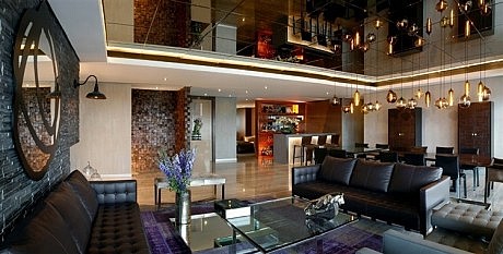
The living and dining room area is flanked by large windows on one side and the hallway leading to all areas of the apartment on the other. To increase light and height, a mirror plafond was installed across the whole ceiling resulting in a dramatic effect, intensified by the glare of the light marble floors. The dining area is emphasized with a long row suspended lamps with a slight variation in height to give a subtle movement on top of the rectangular and square tables that conform the dining table.
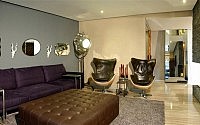
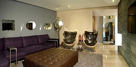
In this space also stands out the combination of leather, wood and glass of the different furniture in both environments, creating an atmosphere full with dark and amber colors and textures broken only by the contrast of the warm purple carpet in the living room. The thick wall that divides the living room from the family room is covered with slabs of black stone whose motion give a nice texture enhanced by the light from windows and ceiling.
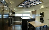
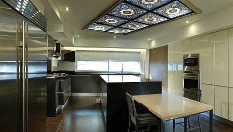
One of the most important concepts for the design of the kitchen of this apartment was the incorporation of details that refer to the tradition of the family differ from the established parameters. On the ceiling was placed a classic Persian carpet framed in acrilyc, giving the room the warmth of the fabric and textures, and a bold splash of color. Another important issue was the distribution of the cooking areas in accordance with the canons of the religion, for which two separate islands were installed, one for the preparation of food that includes meat and other for the preparation of food including dairy products.
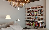
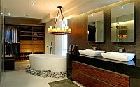
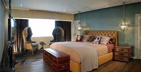
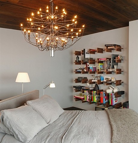
The three bedrooms were located in the private area. The guest room has a very simple style generated with a group well selected elements. The secondary room was developed according to the user’s personality and needs. The master bedroom is also simple, but with elements carefully selected to enjoy the stay in space. The master bedroom has a generous bathroom with dressing room with a nice combination of natural and artificial light.
- by Matt Watts