Pineapple Loft by Resolution: 4 Architecture
Resolution: 4 Architecture designed this warm loft located in Brooklyn Height, NY, back in 2003. Still looks awesome … and trendy. Get inspired!

Description by Resolution: 4 Architecture
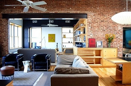
Located in Brooklyn Heights, this loft was conceived in two phases. Phase I consists of the two window bays closest to egress stair, while phase II consists of the addition of a third window bay with its adjacent perimeter wall, transforming the previously two window loft into a spacious corner apartment with two exposures.
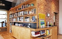
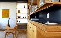
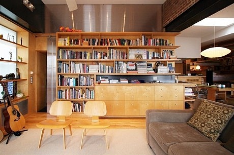
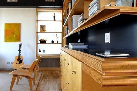
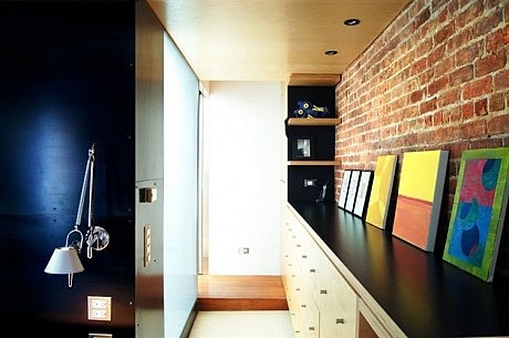
In phase I, public and private spaces are defined yet linked by a permeable zone of cabinetry along the existing line of structure. This “shim wall” directs ones view towards the stage of the space: the magnificent view of the Manhattan skyline through the window. The directionality of the space is further emphasized by the forward thrusting kitchen island/dining table element. The “shim wall” also serves as a light-filtering device, through the extensive use of Lumasite panels in its construction, emphasizing the permeability of the spatial divider between public and private zones in the context of family living, while allowing light to reach all spaces.
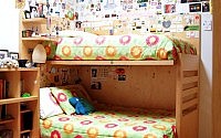
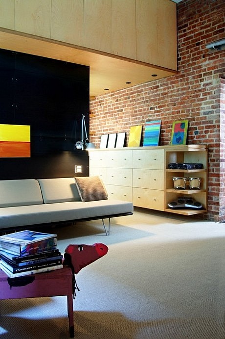
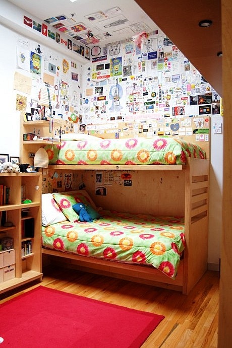
Designed as a continuous element intended to link spaces along it and through it, the “shim wall” serves as a matrix against which different elements of the program are registered. To that end, specific elements are inserted into it in response to specific uses: a sleeping/play zone for the young children in the family off of (and almost an extension of) the kitchen zone, a serving counter at the dining area, a media center at the sitting area. It is a wall to look at, look along, look through, walk through, store into, and store one-self into.
Phase II extends the sitting area in the direction perpendicular to the view, while adding a master-suite. An L-shaped cabinet is used as the elbow between the two spatial zones. The “shim wall” is sistered yet not rivaled by a like element, which allows the space to turn the corner, successfully unifying the various public areas.
This loft renovation illustrates the adapt-ability and expand-ability of a coherent tectonic/spatial language that is able to seamlessly redefine itself in response to the changing dynamics of family life.
Visit Resolution: 4 Architecture
- by Matt Watts