W Apartment by AworkDesign.Studio
Designed in 2018 by AworkDesign.Studio, W Apartment is an inspiring apartment located in Taiwan.


About W Apartment
Urban Oasis: Villa VM
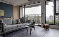
Perched on the 14th story of a Taoyuan high-rise, Villa VM revels in panoramic vistas and abundant sunlight. A youthful couple, along with their energetic two-year-old, cherishes this abode as their inaugural home. They’ve maintained the original “three-bedroom, two-living-area” blueprint to welcome family while safeguarding a playful nook for their child. They entrusted the designer, guided by their preferences and child safety, to infuse the space with personality.
First Impressions: The Foyer
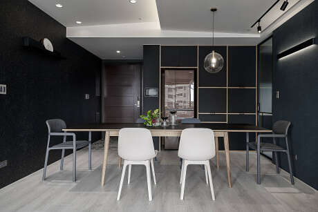
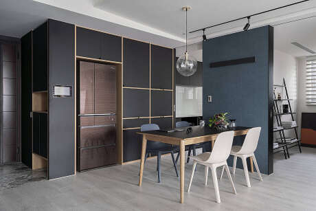
Upon entry, the foyer presents grey hexagonal tiles (measuring around 0.5 meters or nearly 20 inches) framed by two black walls. To the left, a voluminous cabinet crafted from black Melamine Plywood conceals shoes and sundries. Oppositely, black embossed wallpaper introduces texture. Further in, French windows usher in a zestful connection to the outdoors, invigorating the open space.
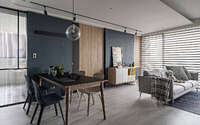
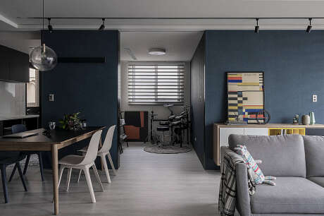
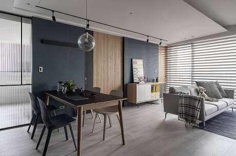
Meanwhile, an angled white ceiling opens up the area, evoking the airiness of an eave. Subdued interior facades contrast this expanse, cultivating depth. Additionally, a trapdoor and sliding door on the left inject a refreshing dynamism into the kitchen and study. Here, dark blue walls, oak veneer, and glass elements intertwine, suffusing the area with light and warmth. The semi-open study serves as a haven for family activities.
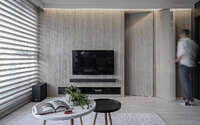
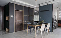
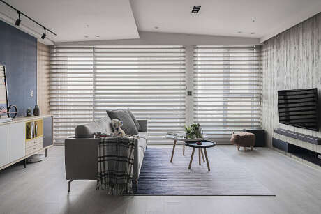
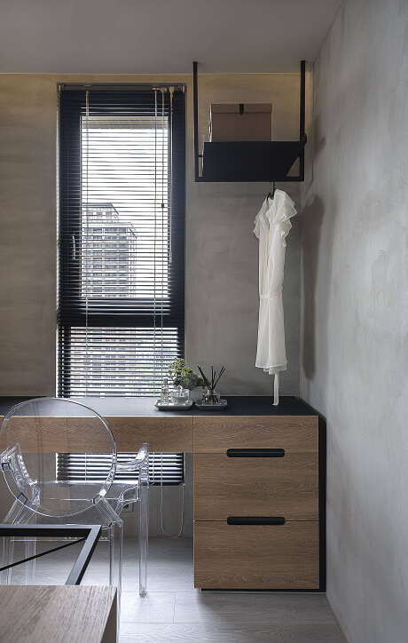
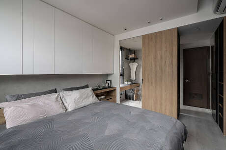
Furthermore, the right-side TV wall, adorned with a faux finish, conceals the master bedroom and storage, ensuring a clutter-free facade. Beyond the foyer, the dining room houses a cupboard for culinary essentials and a strategically placed fridge expands storage possibilities. The master bedroom’s design echoes the living area, prioritizing cabinetry over movable furniture to safeguard their toddler. Significantly, a circular walk-in closet, the wife’s treasure, segments attire while amplifying light.
Harmonious Habitat
Ultimately, varied renovation materials are masterfully employed to cultivate a snug environment. Here, natural light dances with playful contrasts against a canvas of intentional emptiness, fulfilling the family’s desire for a stylish, secure sanctuary.
Photography courtesy of AworkDesign.Studio
Visit AworkDesign.Studio
- by Matt Watts