House of 3 Frames by Megha Kedia Design
House of 3 Frames is a clean minimalist apartment located in Bangalore, India, designed by Megha Kedia Design.

Description
This is a 3 BHK apartment on the 25th floor of Nikoo Homes, Bhartiya City in Bangalore. This is a family home executed considering the client’s requirements which is clean, simple, minimalist with neutral color scheme. The idea is to blend harmony between aesthetic and functionality.
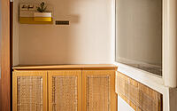
At the entrance we have created shoe storage along with some open cabinets and seating merging cane & light wooden finish. On top of the cabinet there is a name plate.
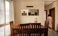
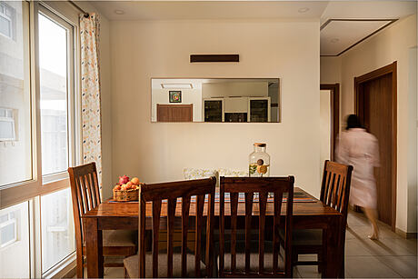
Once we enter inside, there is a wooden dining table with chairs & a bench, this is the integral part of the house which serves multi purpose usage of the space. At times the same unit serves as a WFH set up. The wall has a rectangular mirror which adds reflection and enhances the look. On the other hand there is a crockery unit which holds maximum storage in the house. We have used a combination of laminates from MerinoLam along with tinted glass on its shutters.
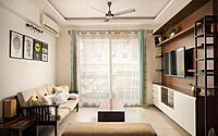
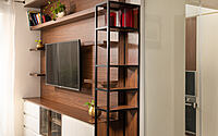
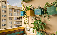
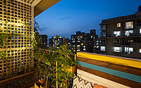
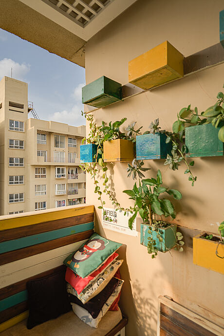
Moving ahead, there is a Living area which has one side of seating space and another wall of the TV Cabinet with few displays. We tried to mix metal and wood to add warmth. There is plenty of natural light flowing from the huge windows in the main area, It gives a breezy and fresh feel to the space. Adjacent to the living area, you see greenery from the balcony and one can always feel fresh and it makes the room airy.
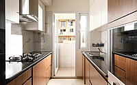
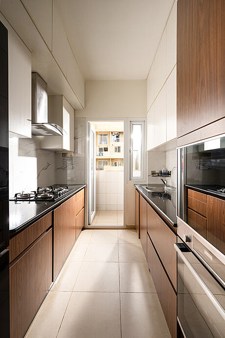
Behind the TV wall, there is a parallel Kitchen, material used here is laminate. We have added a transparent glass door at the entrance. There is a small utility area at the end for washing and extra storage. We have provided ample storage in the kitchen.
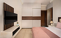
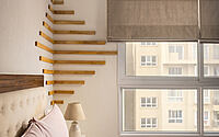
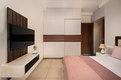
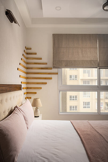
Next to that is Father’s room. It features a sleek TV unit with curved edge and wooden panel. The highlight of this space is horizontal wooden planks at the corner wall which is blending with the subtle wallpaper and roman blind. The color palette used here is beige and white with a touch of wood considering the age & taste of the client’s father who is a retired Railway officer.
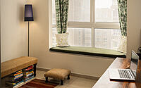
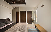
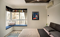
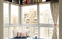
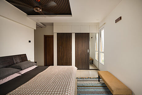
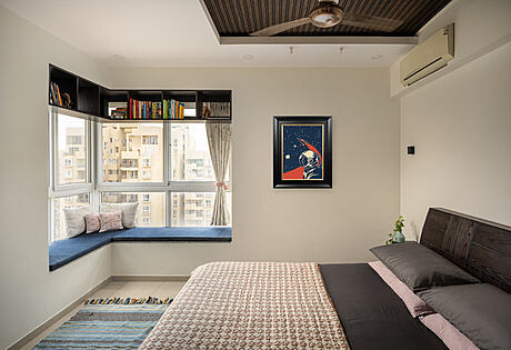
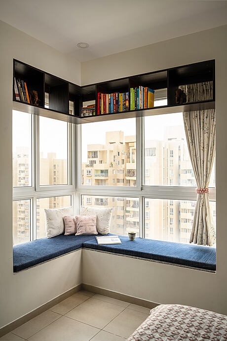
On the opposite side it has 2 bedrooms which is a Master bedroom as well as a reading & Home office. MBR housed a king size bed with minimal side tables and full utility wardrobe. The x-factor of this room is its bay window and its reading storage above. Sipping tea in the morning or viewing sunset in the evening is the best utilization of the space.
The third room has a home office setup along with seating & storage. The color scheme here is neutral with adding green of nature.
I am attaching herewith the files of the photoshoot done, please feel free to use the photos which you seem to best fit this purpose and let me know if any further detail is required to feature this.
Photography by Sudhir Damerla
Visit Megha Kedia Design
- by Matt Watts