Mercurius: Industrial Evolution into a Modern Antwerp Home
Immerse yourself in the transformative journey of Mercurius, a house located in the heart of Antwerp, Belgium, masterfully reimagined by Contekst.
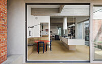
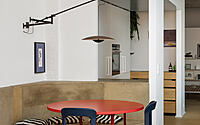
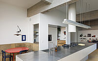
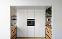
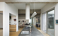
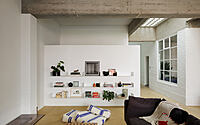
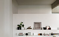
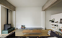
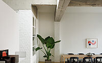
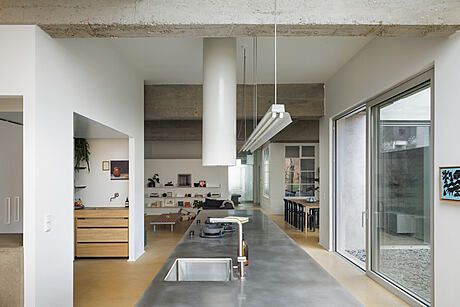
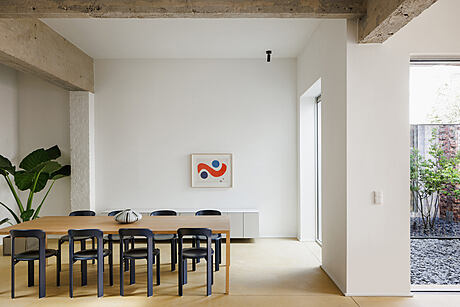
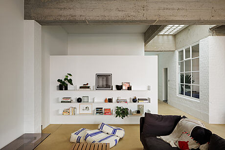
Seamlessly blending industrial and modern design elements, this 2023 project repurposes a former production space and owner’s flat into a functional, light-filled living area. Noteworthy is the unique blend of past and present, evidenced by the sandblasted concrete beams, the salvaged factory lighting, and the subtle Art Deco influences, contributing to a truly distinctive home experience.


About Mercurius
Breathing New Life into Industrial Spaces
Originally, the designers conceived the building as a duplex of sorts—housing a production space on the ground floor and an owner’s flat on the first floor, each with its own access. Over the years, the ground floor has donned many hats, transitioning from a meat processing plant to a car shop. However, as Antwerp’s landscape shifted towards residential living, repurposing the ground floor for residential use emerged as a natural progression.
Infusing Natural Light and Privacy
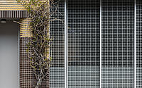
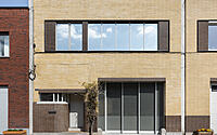
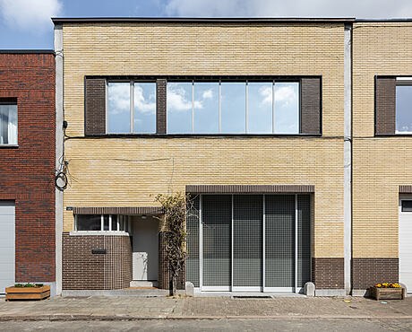
In their quest for brightness, the designers replaced the old industrial gate, introducing natural light from the street side. Their innovative solution? A gate constructed with plastic grilles set into steel frames and mounted on guides. This clever design, harmonizing with the yellow brick facade, ensures privacy without sacrificing light.
Designing for Daytime Living
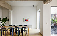
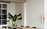
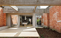
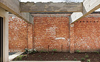
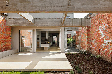
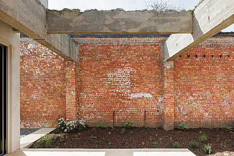
Respecting the grid of the existing concrete structure, the architects shaped the layout of the ground floor. Here, they focused on daytime functions. They sandblasted the concrete beams, enabling them to take center stage both inside the property and in the garden. In response to these structural elements, they created a playroom and utility room. They also transformed the former superintendent’s office into a modern home office.
Celebrating the Past through Reuse
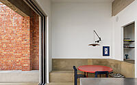
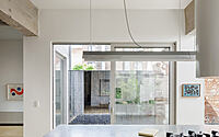
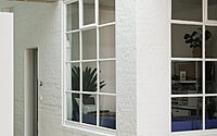
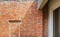
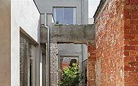
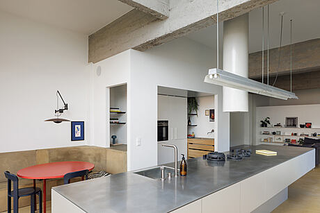
In this project, reuse extends from the macro to the micro. For instance, the team updated the factory lighting to contemporary standards, repurposing it as a pendant above the kitchen. In a bold move, they demolished a large portion of the industrial space to make way for a generous terrace (floating towards the garden) and a verdant city oasis. The exposed brick walls narrate the site’s industrial past.
Preserving Art Deco Influences
Upstairs, the designers preserved some of the flat’s original Art Deco elements. The characteristic round arches of the former living space now demarcate the bedroom and dressing room in the redesigned layout. A unifying feature throughout the spaces is the restored mosaic parquet flooring. Furthermore, they strategically used ‘inserts’ to retain other vintage elements, such as solving the shower and bath combination in the former dining room.
Photography by Evenbeeld – Philippe Corthout
Visit Contekst
- by Matt Watts