Pocket Passiv is a Highly Efficient Sydney House by Anderson Architecture
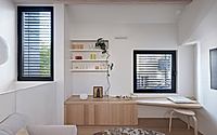
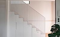
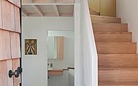
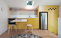
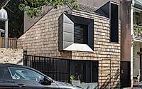
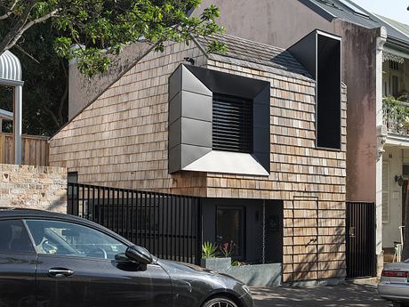
Pocket Passiv, a compact house designed by Anderson Architecture, is nestled in the inner-city suburb of Glebe, Sydney, Australia. Designed in 2023, the residence follows the Passivhaus Plus Standard. It efficiently utilises its 27-square-metre (290-square-foot) space with a split-level layout. The design features an asymmetrical pitched roof and a facade clad with timber shingles, integrating both historical and modern elements to create a net zero energy building.

Pocket Passiv offers environmentally conscious housing
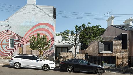
Pocket Passiv, located in the inner-city suburb of Glebe, occupies a 27-square-metre site formerly made up of unused space around a corner terrace house.
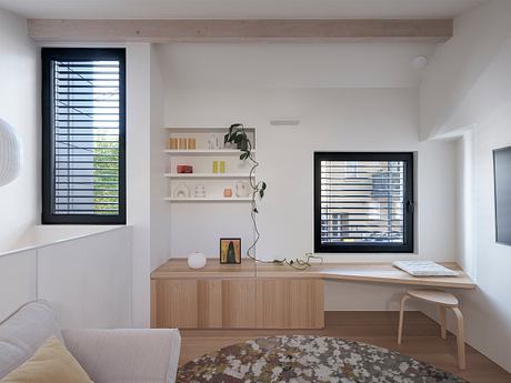
Pocket Passiv takes its name from Passivhaus Plus, an advanced low-energy design standard. With its envelope designed to optimise insulation and air-tightness, and its roof covered with solar panels, the studio is so energy efficient that it generates as much energy as it consumes.
“Passivhaus Plus further acknowledges the building’s ability to generate as much energy as it consumes – ultimately becoming a net zero energy building,” said the architecture studio.
Terraced house studio designed to defer to neighbours
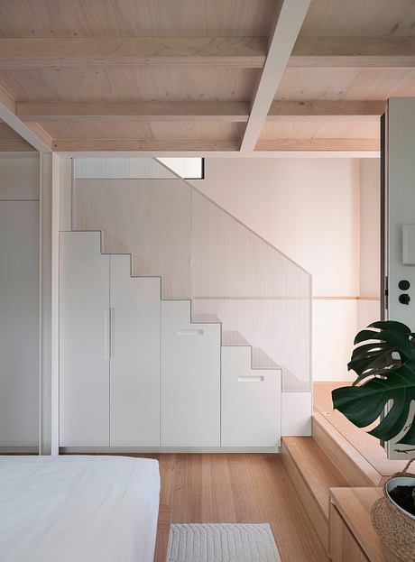
It has an asymmetrical pitched rood that allows for solar cells behind and defers to the historic terrace houses on two sides. It also creates additional height within the Two-storey structure, which sits about a metre below street level.
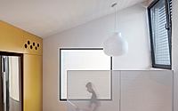
Above a combined bedroom and study on the ground floor, the angled roof creates a dramatic, double-height effect in the bathroom, which features a freestanding bath framed by a picture window.
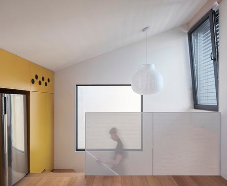
The building’s design gives it a distinctive identity – the ridgeline leans out towards the street – evoking the eye of a cheeky character peeking out from the corner of a room. This almost fictive quality is enhanced by a repeated, scallop motif applied both as roof tiles and to the building’s exterior shell, reminiscent of scales.
Because the street-facing facade is slightly tripartite, the tiles here sit at changing angles to lend a somewhat unpredictable texture to the facade.
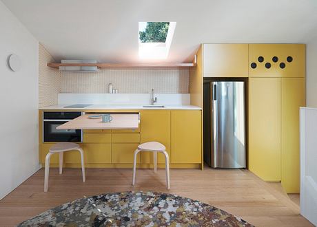
“Beyond its impressive energy-efficient design and construction, Pocket Passiv offers an example of a rare yet needed typology of inner-Sydney residential housing,” it added.
The architects intend for this hyper-local spatial and formal resolution to inspire a broader discussion about atypical, non-extractive, non-wasteful land use in urban contexts.
Photography by Tom Ferguson
Visit Anderson Architecture

