Vaulted Monochrome House by DIG Architects

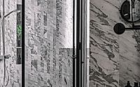
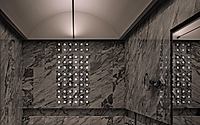
DIG Architects has completed the Vaulted Monochrome House in Mumbai’s central suburb. The 4300-square-foot (399-square-meter) apartment was designed with a minimalist approach to create a clutter-free and cozy space for a socially active family. Its architectural centerpiece is a vaulted ceiling, complemented by elements like a gabion wall and Ceppo-De-Gre stone.

The design, characterized by a monochromatic palette, seamlessly integrates social and private areas, with adjustments made to accommodate the family’s functional and aesthetic needs.

Minimalist living room with modern furniture, circular lighting fixture, and textural elements.
The owners of this space are a family of four. The husband is a founder of a closed fund and wife a PHD scholar ably assists him in his venture. The couple has two grown up kids doing their advance studies in foreign countries. The core requirement of this family was to have a clutter free cozy space with emphasis given on functional planning and at the same time a breakaway aesthetic. Also due to their social nature/status they wanted a space that was inclusive and could serve as a perfect entertainment pad.
Modern minimalist living room with textured gray sofa, abstract wall art, and pendant lighting.
As it stood, we had worked extensively with the couple previously due to which there was that comfort and mutual understanding from the get go. Throughout the designing process there was a certain trust that the clients had put in us as they had seen our work over the years and were familiar with the peculiar way we look at things related to interior designing. Wanting to create that unique aesthetic experience we looked towards architecture for inspiration. After a few initial discussions the idea of architectural vaults fascinated us. Thus we decided to use it as a primary element as a part of ceiling and be consistent with its exploitation throughout the space lending it more authenticity. Along with that elements like gabion wall, solid glass bricks, Ceppo-De-Gre stone shared this very architectural intent. On the other hand we wanted to be pretty miserly and minimalistic with our material palate. This gave rise to a monochromatic space. So as an end result we wished for, and worked towards a space that was niche, minimalistic and social.
Sophisticated modern interior with geometric ceiling, plush sofa, and statement lighting.

Apartment size + Way the structure was handled

This apartment is nestled in the central suburb of Mumbai, with a carpet area of 4300sft. Our scope was to design the apartment from the bare shell status to its completion. The bigger chunk of existing planning was maintained however changed were made to open up certain spaces of importance. The master walk in wardrobe was increased in size along with bathroom space. This increase in area was accommodated in the adjoining bedroom which was converted into a study. In the living room space an alcove was created to accommodate a decently sized fully serviced bar along with the main entrance lobby. This resultant increase in space spilled over into the kitchen prompting a complete replanning of it along with the servant quarters. Throughout the apartment smaller shifts of walls and partitions were planned to increase efficiency of the given space.
Minimalist dining room with a large, round pendant light, marble floor, and textured wall panels.

Key features

In continuation to the architectural theme, the bar was imagined as part of this huge black scoop that started at the main entrance of the house and stretched till the entrance to the kitchen. The materiality of this scoop was black ceramic floor, black PU coated walls and ceiling. The bar itself was conceptualised a part of Gabion wall for it facia wall. This was made possible by trapping randomly sized stones in the metal wire meshes. In addition to that this arrangement can be backlit by a series of LED lights mounted on an acrylic partition supporting this very vertical mass of stones. Flanking this bar, opposite the main entrance, there is a partition of frosted glass bricks. This partition creates this interplay between the bar and main entrance. The refractive quality of this glass lightens up this otherwise intense space.
Dramatic architectural elements, including a backlit glass wall and sculptural furnishings, create a striking interior design.

Overall theme

As mentioned earlier the primary theme of the house was based on its architectural interpretation. So the idea of subdivided Vaults, Gabion wall, solid glass bricks, black scoop, Ceppo De Gre stone with rugged finishes, Cementaceous lime plaster helped realise an expected outcome to the process.
Minimalist bedroom design with concrete ceiling, built-in desk, and abstract artwork.

Challenges

When designing an offbeat space there come plethora of challenges on the way to deal with. First of them was the construction of Vaults. Even though a representation on the original form this had to be dealt with creative solutions. Also the integrated lighting within the vaults without disturbing their purity posed a challenge. The formation of vaults was achieved by creating archical template to lend its shape. And the integrated lighting was a result of a linear aluminum channel (that acted as a lighting track) which was supported by wooden framework around the vaults themselves.
Minimalist bedroom with sleek metal frame bed, wooden paneling, and modern furnishings.
Another challenge came to us in the form of planning. The original layout had 5 bedrooms. The client brief expected us to create 4 bedrooms along with a study. Carving out study, its adjoining washroom and a large master bathroom along with walk in wardrobe in a singular space was tricky.. especially dealing with its services like HVAC, plumbing etc.
Sleek modern bedroom with floor-to-ceiling windows, textured gray walls, and minimalist decor.
In the master bedroom the TV positioning overlapped with the window location. Also two extended niches on either side of the window (which were used as a built in study and an extended storage box) posed a challenge in terms of its end use and overall space formation of the bedroom. This issue was solved by having moving walls on sliding tracks. One of the moving walls had TV travelling along with it. All of them together created permutation-combination of various scenarios of use/utility depending on where you positioned them.
Sleek, modern bathroom design featuring marble tile walls, glass shower enclosure, and minimalist fixtures.
Master bedroom has a long installation of solid glass bricks behind the four poster bed. This translucent mass of bricks gets backlit. The installation wasn’t as much of a construction challenge as upkeep of LED lights which backlit the wall due to its length. This was solved by creating sliding tracks which accommodated the linear LEDs in them which could allow us pull them out seamlessly at the time of maintenance.

Design Philosophy

Our design philosophy has always been ‘call it for what it is’. When we think of a space we think of it as a volume and not in fragments. It very hard to call which part/aspect of the apartment signifies our signature style as we don’t work with a particular style. In most of the cases we try to respond to the space and context if any. Working with a bigger idea and chopping it down to a micro level for the consistency in design throughout the space satisfies our design philosophy.

Sustainability

Sustainability automatically becomes part of this apartment due to the architectural intent. Glass Bricks, Lime plaster, various stones and granites, all are sustainable in nature.

Walkthrough

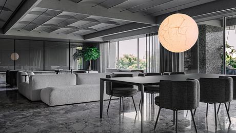
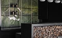
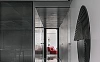
• The carpet area of this large apartment is around 4300sft. As you enter the house, its rectangular layout features a large living space on your left. This is the main stay of the house that connects to the personal rooms by means of a long hallway. Adjoining the living room is main entrance to the apartment flanked by a bar, and kitchen on the rear side of the same.

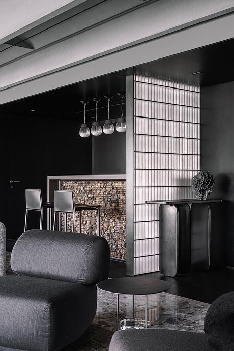
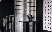
• One of the extensions to the living room is the main entrance to the apartment along with a bar. These two secondary spaces are carefully designed in a way that they complement the central space. The entrance of the house is part of a large black scoop which extends to the bar and the kitchen. Any amenity/ element that is part of this negative space gets more attention than usual & feels like a floating mass.

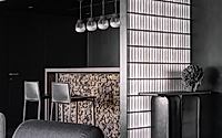
• Opposite the main entrance an entrance console is flanked by a vertical mass of frosted solid bricks. These solid bricks was an interesting choice of material because the glass and its frosted nature refracts the light in an intriguing manner and creates this soft glow around it. This partition divides this black scoop into entrance side and bar side. A geometric wall installation sits by the side of this console.

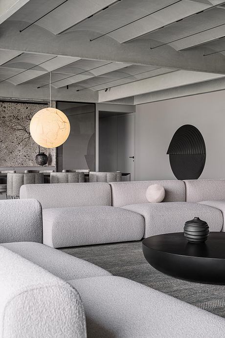
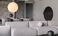
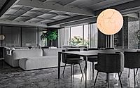
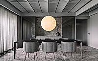
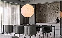
• The living room is a large cuboidal space. The extensions to this cuboid turn into bar, entrance and a large balcony. To control the scale of this cuboid the ceiling has been sub divided into quadrants and the vaulted ceiling cuts through these quadrants on the length side. Vaults are mainly an architectural element used in the constructions of buildings throughout history. By utilizing these throughout the apartment, it renders the intent more authentic and realistic. Projector screenings happen at one end of this space while a service unit for the dining sits on the other end of this cuboid. The wall cabinets have sandwiched metal mesh used for the sliding glass shutters.

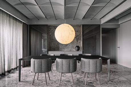
• The extended portion of living room seating faces towards the dining in an attempt towards establishing a dialogue between the two, in with the intention of making dining a less isolated activity. This setup has more protentional to become a social space with guests spilling over towards dining, in accordance with the clients requirements. Also the Moon, lighting pendant designed by Davide Groppi, being central to the space holds the entire space together. In fact the very sight of the Moon from main entrance sets up the visitor with that bit of curiosity about the space.

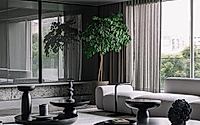
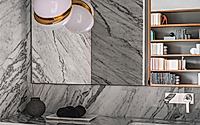
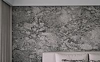
• The seating square of the living room has Ceppo De Gre marble across floor. The dining & the rest of the area has light Gre Ceppo on the floors too. Ceppo De Gre is used widely in the facades of the buildings in Europe but in contrast rarely used in India. The personality of the stone is rugged and of architectural nature. By specifying it for the floors and wall we wanted to give the house a bit of masculine feel and also incorporate the uniqueness factor.

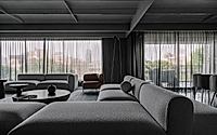
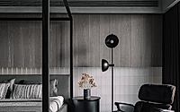
• The material palate of living and rest of the apartment has been rendered in Grey scale. To create interest in this scheme we encouraged the clients use a lot of plant greens in the space. This infuses life into spaces.

• The long hallway connects to the guest room first in the sequence. It’s a simple clean space with headboard done in Cubo granite from RK marble. The vaults here are of narrower widths. One of the walls has a cutout cladded in same Cubo stone housing the temple space. This cutout is covered by a double leaf sliding shutters to cover the temple.

• Next in the line of hallway you come across study and son’s room. Study has a warm palate with the introduction of Oak veneer as Clients wanted a space that was cosy and bright. The study table is placed flanking the window and on either side of it there is ample storage for books, a mini fridge and printer etc. The study itself is a long slab of wood spanning from end to end without any intermittent supports. There is an L shaped sofa close to the entrance for the purpose of entertaining guests.

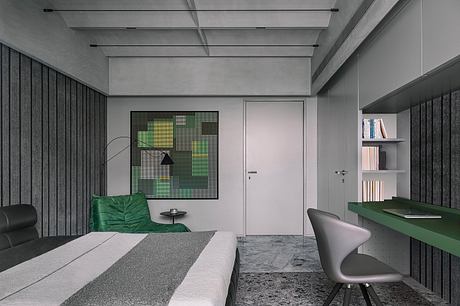
• Opposite the study entrance sits Son’s bedroom space. The room has a comfortable bedspace along with study and an armchair for lounging. The mood of the room is cosy with predominantly monochrome material palate. This grayscale is broken by the introduction of green color in the form of study table and tapestry of the arm chair. The headboard wall is made unequal vertical slats of a rugged finished granite stone. Ceiling of each individual room comes in form of a large trough that contains the vaults within them. This move detaches the ceiling from the wall.

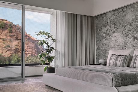
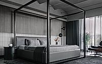
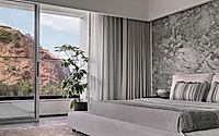
• Next in line is the master and Daughters bedroom at the end of the hallway. Master bedroom starts with its own passage which lead first to the entrance of walk-in wardrobe + toilet and then to the bedroom itself. The bedroom has a large four postered bed along with Eames loungers on its side. The headboard wall is a combination of frosted glass bricks at the bottom and strips of grey veneer on the top. The glass bricks can be backlit lending the ambient light to the space. The vaults in the ceiling are up lit by a long tensioned rope light between two ends of the ceiling. As mentioned earlier, a series of three sliding doors create an interesting permutation combination of scenarios wrt use of the room.

• Daughters’ bedroom is a bit of breakaway WRT the material palate used in the house in general. Mood of the room is light and bright with the use of white for the shell predominantly. Theres a large soft padded bed in the centre with the head board wall cladded in a rugged finished granite. Study table in suspended between two verticals with no intermittent supports in between. The peripheral duct spaces are used for miscellaneous storages hidden by large sliding door making them look like moving walls.

Photography by Ishita Sitwala
Visit DIG Architects

- by Matt Watts

Tags

Gallery

Get the latest updates from HomeAdore

Click on Allow to get notifications