Casa Ruffino Recasts Tuscan Hospitality with Color-Rich Interiors
Casa Ruffino stands within the Poggio Casciano estate in Bagno a Ripoli, Italy, where b-arch studio reshapes hospitality against the ordered Chianti hills. The hotel project translates the Ruffino brand into rooms and salons that balance historic architecture with measured contemporary interventions. Guests move through interiors tuned to color, light, and texture, finding a calm rhythm between working winery and refined retreat.


Low Tuscan hills frame the approach, their ordered rows of vines catching the shifting light. From the courtyard, the historic mass of Casa Ruffino reads calm and grounded, opening to interiors where color, timber, and iron pick up the story of the working estate.
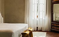
Inside, the mood stays quiet. Long perspectives connect vaulted rooms and low-beamed ceilings, while a palette drawn from grape must and earth traces a gentle route from arrival to rest.
This hotel in Bagno a Ripoli sits within the Ruffino Poggio Casciano estate, where b-arch studio concentrates on crafting an interior world rooted in both heritage and brand. The project works with the existing architectural shell, keeping production active while building a new chapter for hospitality. Interior palette and furnishing choices hold the narrative together: they guide guests through the estate, translate wine culture into touchable elements, and allow the building to evolve without losing its core.
Staging A Seasonal Renewal
Work unfolds in careful phases, aligned with the rhythms of a living winery rather than imposed over them. Construction concentrates in seasonal closures, so the productive heart of the estate never pauses, and the guest experience isn’t fractured. This tempo shapes the interior strategy: each wing and room reads as part of a broader composition, renewed piece by piece instead of through a single sweeping overhaul. Guests arrive to a hotel that feels continuous, not interrupted by visible layers of work.
Balancing Heritage And New Matter
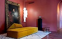
Original cotto floors, exposed beams, and storied wall surfaces stay in place, their wear recording time. Against them, b-arch studio introduces contemporary materials with a measured hand, choosing insertion over replacement and keeping structure untouched. Raw iron becomes a recurring presence, its dark, tactile surfaces framing doors, shelving, and custom pieces that read both industrial and precise. The dialogue between old masonry and lean metal elements keeps the rooms grounded in the estate’s working identity rather than drifting into generic rustic charm.
A key gesture lies underfoot. Existing parquet is repainted rather than stripped out, preserving the warmth of wood while giving it a new graphic clarity and depth of tone. This decision matches the broader approach: invest in continuity, not novelty for its own sake, and let material honesty carry the contemporary layer. Historical value stays visible while everyday use feels current and assured.
Color As Guide And Narrative
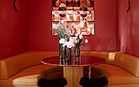
Color does more than decorate; it organizes movement. Tones echoing grape must and cellar shadows mark thresholds and rooms, leading guests from entrance salons to tasting areas and up to the quieter bedrooms. Along the way, shades shift in intensity, moving from richer hues in gathering rooms to softer notes in private zones, so orientation happens almost instinctively. One wall might carry the depth of fermenting wine, while adjacent textiles pull in chalkier vineyard light.
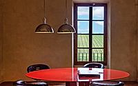
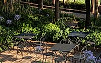
From the windows, the rural Tuscan landscape stretches outward, and the palettes inside stay tuned to it rather than in competition. Interior walls, textiles, and painted parquet sit in gentle contrast with vineyards and fields, so the eye reads a continuous story from chair arm to distant row of vines. The result is a sensory link: guests feel grounded in the working countryside even while sheltered indoors.
Rooms For Pause And Brand Identity
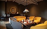
Arrival unfolds through a chain of salons arranged as places to slow down before reaching the more private quarters. Sofas, low tables, and iron-framed pieces form informal islands for reading, tasting, or waiting between tours, with color gradually deepening as the Ruffino world comes into focus. Early cues from the winery—bottles, tools, quiet traces of production—sit within these rooms, present but never didactic.
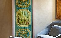
Guest rooms and shared lounges read as collected rather than staged, helped by the mix of modern pieces and vintage or modernist furniture. These elements act as joints between eras, anchoring contemporary upholstery and color to the older envelope of beams and masonry. Brand identity emerges through this mix of objects, hues, and textures instead of overt signage, so guests read Ruffino through atmosphere, pace, and material choices as much as through graphics.
Calm Interiors For A Working Estate
Throughout the hotel, light, proportion, and material quality work together to keep rooms intimate yet open to the wider estate. Windows frame patches of vineyard and garden, and interior tones answer those views with calibrated warmth and depth. The palette is memorable, but it doesn’t shout; it gives the countryside room to breathe while tying back to the winery’s production and symbolic world.
Casa Ruffino steps beyond a conventional hospitality model by threading architecture, interiors, and brand story through the same careful set of decisions. As the estate evolves over time, this measured approach to material, color, and furnishing lets the hotel absorb new chapters without losing its roots in the Chianti hills. Sunset on the cotto floor, a dark iron edge catching light, a grape-hued wall at the end of a corridor: each detail keeps the building aligned with the land and the wine that define it.
Photography by Cortesia di Ruffino1877
Visit b-arch studio


