Google Japan by Klein Dytham Architecture
Klein Dytham Architecture recently completed an additional phase to their design for Google’s Japan office. This ambitious interior project is located in the Roppongi Hills tower in central Tokyo.


Description by Klein Dytham Architecture
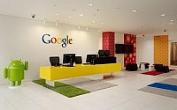
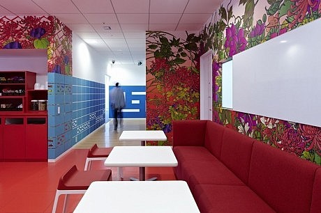
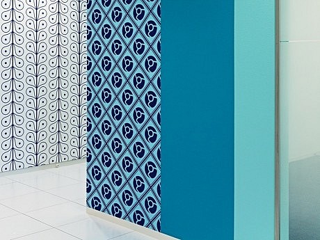
In such a large project one of KDa’s key challenges was to develop a way to expand Google’s facilities that wasn’t repetitive or boring, and which also assisted wayfinding. To help staff feel comfortable and prevent visitors from becoming lost, KDa defined various zones across the floors and gave each a distinct character. Each zone was assigned a specific colour, the colours being modulated through different tones. This creates a “necklace” of differently coloured meeting rooms, each with a specific name and character, strung around the building’s large central core.
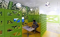
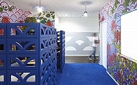
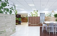
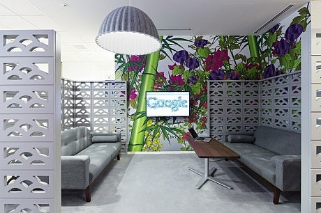
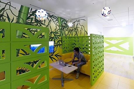
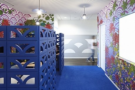
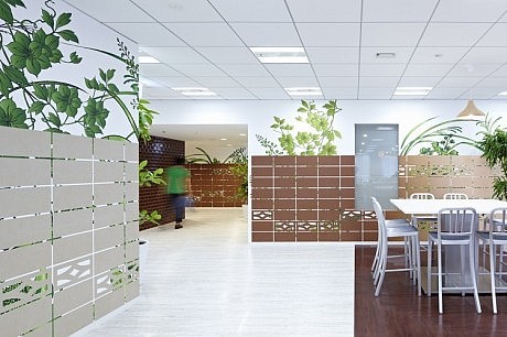
On the one of the floors, KDa defined the circulation route around the meeting rooms with the perforated concrete block walls common in Tokyo’s winding residential lanes. In the city these block walls often provide glimpses into lush gardens, and KDa used them here to allow views into enticing spaces beyond the walls. Each of these “pocket parks” has a huge wall graphic of brightly coloured plants and can be used for gatherings and informal meetings.
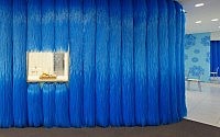
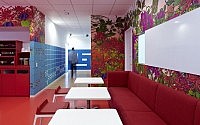
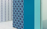
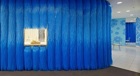
KDa also placed landmarks at key positions to help staff and visitors identify their location and navigate around the floor. KDa have provided mini-kitchens where staff can grab snacks and drinks, each space decorated a different colour. After having designed kitchens themed by Google colours – blue, yellow, red, green – on the lower floors, KDa then looked to create something even more memorable: a bight blue “hairy kitchen” clad in the giant brushes used in automatic carwashes.
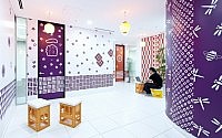
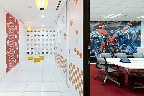
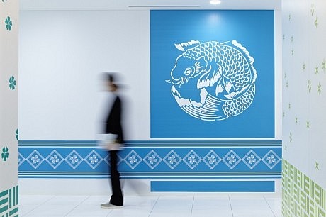
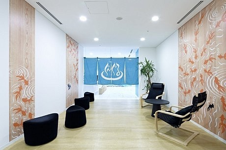
Google request that each of their national offices around the world reflects the unique culture of its location. KDa’s design for the earlier phases of the project had taken cues from the graphics of traditional Japanese fabrics and contemporary anime, but then Google requested an even more vivid evocation of Japanese culture. Looking to communicate the Japanese context without resorting to cliché KDa incorporated surprising elements such as a full-scale yatai (mobile food stall) and a digital koi pond that greets people at one of the entrances – responding to hidden sensors, carp projected onto the floor move towards those who enter the space as if expecting to be fed.
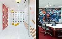
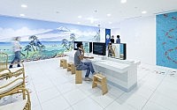
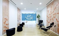
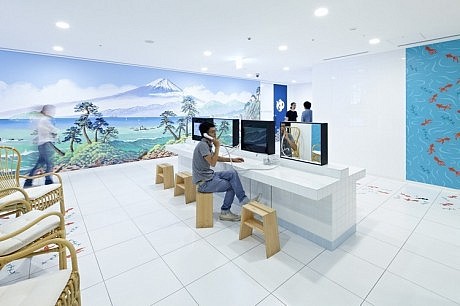
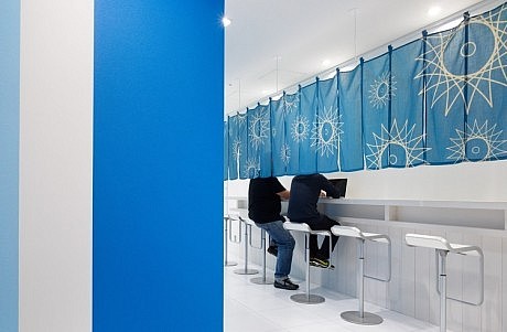
A set of spaces on another floor was themed after a sento, the traditional neighbourhood bathhouses now fast disappearing from Japan’s cities. Passing through a traditional noren curtain, leads to space instantly recognisable as a “wash area”, complete white ceramic tiles, wooden stools, and computer screens cunningly configured where mirrors would be expected. This leads on to a spacious “soaking bath” area – actually a presentation and training room – which like classic sento features a huge mural of Mount Fuji specially created for Google by one of Japan’s last living mural painters. This space is also used for external events, with the “wash area” becoming a reception space for drinks and catering. Nearby, a group of meeting rooms have a matsuri (traditional neighbourhood festival) theme. Here, red and orange wallpaper picks up patterns from the yukata robes and happi coats worn at festivals, wall graphics show photos of festival scenes, and sake and beer crates both act as impromptu seating and create a relaxed party atmosphere.
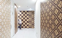
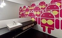
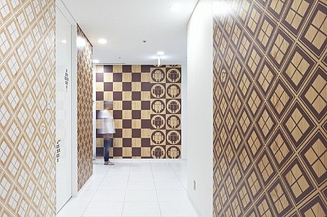
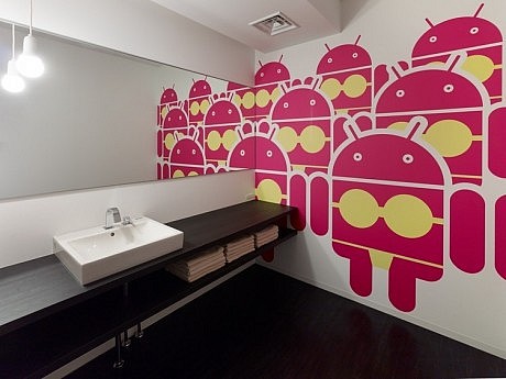
For previous sections of the interior, KDa created brightly coloured wallpaper patterns cleverly derived from refigured Google icons such as the Google Android and Google Map pin. For the new spaces, KDa developed a set of muted, timber-coloured wall graphics whose tone varies from light to dark wood. Subtly evoking Japan’s traditional timber architecture, the patterns occasionally incorporate cunningly hidden icons.
Visit Klein Dytham Architecture
- by Matt Watts