Three Parts House by Architects EAT
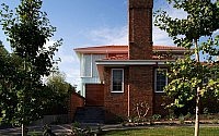
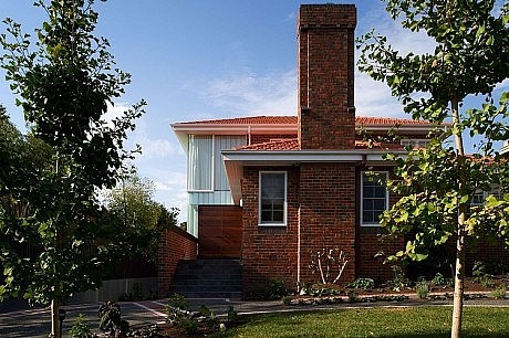
Situated in Melbourne, Australia, the Three Parts House is an alteration and addition to a 1950s clinker brick residence on a 13,000-square-foot block of land.

Description by Architects EAT
The house is programmatically and conceptually divided into three parts – the Lantern, the Courtyard and the Brickhouse.
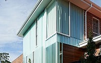
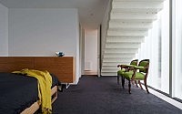
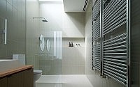
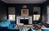
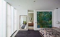
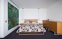
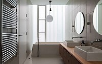
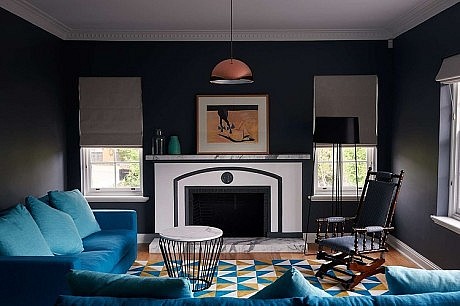
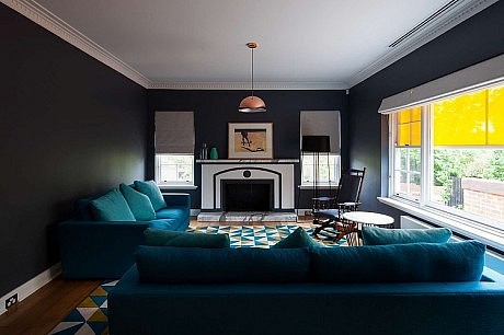
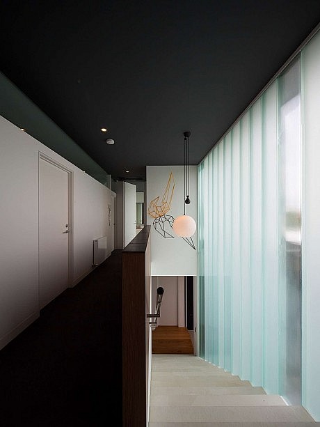
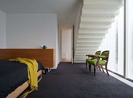
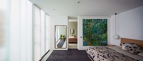
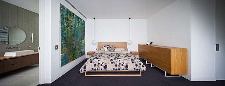
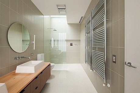
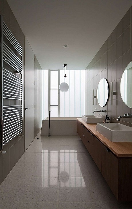
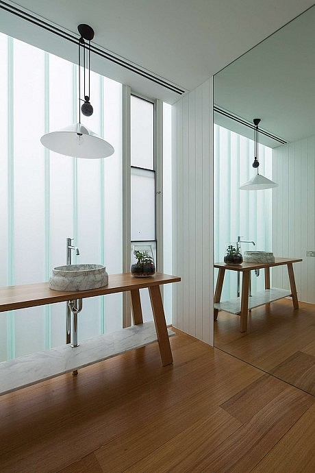
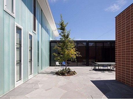
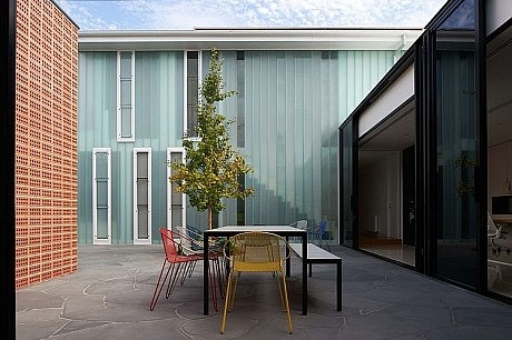
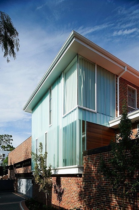
The Lantern is the existing two-story part of the house; programmatically it contains the bedrooms, bathrooms, a formal living room, as well as the entry. The north, west, and part of the south facade are glazed with double layered U-profile glass panels to achieve a large singular span façade for monumentality, under the existing roof and eaves. Eight varying textures and frostings were selected to wrap around the existing structure, providing tactility and varying light transmission quality. This façade is further shaded by a large growing Ginkgo tree, and after dark the building turns into a glowing lantern.
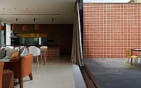
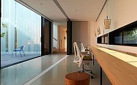
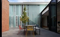
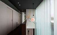
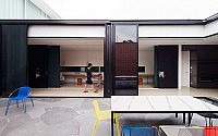
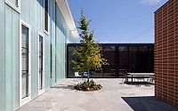
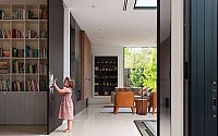
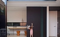
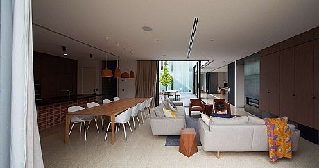
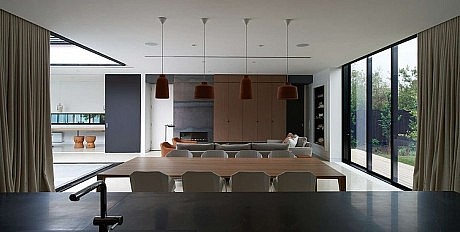
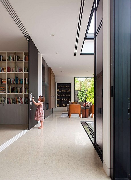
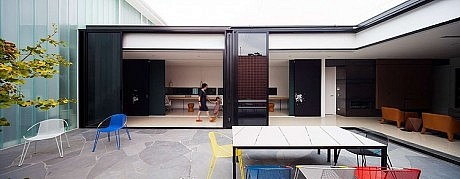
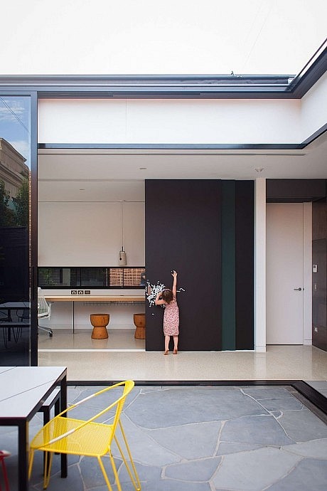
The Courtyard is the link between the old and new, with the long corridor and sewing room forming part of this connection. This central courtyard allows light and air to penetrate into the depths of the building plate. Much like a Japanese Imperial villa, multiple layers of sliding doors and screens modify the spatial relationship between indoor and outdoor, transforming the circulation space into an extension of the courtyard, or using the retractable flyscreen to create a shaded, airy passageway on hot summer days. The space was designed to accommodate a flurry of activity throughout day and night, the direct connection to the courtyard making it perfect for children. With that in mind, the screens are painted as chalkboard with magnetic undercoat, activating an otherwise utilitarian transitional zone.
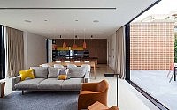
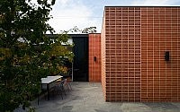
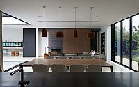
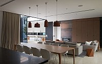
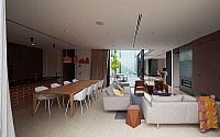
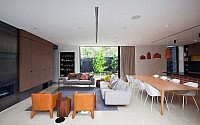
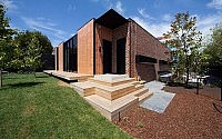
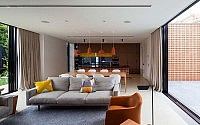
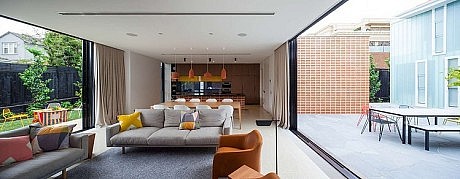
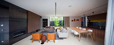
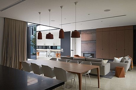
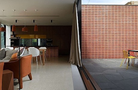
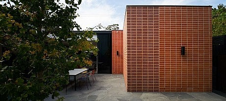
The Brickhouse is the new addition; a space for the family, as well as for entertaining guests. It opens to both the courtyard and the backyard, bringing the two outdoor spaces together under one roof. As the Brickhouse extends into the courtyard, simple brick-laid-on-edge brise-soleil screens form the walls, providing access and natural ventilation to the basement garage. This often seen but forgotten core-hole pattern creates a memorable and highly textured surface en masse, and at the same time, a functional and breathing façade.
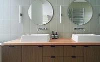
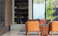
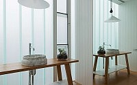
The approach to materiality was playful and dialectic. The gridded pattern of the bricks and the straight vertical lines of the U-profile glazing are juxtaposed against the paved Mintaro slate courtyard floor; the heaviness of the bricks was contrasted against the lightness of the U-profile glazings; fine timber veneers and luxurious honed marble are placed directly next to raw unfinished steel.
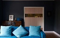
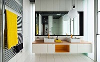
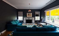
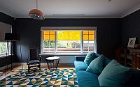
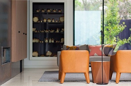
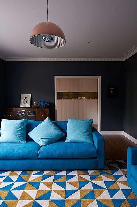
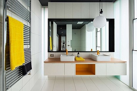
Colors were chosen to compliment the furnishings and predominantly white to act as a backdrop. The client’s favorite color, yellow, is dotted throughout the entire house, intermingling with other yellow objects – the entry coat peg, the awning, the rug, Dion Horstmans’s sculpture, basin mixers, chairs in the courtyard, the kitchen cupboards, and the monkey bar in the backyard. It is a playful journey that invites one to connect the dots.
- by Matt Watts