Lipetsk Residence by Geometrium
This stylish single family residence is situated in the Russian city of Lipetsk.
It was designed by Geometrium.

Description by Geometrium
At the beginning of August 2014 we took House project in Lipetsk with total area 306 square meters (3,294 square feet). Customers — a young family — husband, wife and three newborn babies. House was not built by the time of technical requirements preparation, so interior design was made accurate with architectural project plan.
The interview with clients took us about 6 hours. We figured out a detailed needs, together imagined the future life in the new house, analyzed and created detailed technical requirements album with 48 pages.
When technical requirements was approved we stepped over to planning(project) decisions. Based on technical requirements data and architectural project, we developed planning decision:
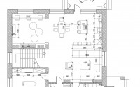
— On the ground floor, we placed a recreation area near the shower and hamam. Customers wanted to sing karaoke, drink wine, smoke hookah and relax from everyday hustle and bustle. Also we put couch, where you can lie down and read a book on a soft mattress. This is a sport area as well with ping pong table at the entrance and exerciser in the corner. Other areas are intended for the storage and boiler room.
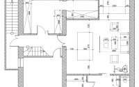
— On the first floor, we placed the entrance area — the hall, the main area — a living room-kitchen-dining room, in front of kitchen we placed a children’s playground where the kids can play and be seen, while mom cooks. Also on the ground floor is a laundry room and restroom area that will store all the equipment for cleaning, additional freezers for products, storage, washer and dryer, ironing system — all that will be necessary mistress. On the floor is a guest bathroom also.
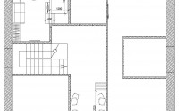
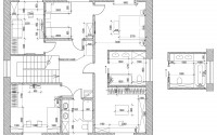
— On the second floor of the house private areas of all family members located. They are designed so that the children had their own room and bathroom. One large bedroom and dressing area, which is shared bathroom for parents. In the on the second floor hall and in Yaroslav’s room — private third tier, which you can use for book reading or iPads.
First floor
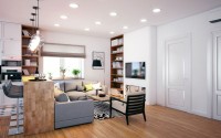
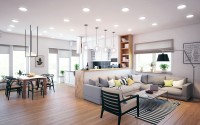
Living Room:
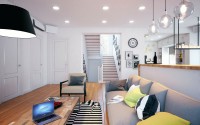
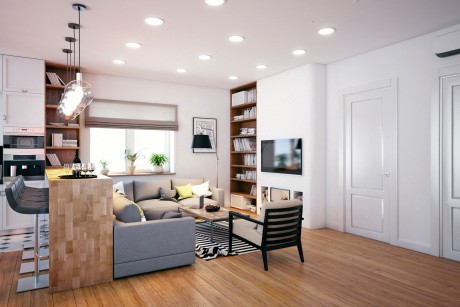
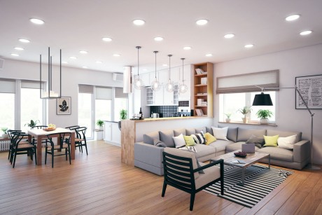
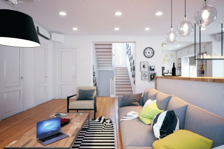
Most important thing for customer was comfort to host a large group of friends. We really wanted to place a large corner sofa, which would be designed for a large number of guests, as well as the bar, behind where you can watch TV.
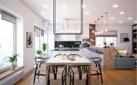
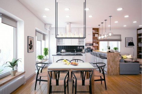
So we got one large space. Using bar desk we created separate areas kitchen-dining room and living room. Materials in the living room, mostly natural. Floor, shelves, bar desk, kitchen facades are made of solid wood.
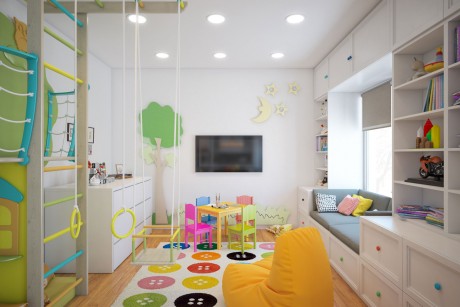
For Alena important thing in kitchen area was to look after children, who will play in the game room. To achieve this, we made a kitchen island with cooktop, and left the playing area without walls.
Play area:
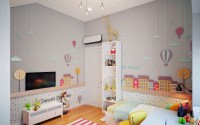
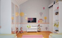
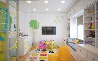
This area is designed in such a way that when children grow up, it will be converted into study area — a place where they will do their homework. When children become mature — it will be a second living room for youth.
Therefore, we left the walls white, but children’s atmosphere is maintained with bright elements — figures made of plywood, which can be easily removed from the wall when the kids grow up. In the left corner is a chest of drawers with pull-out cot for an afternoon nap. Rack with a daybed in the future can be removed , and place the tables by the window for learning.
Guest bathroom and laundry room:
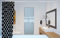
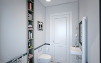
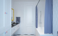
Guest bathroom has a minimum area, thus holds everything you need. Tile in the area is only in the wet zone to the height of 900 mm (3 ft) from the floor. Above — the painted walls. As this area is not the main, we did it low-cost, not to the detriment of the overall concept and design.
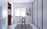
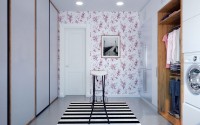
In the laundry room area was necessary to place a washing machine and dryer, two refrigerators, and at the request of the client — a large amount of storage space for household appliances, equipment for cleaning, etc.
In the same room Alena will iron things, some things will even be stored here. Therefore, we have provided a niche with an open wardrobe. Washer and dryer is not located on the floor, and at the optimum height for easy use.
Outside sliding doors from floor to ceiling there is a TV, which you can watch while ironing.
At the request of Alena, a room made brighter and more contrast added flower pattern on the walls, so this room was not boring to be.
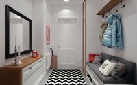
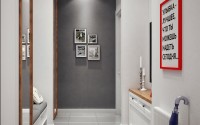
Hall:
The room that we meet at the entrance to the house.
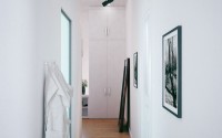
The main task — to place a minimum of 2 meters (6.56 feet) wardrobe to be able to put guest’s things, a place where you can sit down to change the shoes and mirrors.
The room is designed in the same style with all house. Added red color for greater contrast and black-and-white carpet. At first, it was intended to make the red front door, but later abandoned the idea.
In this room you are not supposed to stay long, so a strong contrast in it is welcome — it adds dynamics.
Ladder:
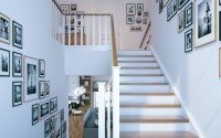
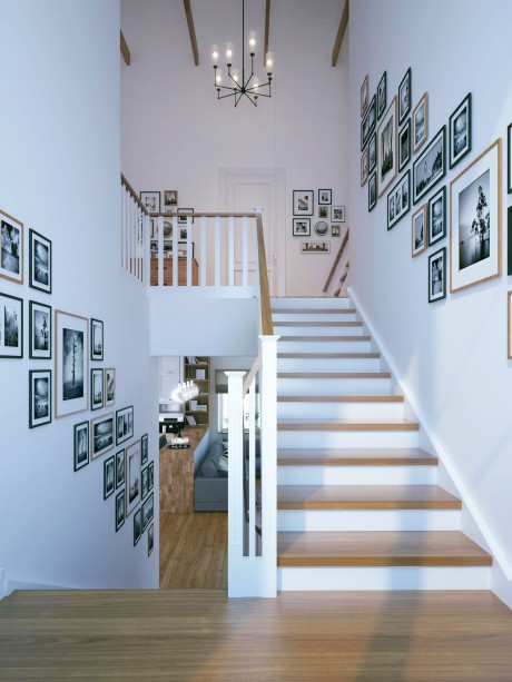
Classic Scandinavian style — wooden stairs and railings, the rest is made of white painted MDF.
On the walls — paintings with wooden and black frame. Adds rhythm and combines areas of the first and second floor.
Second floor
Hall second floor:
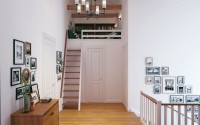
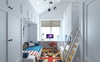
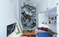
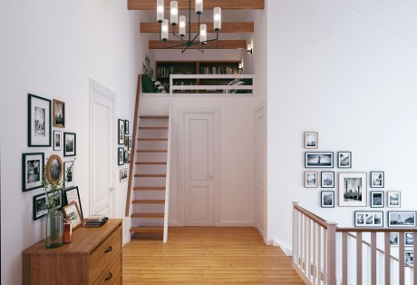
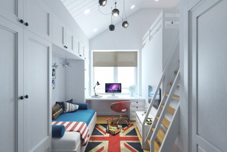
In the layout of the house we have added a third tier, which is presented in hall second floor hall and in Yaroslav’s room.
By climbing to the third tier, you can retire, read a book, surf the Internet or play board games. This will be especially useful when children grow up, and will play together with friends.
Stairs to the third tier is designed for minimum standards. This ratio and the depth of step height and angle — minimum allowable. You will need to carefully use these stairs — not the safest place in the interior.
Bedroom:
In technical requirements bedrooms was described as a place with bed, sofa, couch to sit or lie down to read a book.
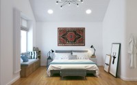
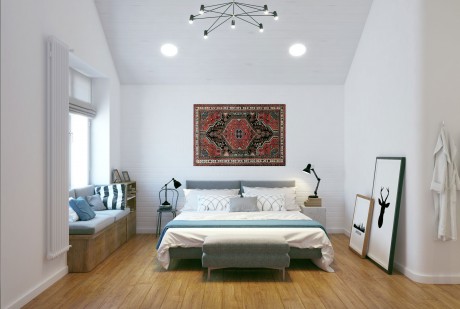
When customers have shown us examples of what is could be — it was a Scandinavian interior with rough plaster slightly reminiscent of the white cave. This was a good sign for the willingness to experiment =)
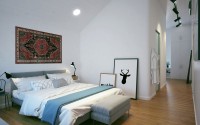
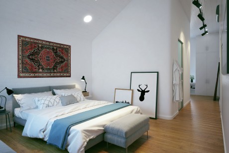
Instead uneven rough wall, we did the usual and so begotten in the interiors, white brick. A wall hanging carpet! Yes, the same Oriental rug that hung in almost every apartment in the USSR. It was an experiment that perfectly caught in this interior.
Customer wanted their own area in which to store personal belongings, with its own bathroom which is not available either children or guests.
We combined dressing room and bedroom and bathroom. Where in the partitions are rounded on the corners, so that two single band appeared whole. This technique we used already in some projects, so we can say it’s our company feature =)
Ceilings, as well as in all the rooms on the second floor, decorated with white painted paneling. It gives the interior a certain atmosphere of rustic lodge and leads Scandinavian interior of the rigor and conciseness.
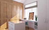
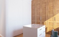
In the dressing room area was necessary to accommodate a large number of things, as well as technical cabinet to control heating and underfloor heating.
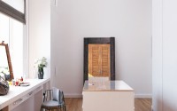
In this same area was planned make-up table, where we placed the dressing room mirror with lights.
Decorative Accents dressing mirror is an old wooden frame and seat with metal elements.
Owners bathroom:
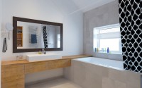
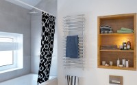
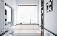
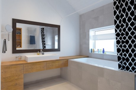
Bathroom with half tiles under concrete from the Italian factory. Imitation concrete stains gives the interior a certain contrast. This is particularly works well with furniture made of solid teak, white walls and dark elements.
Client wanted to have additional place in bathroom to put somewhere ipad or laptop, to watch movies during bath taking. To do this, we continued countertop made of solid teak to the window and provided moisture proof outlet.
Boy’s room:
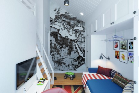
In the room there is a second tier for Yaroslav. The staircase is made with two handrails, therefore safer. Room design and color specifically for the boy. This room has everything you need for the development and good rest.
On the opposite wall from the window — drawing map.
Girls Room:
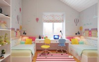
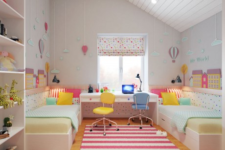
In the girls’ room, we mirrored furniture arrangement in window area. The functions that they will do at the same time — to sleep, do homework — we completely repeated, that none of the girls would not feel that it’s something cheated.
In the room there is a common wardrobe.
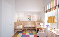
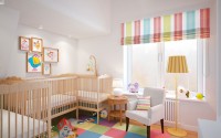
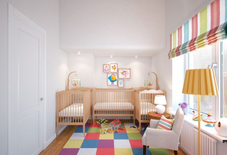
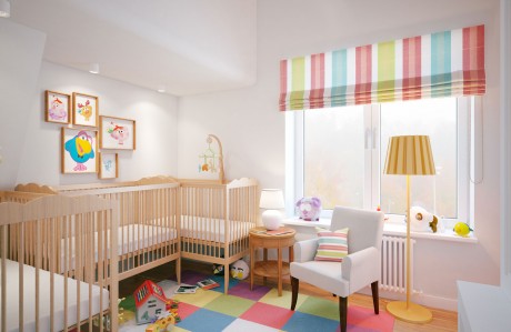
Cradle room:
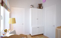
Now the entrance to this room is made from bedroom, while the children grow, the door will operate. In the future, will be closed or perhaps Lead the opening. The room will be converted into a guest bedroom.
To do this, the whole atmosphere of the nursery we have given in textiles and bright elements, and the walls and the floor are the same as in other areas of the house.
The design of the ceiling and walls of the back of the design is the second tier of the room Yaroslav.
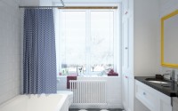
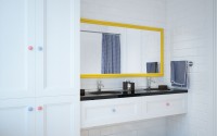
Children’s bathroom:
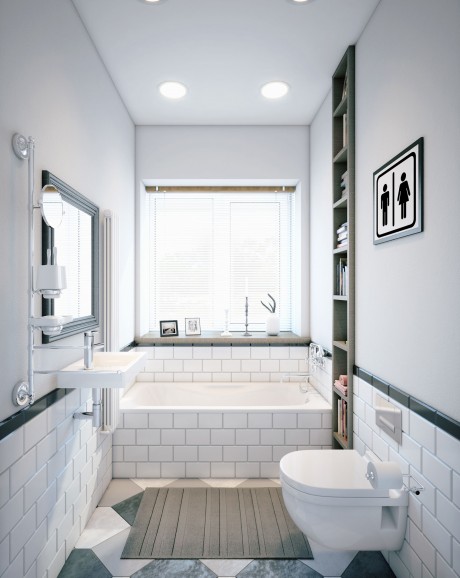
Just as in other areas, we braved the Scandinavian style.
White tile is the background. Bright yellow handle and frame, rug and towels create an atmosphere.
Ground floor:
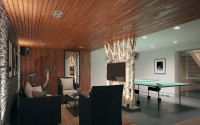
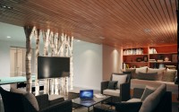
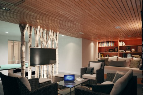
In the basement was planned to meet the company, sing karaoke, smoke hookah, drink wine, go to the hammam, which is located behind the mirror door.
There is rattan furniture, ceiling is decorated with teak board, and Russian birchs separate relaxation and sports areas.
In the corner there is a couch where you can relax — to lie down and read a book after the hamam.
Lighting thought out so to create an intimate and welcoming atmosphere.
The backlight illuminates the bottom wall of birch and slate panels 3D, and thus emphasizes the decorative relief wall and trees. If desired, you can turn on the main light on the ceiling, for complete coverage area.
The main idea of the project — to make more space and air, to add more natural materials while keep within a reasonable budget. In the priority value for money.
At this stage we are supervising this project, and completing with furniture and decoration materials.
Photography courtesy of Geometrium
- by Matt Watts