Maison Terrebonne by La Shed
Situated in Montreal, Canada, this modern private residence was designed in 2015 by La Shed.

Description by La Shed
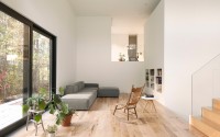
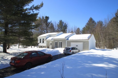
Born from an extreme transformation of a typical 90’s bungalow, the “Maison Terrebonne” is located on a vast wooded plot of land. Although certainly contemporary, the new residence is built on the same foundations as the original house while preserving one of its principal characteristics; split levels. This principle is at the very heart of this building’s new architecture. This thorough building overhaul, in combination with a larger upstairs, was designed in order to meet the needs of a person living alone. Despite a small 1500 square foot living space, the residence offers vast open rooms with an abundance of natural lighting.
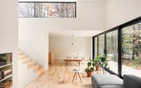
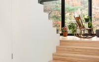
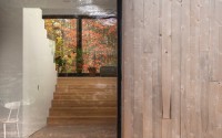
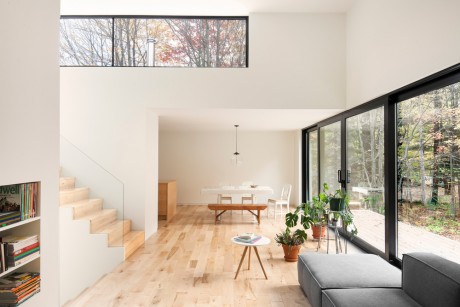
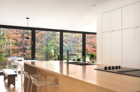
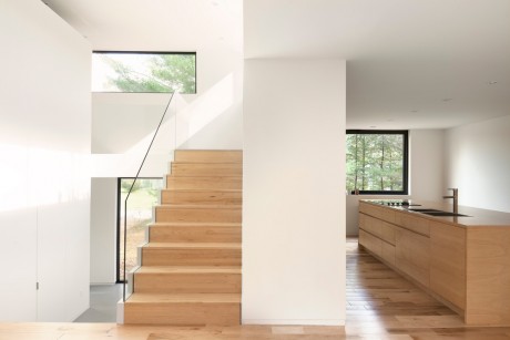
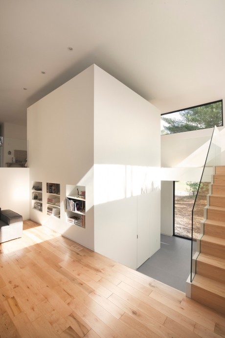
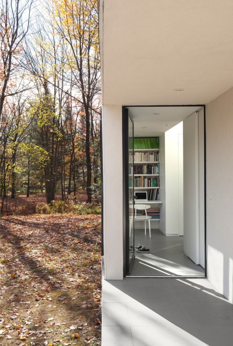
The house now features three split levels that are each designed for a distinct set of functions that help establish a clear hierarchy between intimate and communal zones. These zones are designed to be very open in relation to each other and are only divided by the threshold created by the flights of stairs. Directly accessible from the carport and at the same height as the ground outside is the first of three levels that contains both the entrance vestibule as well as a small office. Even though this entry zone is also open, it is concealed from the living spaces on the level above. Once in the center of the staircase leading to the second level, the visitor comes face to face with a large window with a view on the woods behind the home. The kitchen can be found there, organized around a large wooden island whose materials stand out in relation to the neutral white walls. Along the large bay window adjoining the kitchen can be found the dining and living rooms. At the crossroads of all these levels is located a pure white block that naturally reinforces the intimacy between zones and around which gravitates circulation within the home. This block has a powerful effect on the upper portion of each level as a result of it being unattached to the ceiling, which allows for both an unobstructed line of sight and opulent natural lighting.
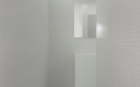
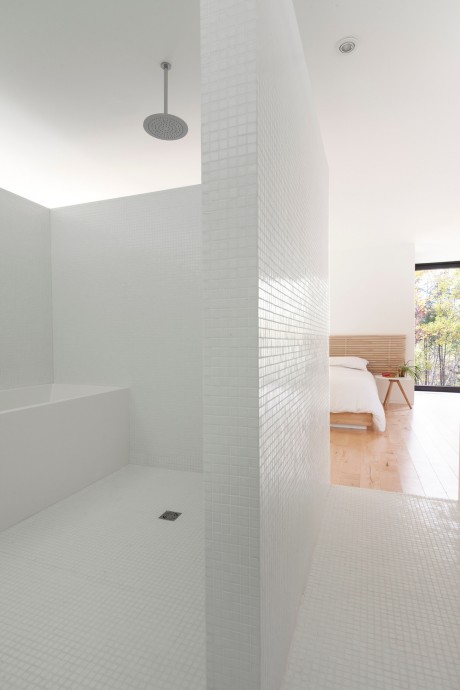
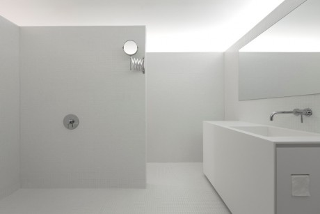
The staircase and corridor leading to the owner’s private suite on the top level are located behind this central block and have a view on the inferior levels. Inside the cube and accessible only from the bedroom is a hidden bathroom designed with simple, clean lines. Though without a door, intimacy is preserved by the configuration of walls leading to the bathroom. Inside the bathroom, floor and walls are covered in a pearl white glass mosaic and it is modestly furnished with two white, minimalist blocks, bathtub and vanity. In order to accentuate the furniture’s monolithic appearance, doors with a smooth matte finish were placed on either side to avoid creating divisions at the front while a Corian sink was molded into the counter above. A thin setback kick space creates the impression that it isn’t attached to the floor while giving the bathroom a sense of space and lightness.
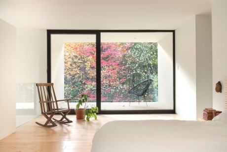
The bedroom is located at the very back and opens partially to the living spaces below. In order to limit visibility from the outside into this room, windows were voluntarily limited in height and therefore create long strips of light. At the rear, the room extends towards the woods by way of a loggia. From here the surrounding natural environment can be viewed without any obstacles thanks to the transparency of the glass railing barrier.
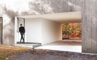
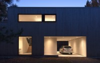
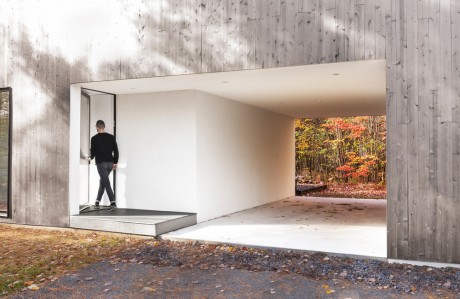
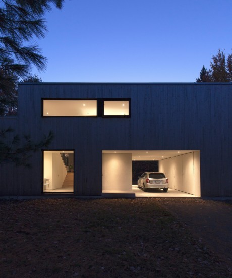
The exterior is covered in natural eastern cedar siding that will fade over time to eventually further bear a resemblance to the bark of trees in the surrounding woods. Simple openings surrounded by black frames serve to punctuate the sheer volume of the house. The former garage has been replaced with a covered parking space that’s open on either end, and thus gives the impression that it was emptied. This openness creates a sense of transparency that, like all large openings, provides the space for nature to reclaim its place.
Photography by Maxime Brouillet
- by Matt Watts