The Junction by Liquid Architecture Newcastle
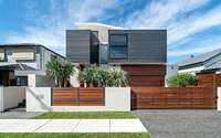
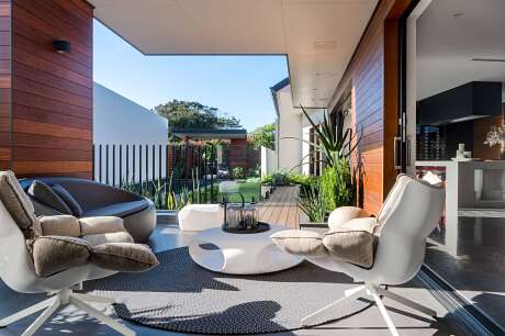
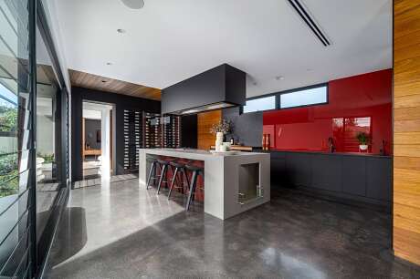
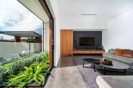
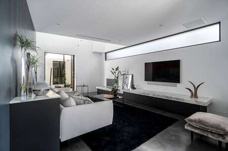
Designed in 2018 by Liquid Architecture, The Junction is a contemporary two-story house is located in Newcastle, Australia.


About The Junction
The Pursuit of Architectural Brilliance
Fueled by a desire for uniqueness, an initially ambiguous brief seamlessly evolved into an architectural gem. Consequently, a radiant, alluring Newcastle residence emerged. Stephen Gray of Liquid Architecture delves into the captivating facets of this project.
Crafting a Contemporary Oasis
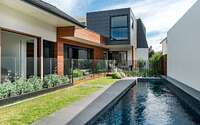
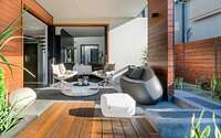
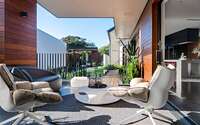
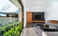
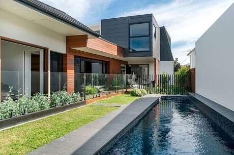
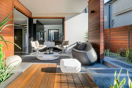
Initially, Stephen faced the challenge of designing a modern home tailored to today’s lifestyle. This vision, therefore, needed to effortlessly blend indoor and outdoor realms. Subsequently, the property boasts four luxurious bedroom suites, each replete with private bathrooms and expansive walk-through closets.
At the core of Stephen’s approach is collaboration. He firmly believes that clients’ desires should reign supreme. Given that his design perspective is ever-evolving, he brings a renewed zest to each project.
His design process, moreover, is dynamic and multifaceted. During on-site brief discussions with clients, Stephen actively formulates mental sketches. Later, these embryonic ideas transition to paper. After a period of refinement, they are confidently presented to the client, shaping the project’s trajectory.
Inspired Designs and Thoughtful Material Choices
For Stephen, the flat, rectangular plot presented a novel challenge. However, when seeking inspiration, the bustling streetscapes of New York serendipitously beckoned. By adapting its iconic grid layout, Stephen infused Bruce Street with unparalleled charisma, crafting a myriad of intriguing spaces.
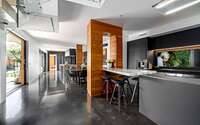
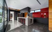
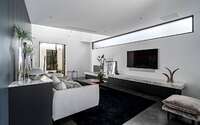
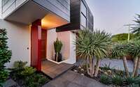
In terms of material selection, Stephen’s pronounced inclination towards black and white played a pivotal role. Envisioning external walls adorned in white rendered masonry contrasted with black zinc, he punctuated this palette with warm touches of hardwood. Internally, the juxtaposition of black polished concrete floors downstairs with hardwood upstairs, enveloped by pristine white walls, is nothing short of striking.
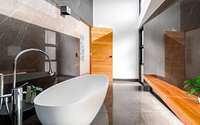
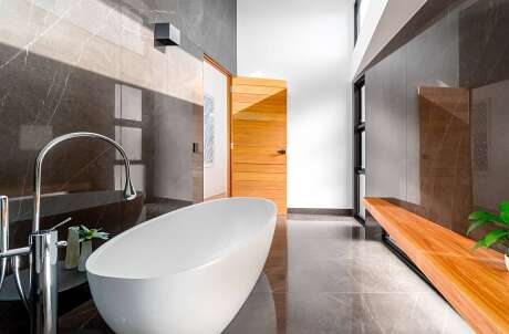
For wet zones and the staircase’s void, Stephen gravitated towards large tiles. Leveraging the building’s generous height, he curated a harmonious palette of black, white, and intermediate shades. Public wet areas exude a gentle ambiance, while the three ensuites, tailored for boys, project a bolder aesthetic.
The feedback on material choices has been overwhelmingly affirmative. These meticulous selections, recognized as impeccable, combine high-quality products with artisan craftsmanship.
Collaborations and Distinguished Design Elements
Collaborating with Earp Bros on this endeavor was both invigorating and assuring for Stephen. Such collaborations, he believes, fortify the assurance of delivering an unmatched final product.
Among the myriad standout features, one distinct element captivated Stephen’s heart: the minimalist bathroom. Realizing his long-held aspiration, he crafted an enclave solely dedicated to a bath, epitomizing both elegance and luxury.
Photography by Joshua Hogan
Visit Liquid Architecture Newcastle
- by Matt Watts