Casa dos Oleiros by Paulo Martins Arq&Design
Dive into the inspiring world of Casa dos Oleiros, an emblem of urban revitalization in the historic center of Castelo Branco, Portugal. This two-story house, designed by Paulo Martins Arq&Design in 2020, expertly merges contemporary minimalism with the city’s rich past.
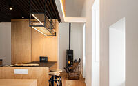
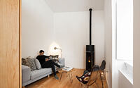
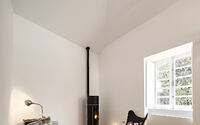
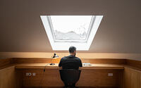
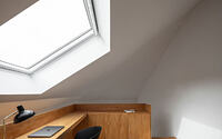
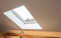
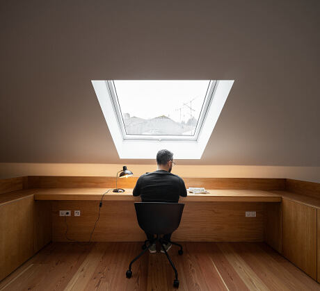
Casa dos Oleiros maintains its original façade while showcasing a fully modernized interior that delivers comfort, functionality, and style. Natural light floods the space thanks to the thoughtful design, and a strategically placed skylight offers a view of the nearby castle, a constant reminder of the city’s vibrant history.
A fusion of quality materials and simple elegance, this dwelling sets a trend in urban living and represents a beacon of hope for the revival of declining city centers.


About Casa dos Oleiros
Reviving Castelo Branco’s Historic District
Nestled within the charmingly antiquated segment of Castelo Branco, this house has been bearing witness to a worrying decline in the district over the past few years.
Crafting an Urban Revitalization Blueprint
Addressing this concern, the project embraced the essence of an archetype with a grander vision – to pave the way for urban revitalization in the city. The objective was not just to breathe life back into the city’s historical center, but also to inspire younger demographics to become a part of this vibrant transformation, thereby reenergizing the district.
Marrying Historic Charm with Contemporary Comfort
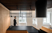
To align with this ambitious initiative, the project preserved the house’s original exterior façade, while redefining the interiors according to contemporary standards of comfort and minimalistic elegance.
Designing for Modern Living
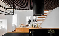
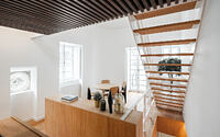
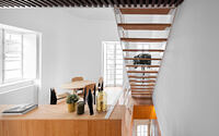
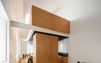
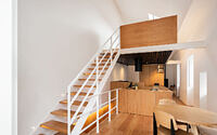
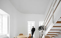
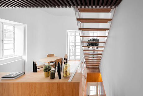
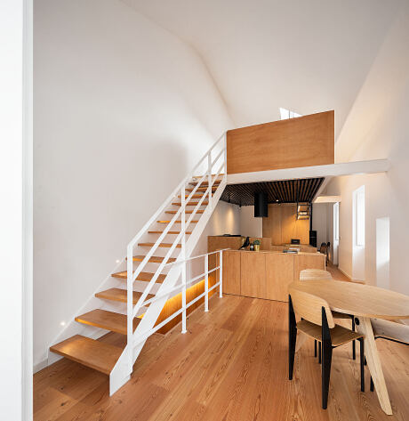
The reimagined house spans two floors and a mezzanine. We’ve designated the ground floor as a peaceful sanctuary, considering the lighting conditions. Meanwhile, the social areas enliven the upper levels.
Enhancing Spatial Perception and Light Flow
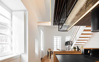
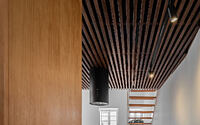
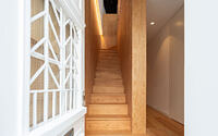
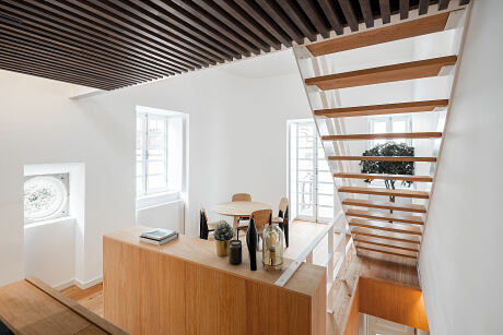
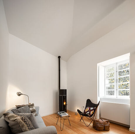
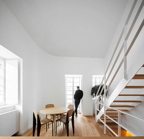
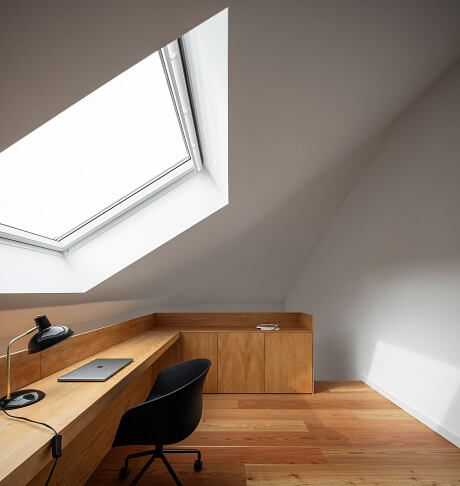
Via the home’s original staircase, access opens to the upper levels. We’ve reinstated the spatial openness of the roof here, creating a generously high floor-to-ceiling height. This design decision allows natural light to cascade from the white ceilings and walls, filling the formerly confined space. We also added a skylight to the mezzanine, offering captivating views of the castle and a constant reminder of the rich historical context that envelops this modern workspace.
Choosing Light, Welcoming Materials
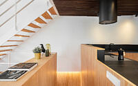
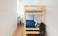
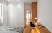
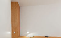
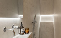
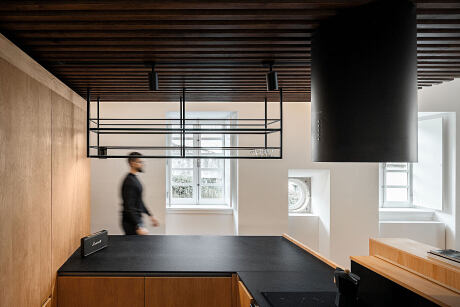
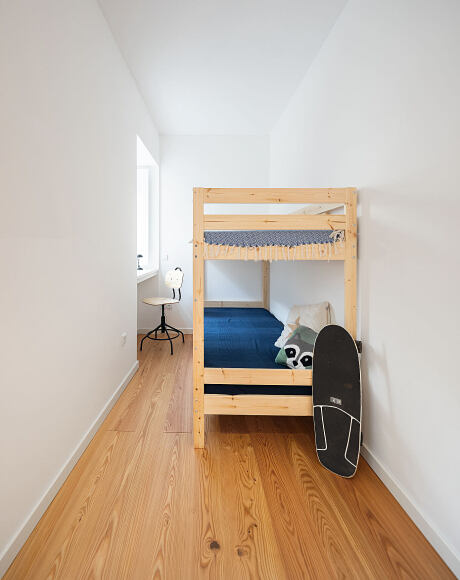
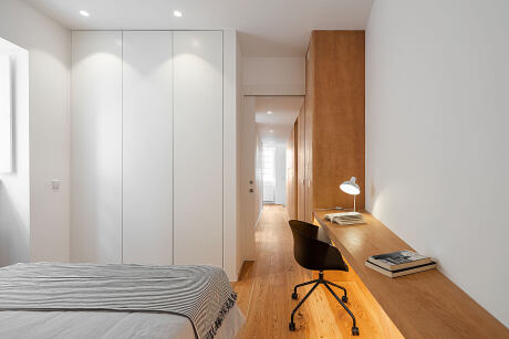
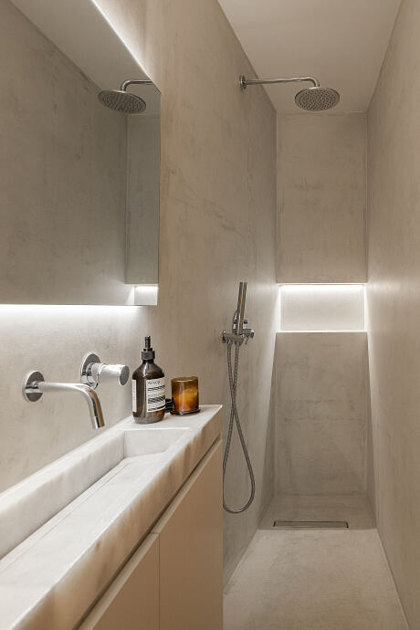
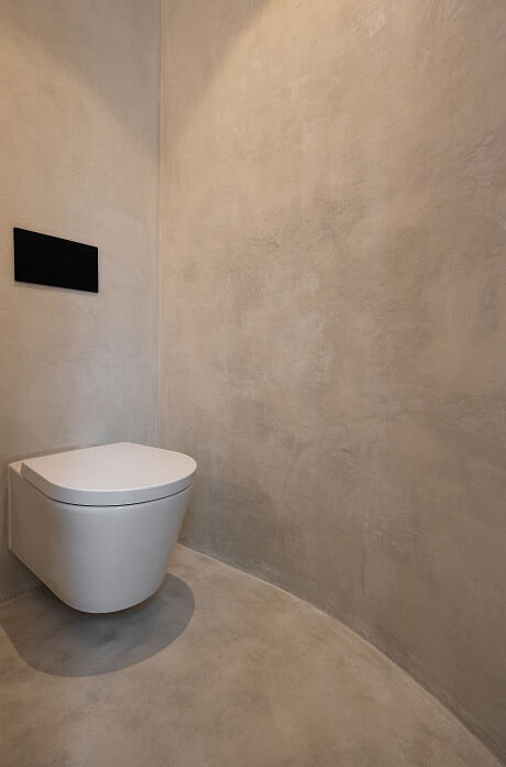
With regard to materials, our goal was to create an atmosphere that was light, casual, and inviting. We chose simple, yet high-quality materials. Light hues grace the walls and ceilings, while we finished the floors and furniture in Scots pine, enhancing the overall welcoming ambiance.
Photography courtesy of Paulo Martins Arq&Design
Visit Paulo Martins Arq&Design
- by Matt Watts