RA Duplex Apartment by 441 Design Studio
Located in Romania, RA Duplex Apartment is a classy apartment has been recently designed by 441 Design Studio.

About RA Duplex Apartment
Innovative Duplex Design in a Residential Complex
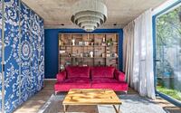
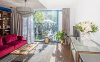
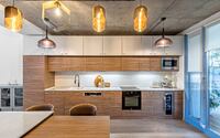
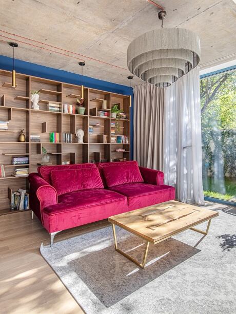
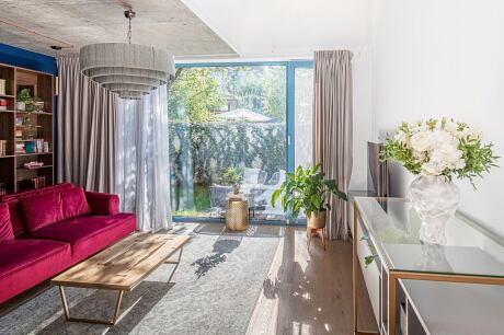
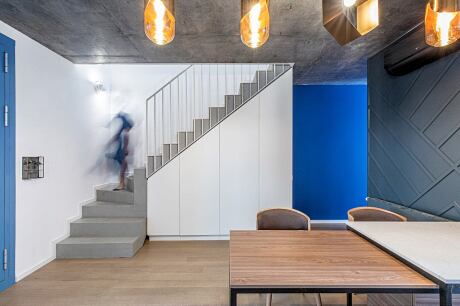
The design stage for the duplex commenced during the construction phase of the residential complex. From the outset, we decided to maintain the exposed concrete ceiling and visible electrical installations, creating an industrial vibe. Despite this modern touch, the living room primarily adopts a classic style.
Balancing High Ceilings and Bold Colors
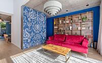
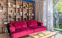
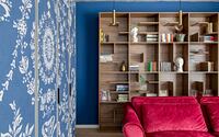
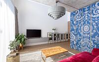
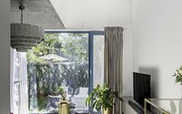
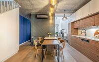
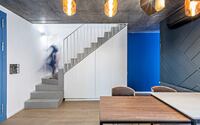
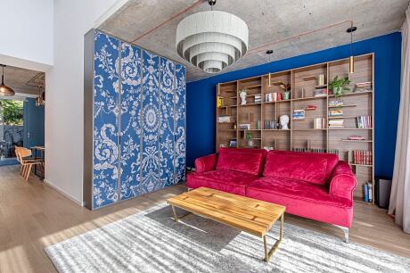
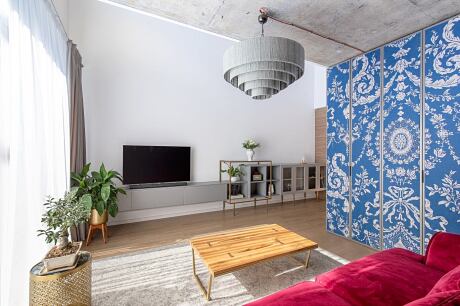
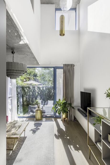
The living room features a 6m (19.7ft) high ceiling, generating a tall wall that we aimed to keep as minimal as possible. This design choice counterbalances the striking royal blue wall on the opposite side, which, when combined with the sofa, creates a powerful contrast. Despite the use of dark tones, the living room maintains a spacious appearance thanks to the simple white wall and abundant natural light.
Seamlessly Integrating Air Conditioning and Radiators
To incorporate the air conditioner and radiators into the design, we crafted a closet with printed textile fronts displaying a classic pattern. This solution effectively conceals the less attractive elements without hindering their performance. Bearing the same blue hue as the wall, the closet blends seamlessly into the room.
Harmonizing Color Choices with Unique Carpentry
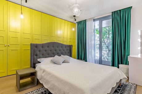
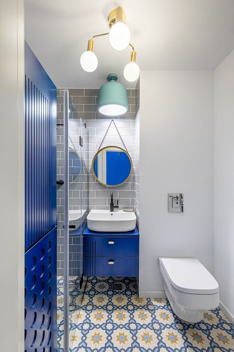
The unconventional carpentry color influenced our chromatic choices, subtly tying the entire project together through a cohesive color palette.
Maximizing Natural Light and Spatial Flow
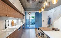
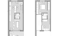
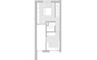
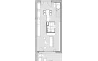
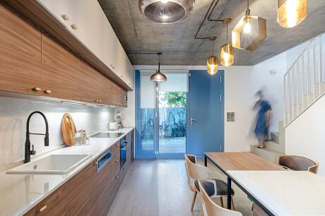
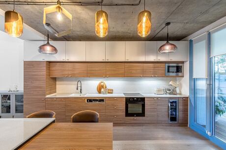
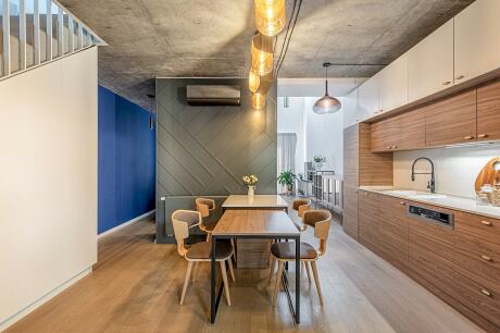
The circular layout of the ground floor allows natural light to illuminate the living room and kitchen from two directions, creating dynamic light patterns throughout the day. The layout also connects the living room with the kitchen, so we chose a continuous piece of furniture to intentionally link the two spaces. Each section, however, features distinct colors and textures, enhancing the visual expansion of both areas.
Minimalist Kitchen with a Touch of Warmth
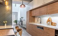
The kitchen embraces a minimalist design, combining warm white and natural wood tones with golden accents. A contrasting painted MDF panel adorns the wall next to the table, which occupies a central position as the heart of the home. Comprising two elements, the table can accommodate up to 8-10 guests.
Photography by Sabin Prodan
- by Matt Watts