House C by Alvisi Kirimoto
House C is an inspiring industrial house located in Rome, Italy, redesigned in 2020 by Alvisi Kirimoto.

Description
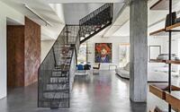
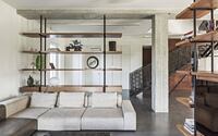
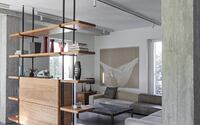
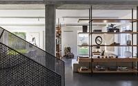
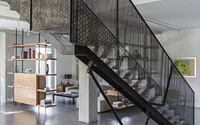
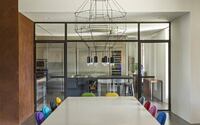
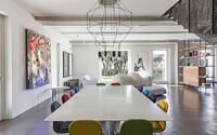
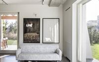
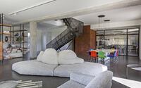
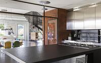
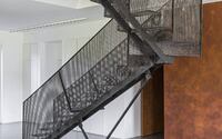
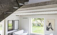
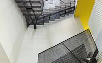
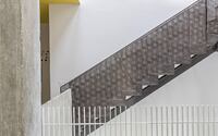
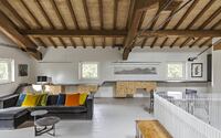
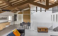
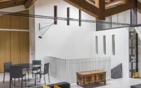
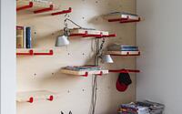
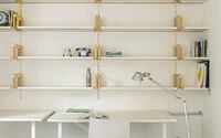
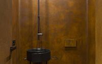
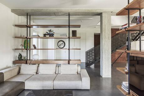
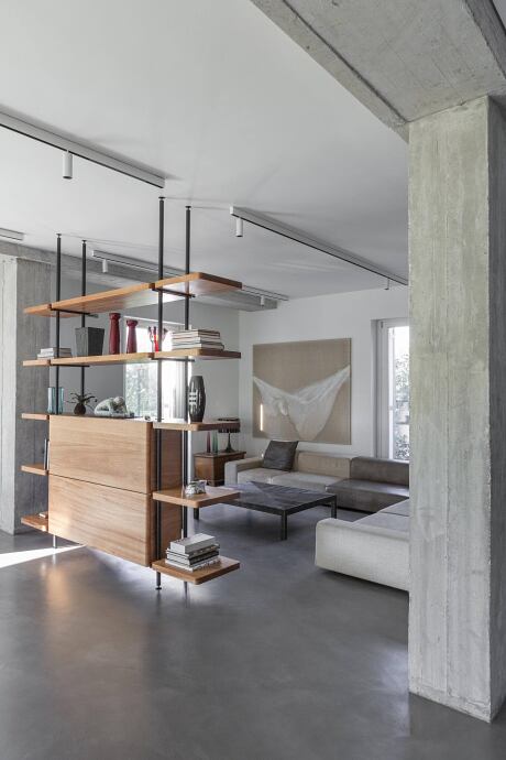
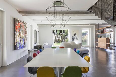
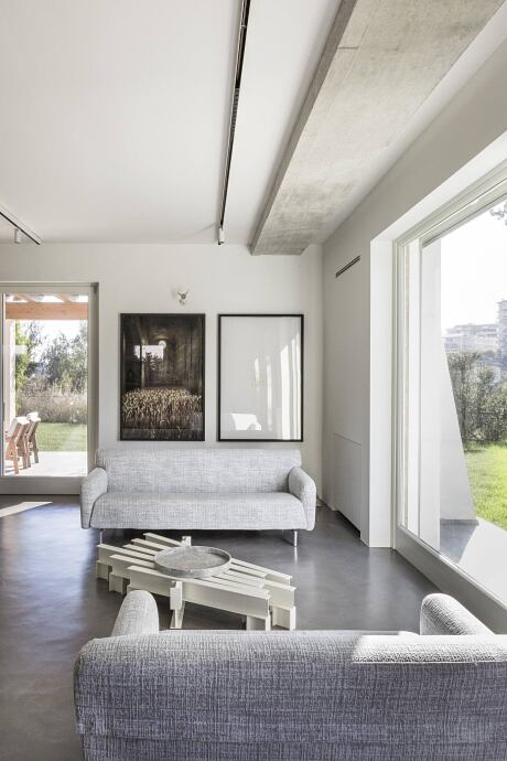
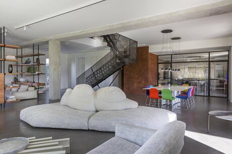
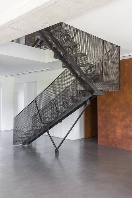
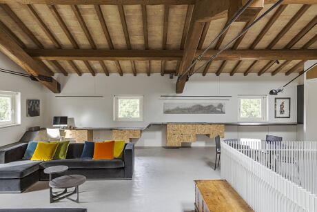
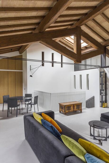
Immersed in the greenery yet located in the heart of the city, a few minutes from iconic sites of contemporary Rome such as the Auditorium – Parco della Musica by Renzo Piano and the MAXXI – National Museum of the 21st century arts by Zaha Hadid, the architectural firm Alvisi Kirimoto has completed the interiors and the design of the outdoor spaces of a farmhouse rebulilt on the volume of the existing building, firmly anchored on a hill overlooking the Inviolatella Borghese park, north of the capital. For the owners, it was important to have a home well integrated into the landscape, with bright environments and a strong connection with the outside, where nature can be enjoyed without relinquishing the vibrant pace of the city. This welcoming, open house was designed primarily for moments of conviviality with friends, but also to host the atelier of the owner: Antonella of Opificio Lauchli, who works in the artisanal field for the creation of custom-made complements and furniture, interior decoration and the transformation of antique furnishings. The archetypal shape of the farmhouse is balanced by the contemporary interiors, which are spread over three floors, in which the architects wanted to enhance the feeling of freedom and space, exploiting the height of the ceilings, limiting the number of walls and leaving the perimeter permeable with a series of French doors leading to a large garden. “We have divided the space on three levels, working on the ‘sky’ of each one, to embed three different experiences. On the ground floor, we used white and concrete; for the first we chose the brightness of the yellow; finally, on the top floor, we left the exposed wooden structure. The element of continuity that accompanies the visitor in this sort of architectural promenade is the staircase. Designed as a single piece, it is made of expanded metal, allowing light to filter through a play of reflections and shadows. The house has an amazing rock soul, like the owners. It is a homogeneous and dynamic space, where materials and surfaces change, extending the emotion from the visual experience to the tactile dimension”, – says Junko Kirimoto, co-founder of the studio. The ground floor is designed as an informal space, with a large living room that houses a TV area with a custom-designed bookcase in natural wood and black iron supports, and a dining area and open kitchen entirely in stainless steel with a central black island, shielded by a stained-glass window. From its central position, the scenic staircase dominates, made entirely of natural iron treated with a slender central support leg and a single sheet of micro-perforated metal sheet that constitutes the steps and the parapet. Light and transparent, the stalrcase, with Its permeable skin, offers unusual perspectives and invites appreciation of the entire stairwell, which culminates on the top floor with a large skylight. The layout is completed by the owner’s laboratory, and a series of accessory spaces, including the laundry room and the guest bathroom, treated with a corten-effect micro cement finish that introduces an additional material element on the ground floor, where ceilings and white walls highlight the structure of the pillars deliberately left in exposed concrete. The same colour choices and finishes are repeated on the first floor, which is dedicated to the children and characterized by an extra note of colour in its yellow ceilings. Along a corridor with a balcony overlooking the staircase, are the retractable doors of the bathrooms and the four bedrooms, with their refined custom-designed furnishings, from bookcases to desks, from blackboard walls to hangers. Wandering further, visitors access an extensive living and study area with a guest bathroom, which acts as a filter for the area reserved for the couple, with a double bedroom with custom-made furniture in OSB treated with glossy green lacquer, a bathroom and a walk-in closet. The top level has a highly material character: the floor, in grey micro-cement contrasts with the pitched roof with wooden trusses and exposed tiles.
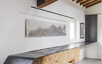
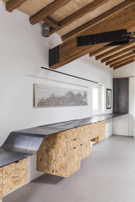
A natural OSB tape, treated with a transparent protective coating, and the upper shelf covered in treated black iron, winds along the whole room, wrapping it on three sides. From suspended furniture for the TV, the ribbon transforms into a magazine rack, becomes a bench, folds to take the shape of a chaise longue, rises to become a work surface, then a flap top that conceals a kitchen with sink and stove top, which finally, at 90 °, becomes the covering of the opening door of a piece of furniture.
The porch, designed with a living area and a dining area near the kitchen, blurs the boundaries between inside and outside. The garden with English lawn houses the vegetable garden with corten tubs, projected onto the urban landscape. And it is precisely here, that the synthesis of the versatile proposal of the Alvisi Kirimoto studio takes place, to seamlessly combine city rhythms and a greener lifestyle.
Photography by Serena Eller Vainicher
Visit Alvisi Kirimoto
- by Matt Watts