House C-VL by Graux & Baeyens Architecten
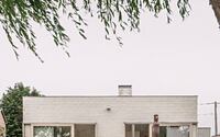
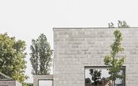
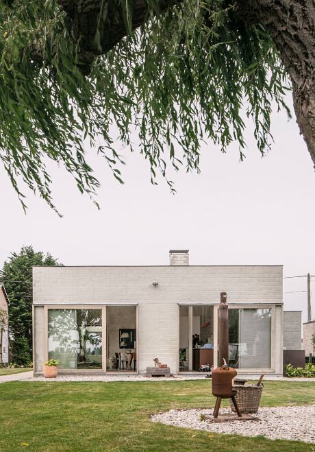
House C-VL is an inspiring bungalow located in De Haan, Belgium, redesigned in 2017 by Graux & Baeyens Architecten.

Description
In renovating this 1960s-era bungalow, certain areas in the house were kept undefined. This left a lot of room for the personal interpretation of the residents, so that the house came to life very spontaneously.
Three squares
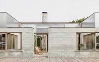
A living space that could be doubled at maximum, a deep, narrow lot and an uninspiring original construction: those were the raw ingredients for the renovation of this bungalow. Nevertheless, this house from the 1960s also concealed an interesting element. Stripped to the essentials, the floor plan revealed the basic shape of one and a half squares. Mirror this shape and you will get three squares, with a fireplace in the middle. Suddenly there was an exciting element to work with.
Centrepiece in every room
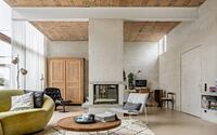
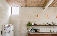
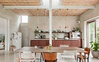
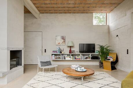
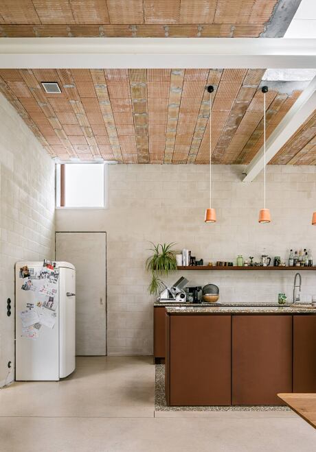
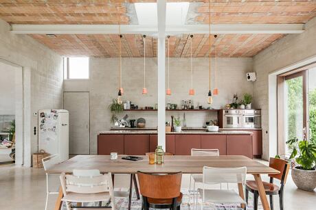
To provide ceiling support for the square spaces, a structural element was introduced into each one: a white cross in the rear and front squares where the kitchen, dining room and bedrooms are respectively located; and in the central space of the living room, a concrete crosspiece that rests on the chimney. By placing the constructive crosses asymmetrically with a single column in each space, a different layout was created each time, with the cross as the centrepiece around which the space unfolds.
Original patio
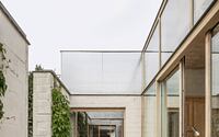
Instead of integrating the entrance, storage room and toilet into the concept of the three sleek squares, as often happens in a new building, these spaces were given a place in the original annex. Out of love and respect for the typical Flemish building context with its extensions and additions.
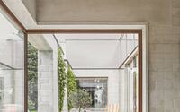
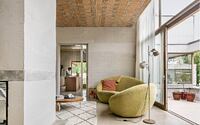
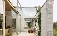
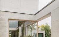
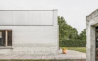
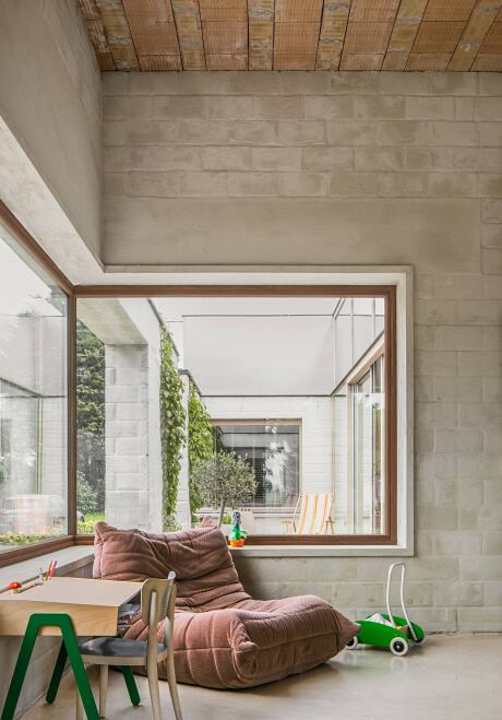
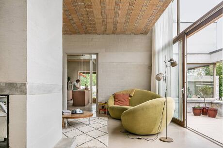
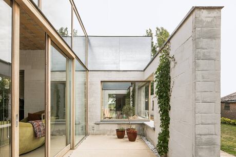
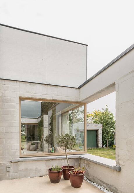
On the south side of the house, openness was created in the living room by means of a large glass wall. The proximity of the neighbours was not a deterrent. On the contrary, this fact stimulated us even more to arrive at a creative solution. The windows were positioned somewhat recessed and the resulting patio was delineated by a wall on the contours of the original outbuilding and with the same window openings as in the original. This design opens up the antechamber and at the same time creates a buffer for the adjacent living space. Moreover, this intervention not only created a fascinating interaction between the living room and the strip of garden at the side, but also between the dining room and the bedroom, resulting in a very spacious feeling.
Spontaneous living
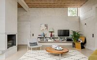
In the interior, high ceilings were chosen that were deliberately left rough. The structural walls were painted with Kalei stucco. In the living room, the support beam rests on the chimney, but otherwise it simply cantilevers without resting on anything. It is a detail that contributes greatly to the spacious feeling of this room. The hearth itself is not just straightforward, but contains playful concrete elements that here and there have a frame or decoration and where the children spontaneously sit down with a book. This is just one example of how the residents have been given the freedom to design their living space themselves. Even the corners created by the positioning of the crosses in each room are not necessarily assigned a specific function, so that anything is possible.
Summary
This inconspicuous bungalow has grown into a home with exciting views, original constructive elements and cosy, undefined areas.
Photography by Jeroen Verrecht
Visit Graux & Baeyens Architecten
- by Matt Watts