Yung Zingtung Copper Culture Exhibition Hall by Salone del Salon
Yung Zingtung Copper Culture Exhibition Hall is a traditional oriental exhibition center located in Foshan City, Guangdong, China, designed by Salone del Salon.




Description
Design is a kind of exercise from recognizing the form to constituting the entity.
— Louis Kahn
Balancing between art and life, aesthetics and function, we discover the creation of aesthetics in the spirit of functionality and are closing in the essence of traditional oriental culture. Based upon Yung Zingtung’s core branding, it incorporates product demonstration, culture impression and brand image. With its vast openness and extreme simplicity, subjects on display grasp your attention at the first glance. Conformity and individuality interact with each other with harmony.
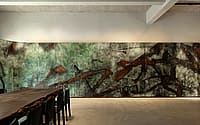
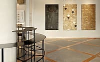
The traffic flow design resembles an art festive, intertwined with dimensional copper elements. Light and shadow, space extend, walking and touring among display galaxies, your mind lingers gradually. Traces of dedicated craftsmanship and aesthetic appreciation are made obviously by the language of space and display.
Formality is as the mean of serving the storytelling, artifacts travel in time to keep the heritage with the poem, aesthetic braves the boundaries to expand the ideas with infinity.
01
Restrain and release
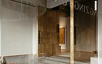
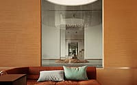
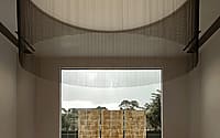
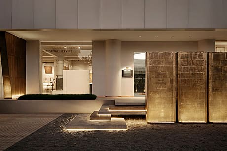
Asymmetry pillars and floor-to-ceiling windows maximize the internal and external interactions. Natural light shines through the windows to release the freedom to the architecture, even to the flow of space, and extend the internal and external dimensions. The products are displayed in a direct way to be expressed by such ingenious design, which lets the viewers have the chance to get the visual expression of the concept of brand.
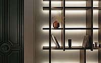
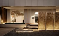
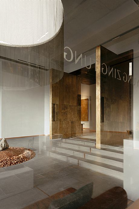
The brass materials are setting up outside directly to show the bold design. It is a kind of unrestrained release and restraint of openness. It happens to create a tortuous path that awakens the desire for exploration for the viewers. During the daytime, the natural light will be enough in the space, especially the true texture of the metal. At night, the light and shadow are mainly making the copper become outstanding, even showing the space clearly.
02
Solidification and flow
The form is a kind of interpretation to express the extended meaning that the design is from a concrete finite to an abstract infinite. This is a journey of artistic exploration of materials from the outside to the inside, from the vision to the imagination.
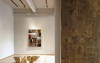
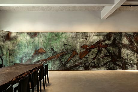
Tracing the roots from the original roughness of brass material, the craftsmen create it as an artistic work by crafting to express the material and brand cultures without lots of statements. It is easily to capture the solidified hardness from the texture and the lightness of flowing signals of evolution.
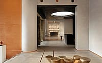
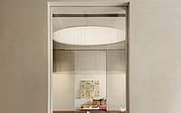
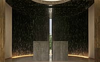
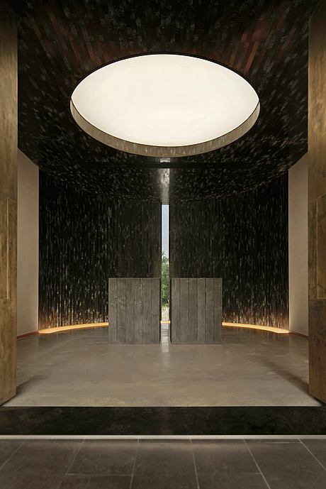
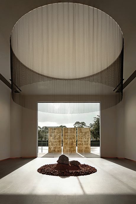
The solemnity starts from the solidification of form with the flowing of light and shadow. There is a crack in everything, that’s how the light gets in. The light is gathered as a line; the dome is shaped as the sky curtain; and the arc of the ground is like flames, each element of design captures the transformation of light changing. All of them construct the space and make the atmosphere be full of enthusiasm and refine the aesthetics. The symmetrical architectural structure embodies the etiquette and order without any suspense and expresses the solemn ceremony with the focus of light to achieve the great momentum.
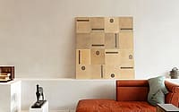
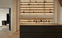
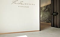
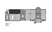
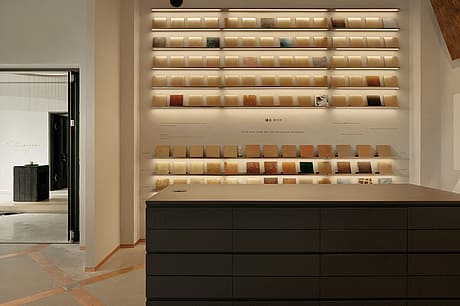
Each space is an independent unit based on functional, they constitute the brand image and personality. Each unit is expressing the purity of minimalist modules. The core products demonstrate in different scenes, yet it always attracts the attention of the space, highlighted by the harmony, connected by between the various themes.
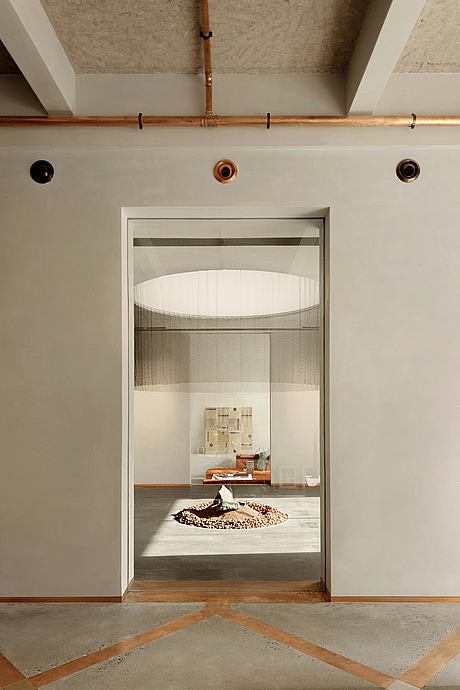
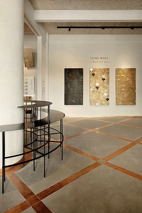
The designer uses the copper lines to divide the ground to make a nice pattern. It is a way to show the aesthetics, meanwhile, to make the copper have different forms to be expressed in the continuous spaces, which is also a hint of design to unify the system of the whole space. The design builds an exhibition space between people and brands that aims to give the viewers a place to explore unbounded, infinite, and selflessness statement in deep immersion and contemplation, movement and imagination freely.
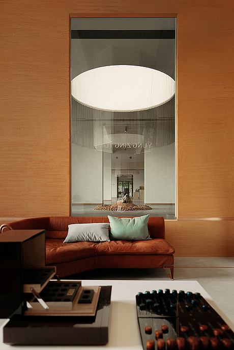
Let your mind flow through the surface like stave and syllabus in the music sheet. The designer intentionally opens multiple communication windows to facilitate the connection between the independent spaces, achieving privacy and publicity. The inherent narrative of traditional display is broken through by the connection, that is why the time and space are liberated, then you can feel free to walk around in the space.
03
Tangible and infinite
The design is inspired by architectural forms and residential philosophy. From the point of spatial form, the design is raised to the core idea, and finally returning to the essence of the meaning of space language. Products will always be the protagonist of the display of space. The designer took this concept to design the exhibited area extremely.
From the simple display to showcasing the multi-dimensional traits of the display, the space comes with a sense of luxury yet low-key style. The multi-faceted plasticity of copper married with the brand’s unlimited potential; the designer is exploring the potential of aesthetic expression. All are exhibited in the tangible display concretely.
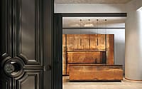
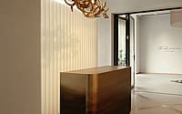
The devil is always in the detail. To have a deep experience about exploring the stronger cultural gene, you can find the boundary between the tangible and the intangible beauty gradually disappeared. Breaking through the limit of form, crossing the dimension of time, an appearance of a brass door shows the infinite trait of copper.
There is no limit of time, so it can carry thousands of years of history. There is no limit of the land, so it can hold everything in the world. The design can be restrained and unbridled. Every creation has its meaning. Beauty is in the eyes of the beholder. The infinite mouldability of material resembles the brand’s culture, the design of the space expresses it well with metaphorically incorporating lines, dimension, and surface.
Photography by Cui Ziyang
Visit Salone del Salon
- by Matt Watts