Origin Realm by Xigo Studio




Description
Flow is the source
Concept Statement
At the beginning of designing the scheme, XIGO STUDIO thought about the origin of housing design, and hoped to create a more mobile and closer space while sorting out the movement relationship between human and space. By studying the basic forms in nature, the design team made the design full of imagination and power. Taking “Atom” as the conceptual demo of the project, they extended the physical model of this smallest particle to the design transformation of this project. The designers abstracted the structural form of atom, and transformed it in space and plane so as to show the purity and nature of the space form through the material origin of physical aspect.
Site Analysis
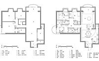
The apartment owner is a family of three, who has very high requirements on living sanitation and storage condition, and hopes to have a simple space form while maintaining the integrity of the space. With the area of 188 square meters, the original structure has well-regulated “dynamic and static zones”. After the wall partition of the kitchen is dismantled, the public area presents as a complete space structure that is transparent and open. With such an open and large house type, there should be more design possibilities.
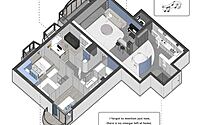
After reconstruction, the plane still remained the basic pattern of three-bedroom. However, XIGO STUDIO rearranged the space of the public areas, reframed the structural relationships of different rooms, and endowed the originally single “box body” with a space sequence with progressive changes. Meanwhile, they focused on the construction of space form, promoted the function through form, and developed a dependency relation full of connectivity so that the habitants can have rich space experience when they live there.
Arc Screen Wall
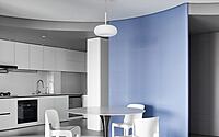
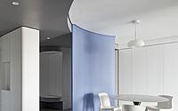
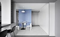
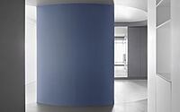
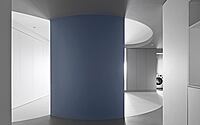
When habitants enter into the hallway, their first sight will be cast at the arc screen wall between the hallway and dining room. Two moving lines that “move in the direction of light” are designed in the screen wall. The entrance on the left leads to the main moving line which connects the whole space, and reaches the living room adjacent to the balcony. While, the moving line on the right is connected with the open kitchen and leads to another daylight opening located in the laundry area. Between the two moving lines, the third back-and-forth moving line is formed around the dining area behind the screen wall, which endows the space with openness.
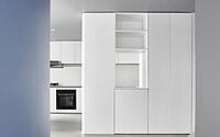
The shielding function of the arc screen wall, on the one hand, ensures the privacy of the internal space, on the other hand, it foreshadows the subsequent space functions. Between the screen wall and the entrance door, a small distance dislocation is formed to introduce light into the relatively independent hallway space. In the hallway area, a space with very strong storage function is designed. And an arc element is embedded as the closed and white area for shoe changing. The moving line on the right is connected with the kitchen. The roof-connected kitchen cabinet is designed with holes to provide area for putting vegetables after habitants enter the apartment, which forms the interconnection between the kitchen and the hallway.
Revolving Dining Room
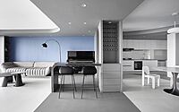
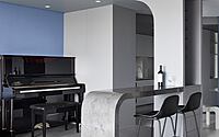
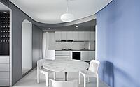
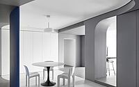
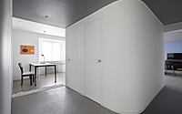
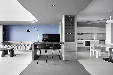
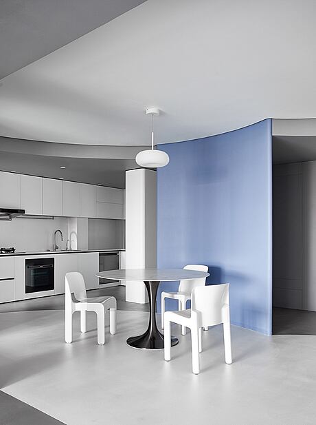
Through the clear division of gamut boundaries and the construction of color lump and structure, XIGO STUDIO boldly abstracted and summarized the space form. The streamline that extends from the window to the interior, and rotates around the dining room makes the space more active, and the dynamic rhythm more intense. And the streamline, together with the streamline ceiling of the bar space in the living room also forms a rhythm change. In the minimal form, the functional content is retained. The application of cool colors and integration of geometric shapes jointly endow the dining room with a visual sense of art exhibition hall. Accordingly, the white tables, chairs, lamps and lanterns become the art collections in the “exhibition hall”, and echo with the environment in form and color.
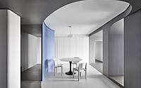
Seeing from the living room, we can find that the streamline starting from the horizon embeds and overlays with the horizontal frame line. The adequate storage wall and sideboard cabinets solve the storage problem for the whole family. The three vintage chairs in the scene have certain collection value. They are respectively No.4860 Universale Chair designed by Joe Colombo in 1965, Artemide Selene Chair designed by Vico Magistretti in 1969, and Carlo Bartoli Chair Model 4875 designed for Kartell in 1970.
Center Stage
The designers integrated the bar counter with the piano area as the center stage, and arranged the overall space around the stage. The stage, as the core that drives the space form to produce streamline motion, is like the “nucleus” of the space, connecting with each functional area. The four functional zones: entrance porch, dining room, stage and living room are arranged in sequence along the direction of the light source from the north side. The influence of light is gradually strengthened and weakened in the transition of the four spatial levels, creating a progressive spatial rhythm from the entrance to the interior of the apartment. Streamline forms intersect in the central space. The stage also forms the core visual focus of the entire space meanwhile.
Dynamic Living Room
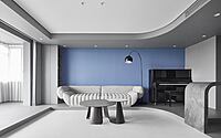
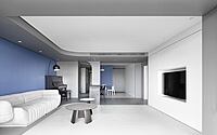
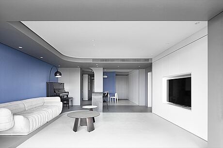
The streamlined drop ceiling extends from the balcony to the corridor. The color distinction of gray and white emphasizes the form track of the streamline. At the same time, the plane’s color partition extends to the three-dimensional space segmentation. The color gamut’s shape division of the floor echoes with the color form of the ceiling. Meanwhile, the gray structure formed correspondingly extends to the internal corridor. Looking towards the living room when standing at the end, habitants can find that the continuous streamlined drop ceiling outlines the frame of the space picture. The gray drop ceiling extends to the entrance of the corridor on the side, leading the space’s kinetic potential to the interior of apartment.
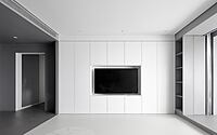
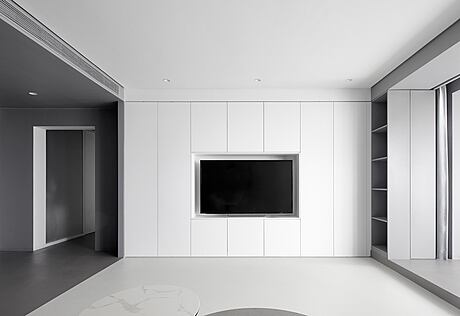
Apart from the space’s form construction, the use of furniture items is kept to a minimum. TACTILE banana boat sofa designed by Italian designer Vincenzo De Cotiis for Baxter in 2014 is adopted. The sofa is in harmony and unified with the space through its streamlines’ hugging shape and ductility. The whole TV wall is designed with a storage system that starts from the ground, which provides a maximum storage space, making the space more neat.
Introduce Light into the Apartment Interior
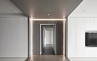
The participation of light is a prerequisite for space to be presented in our vision in the form of “space”. The designers hope the natural light can penetrate into every corner of the space as much as possible. The gray drop ceiling painted with latex paint, and floor decoration extend to the end of the corridor. The light belts that surround three sides create a sense of future like the sci-fi tunnel.
The original corridor, as the transitional space for public and private areas, is wrapped in the center of the whole space structure, which appears closed and narrow. XIGO STUDIO exchanged the location of the original study with the secondary bedroom to create a more convenient viewport so that the natural light from the north side can be introduced into the corridor and then to the master bathroom on the south side. The entrance of the master bedroom is designed opposite to that of the corridor so that the corridor can receive natural light from the third direction when the bedroom door opens in the daytime.
Meanwhile, the designers expanded the width of the corridor leading to the study. Ultra white glass is used as the partition between the study and corridor, ensuring the transparency. The guest bathroom was divided into two areas: namely closestool cubicle and shower cubicle. The two areas are respectively arranged on the both sides of the corridor. Accordingly, this design helps to realize dry and wet separation in the guest bathroom. The opening and closing of venetian blind can flexibly change the state of the study according to the need for use. Besides, the flexible function of venetian blind also can endow the corridor with rich light and shadow change, and effectively ensure the privacy of the study at the same time.
Independent Space
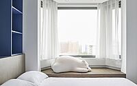
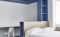
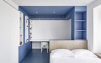
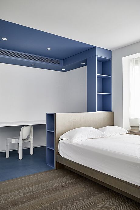
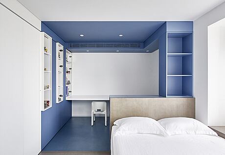
The apartment owner’s daughter needs an independent space where she can stay in the room all day. Since the owner’s daughter has the hobbies of collecting garage kits, anime products and other objects, three sets of lockers with glass doors are installed at intervals in the secondary bedroom according to the demand, which enriches the space. Besides, the glass doors of the lockers create a sense of breathability.
To meet the girl’s requirements on daily sleeping and living at the same time, the implantation of gray and blue structures define the functional division of learning and game. In the small space of the secondary bedroom, zones are arranged orderly, color gamuts are differentiated from each other, and forms are related to each other. In the other side, bed is connected to the bay window, forming an overall rest area. Under the bay window, a storage cabinet is designed to provide storage function for bed products.
Storage in the Master Bedroom
The master bedroom is a room designed for the male owner and female owner. Gray wood floor is used for paving the floor. The whole room is relatively neat and simple. To solve the storage problem, XIGO STUDIO designed a walk-in cloakroom installed with an orbital stealth door whose track is hidden inside the door, achieving the effect of minimal suspension. Inside the cloakroom, there is a powerful open storage system which completely solves the problem of storing owners’ clothes for daily use.
Exquisite Bathroom
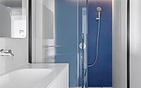
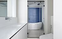
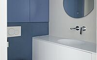
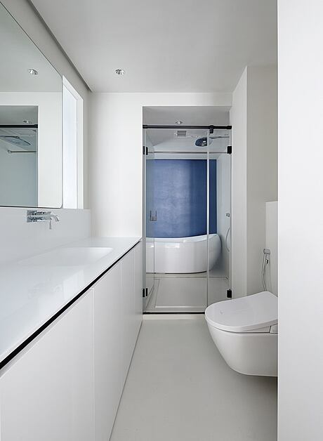
The bathroom is totally divided into three areas: master bathroom, guest bathroom and independent bathroom. Dry and wet separation is realized in the bathroom. In the dry area, wall-mounted closestool and artificial stone basin are installed, achieving a high-efficiency of seamlessness. Windows are designed both in the dry area and wet area of the master bathroom. The windows, together with the Changhong oil sand glass provide the bathroom with sufficient daylight. Meanwhile the materials used present a hazy ambiguous aesthetic feeling.
Photography by Li Ming
Visit Xigo Studio
- by Matt Watts